The team was tasked to create a safety induction animation for bp's outdoor location, for this particular video we created a safety induction video for the bp lifeboats. Myself and the creative director brainstormed different ways to approach the animation without being repetitive to the previous projects, yet also remain cohesive with the bp branding and identity. For this project, my role was to create the majority of the visuals for the animation, from creating the initial storyboards to creating the detailed backgrounds, I worked to create a sequence of images that is informative and engaging.
This animation is intended to be used as a guide to help keep staff, contractors and visitors safe and educated on the potential risks and hazards on site. We suggested making a safety animation rather than a normal video to grab the viewer's attention through vivid graphics, thrilling sound effects, and interesting voiceovers. It allows the employees to learn without putting in much mental effort. Linked below is the final video.

QU lifeboat safety induction video
The final animation delivers small bitesize pieces of information in a way individuals can absorb the main key points and retain what they have learnt. I suggested using a variety of mixed media from film to animation will keep the content interesting. Using storytelling, demonstrations and reconstructions and displaying the site layouts will allow people to know the basics of what they need to do to stay safe.
Indoor background illustrations
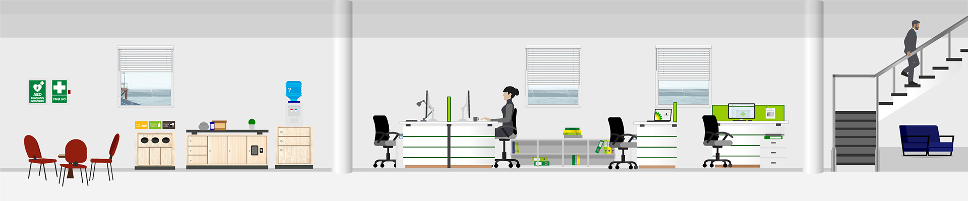
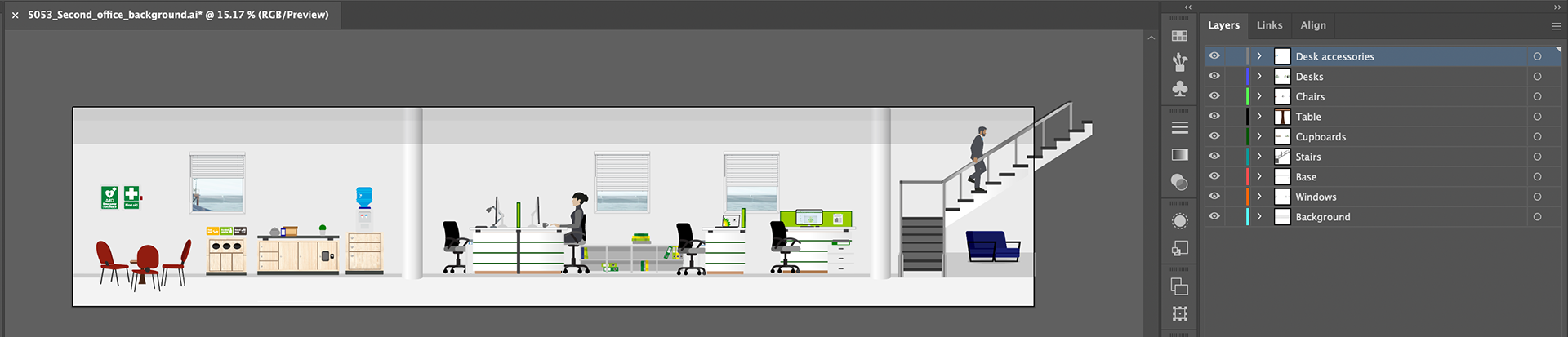
For this project the site illustrations were key. We combined both images of the sites but also I drew detailed illustrations of the key backgrounds to interact with the animated character Betty. The first indoor background is used to show the indoor office space. I drew the background in a landscape format, to allow the character to walk through and show the three key aspects of the office: the kitchen, desk spaces and a glimpse of the staircase. I made sure all of the documents are layered based on the objects in the image, to allow the client to easily edit it for future projects.
Indoor
Reference photo
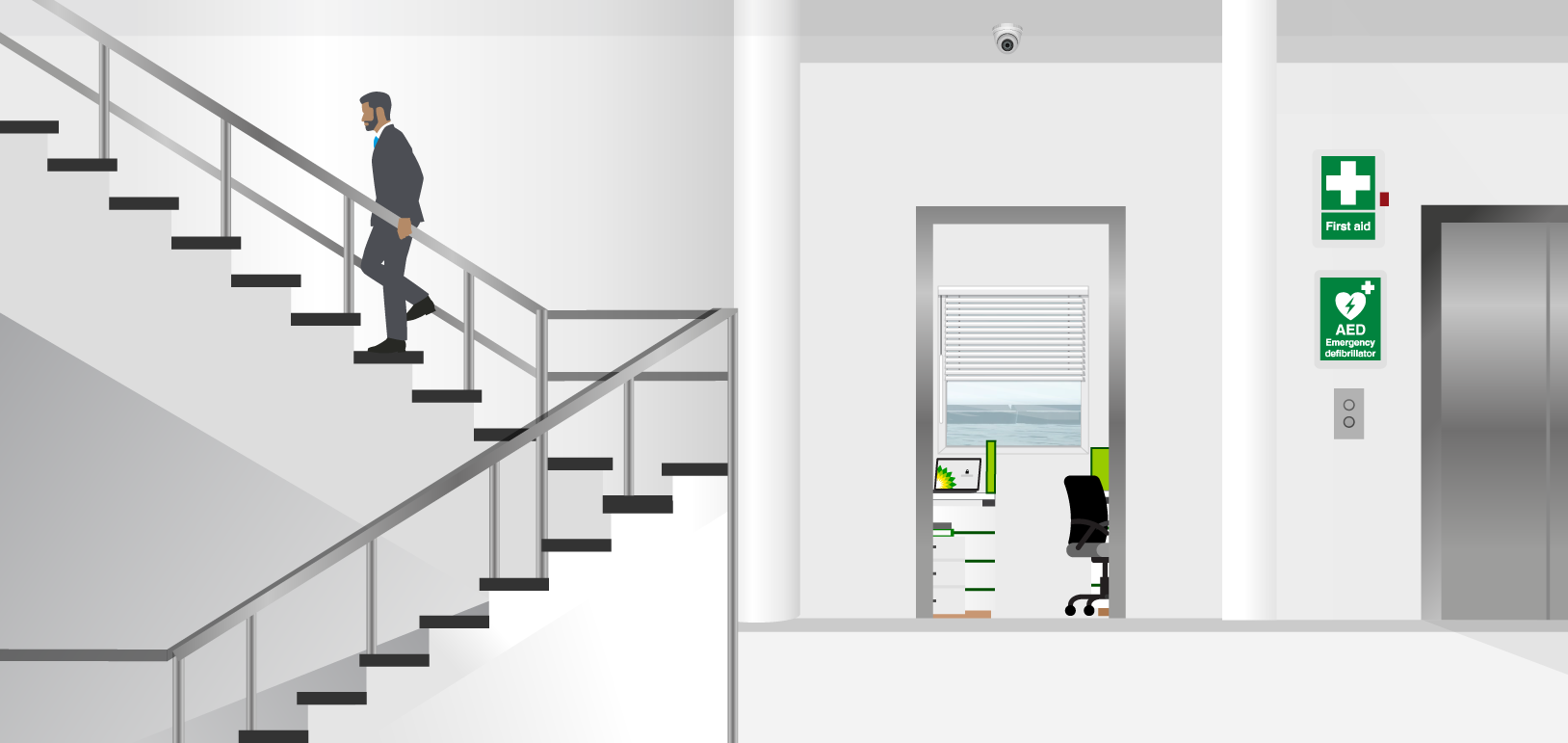
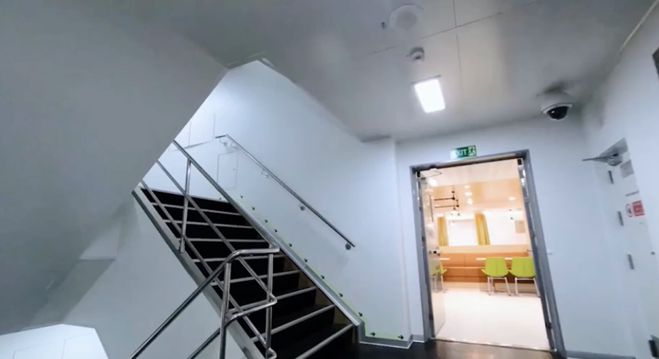
For the second indoor background, I roughly referenced the image taken by an employee, however, flattened the perspective to work with the animation's general 2d layout. The client requested to add the AED and first aid posters to reiterate the importance of safety in all parts of the building.
Outdoor background illustrations
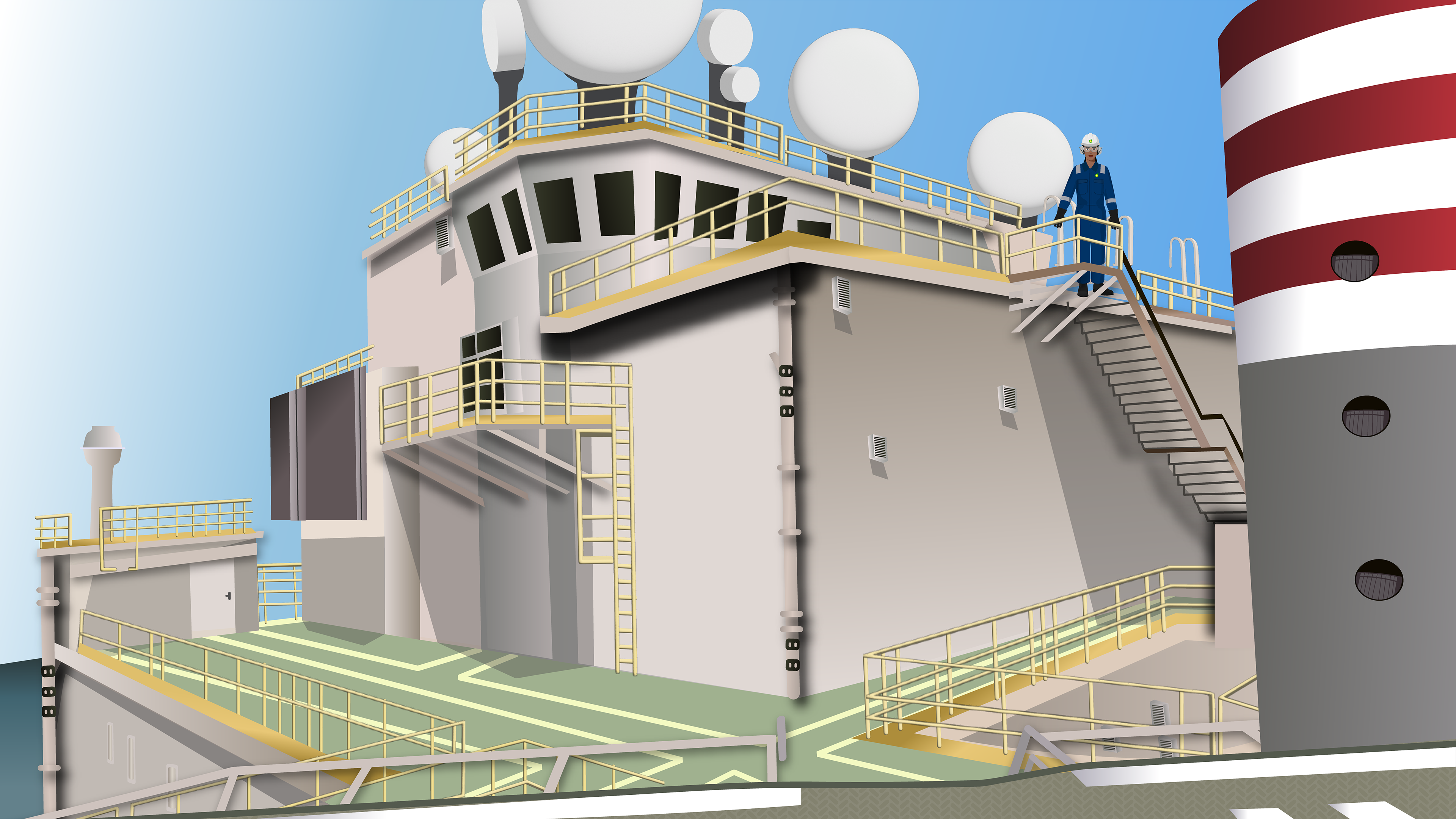
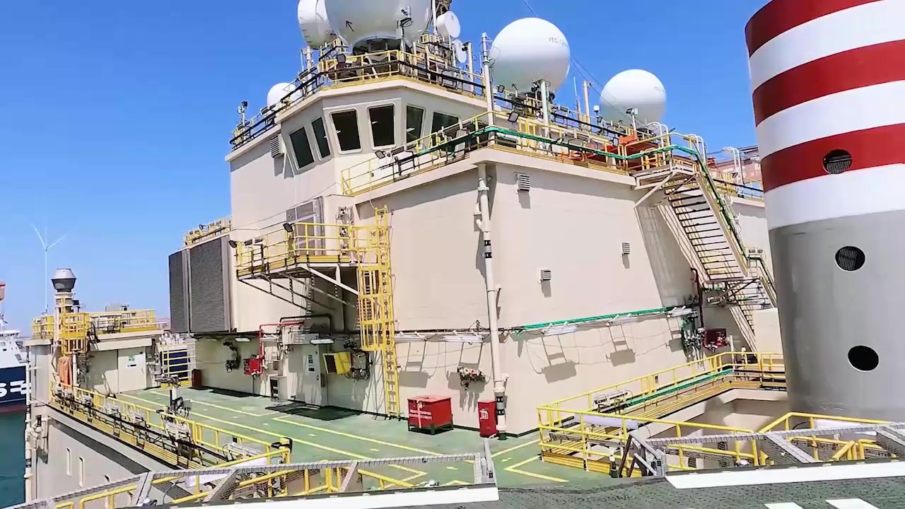
Outdoor background illustration option 1
Reference photo
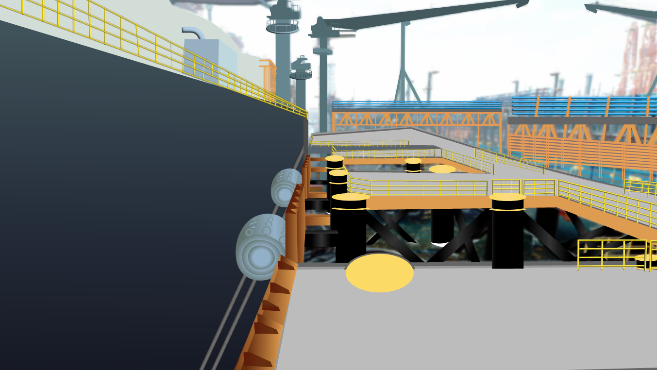
Outdoor background illustration option 2
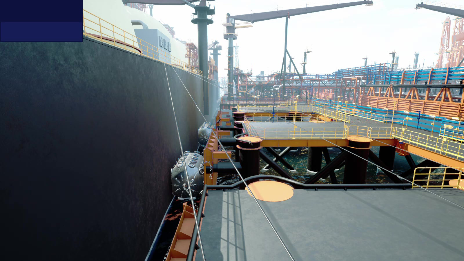
Reference photo
For the outdoor background, we were torn between two options (as seen in the reference photos above), however, we decided early on that we prefer the second option. I illustrated the two simplified background options, focusing on the second option. These illustrations were challenging to draw given the level of detail and dimension, however, after breaking down the elements, I managed to get it done in a tight timeframe.
Additional assets
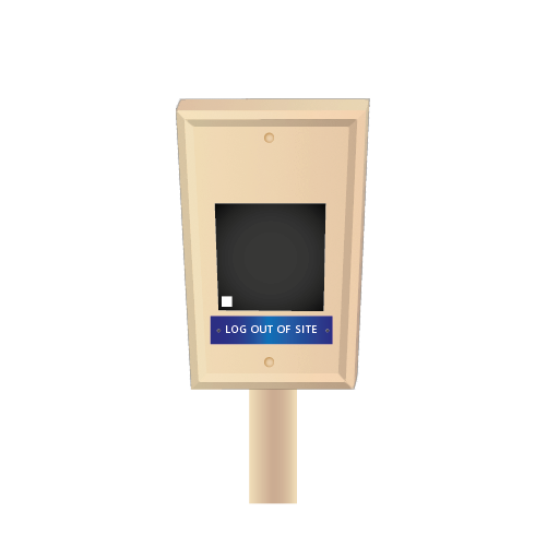

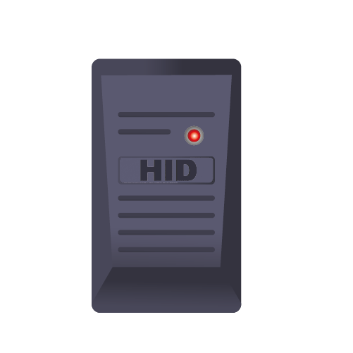
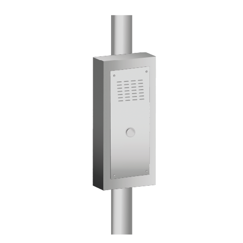
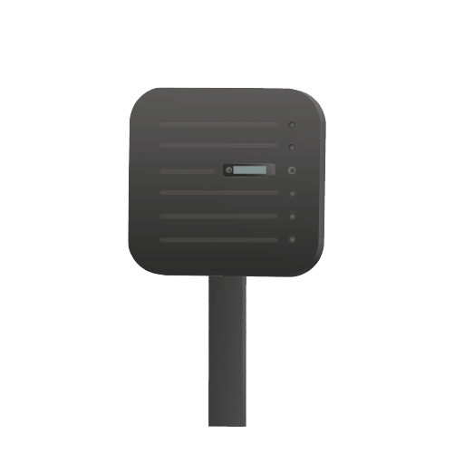
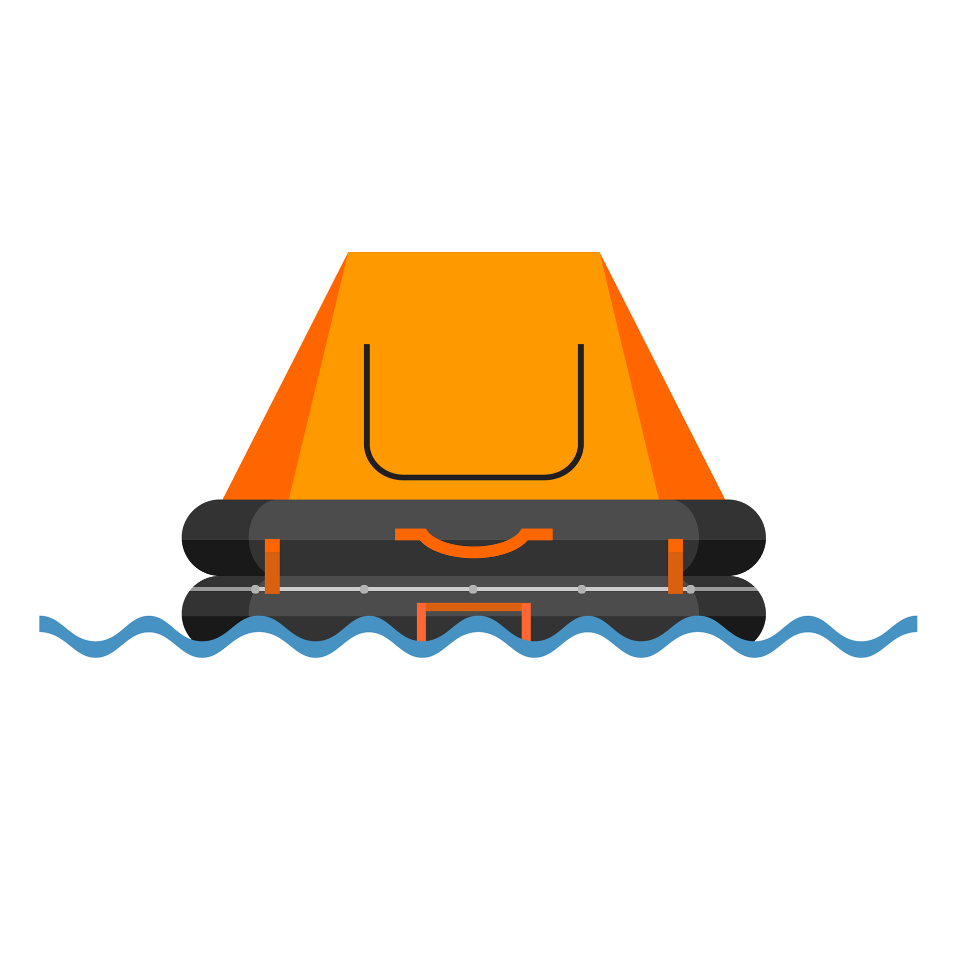
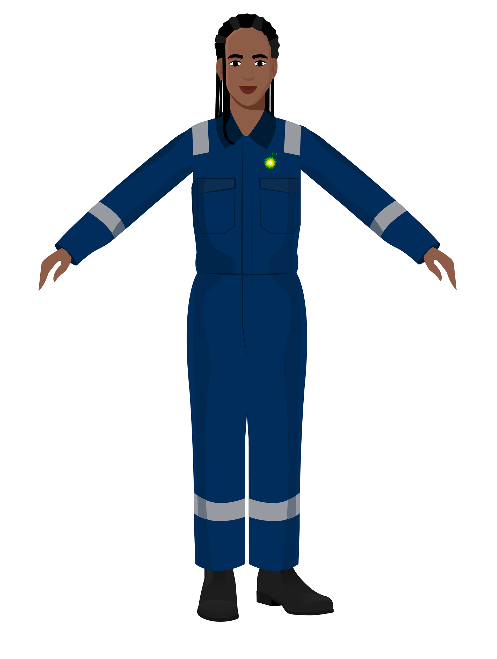
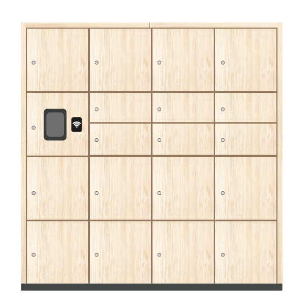


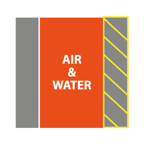
These are additional assets I drew for this and other overlapping projects. The first row of illustrations are the different alarms/ authentication objects the visitors would encounter. The second row is the random illustrations I created throughout the video, and the last row shows the street/ parking signs. All in all, it was great to work on a project from start to finish and play a key role. Illustrating imagery that I have never drawn was challenging yet rewarding, developing my skill set.