In the world of the industrial environment, health and safety training is considered one of the most fundamental aspects of achieving workplace safety goals. Our client asked the team to create an out-of-the-box safety animation that can be presented to both visitors and employees. We encourage clients to opt for safety animations rather than videos to make the visuals interactive, effective and diverse. Myself and the creative director brainstormed different concepts to make both animations fun and easily digestible. The visuals of the animation had to be unique enough to stand on their own, yet remain cohesive with the bp branding and identity. For this project, my role was to create all of the visuals for the animation, from creating the initial concepts to creating individual characters, I worked to create a stream of visuals that is organic and informative. Linked below are the final two animations.
Final videos
Concept 1
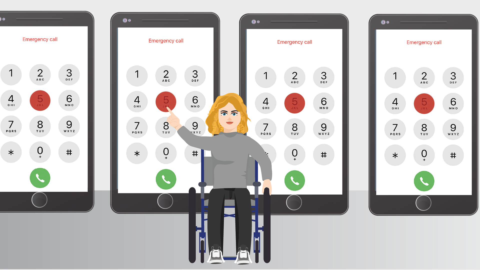
Concept 2
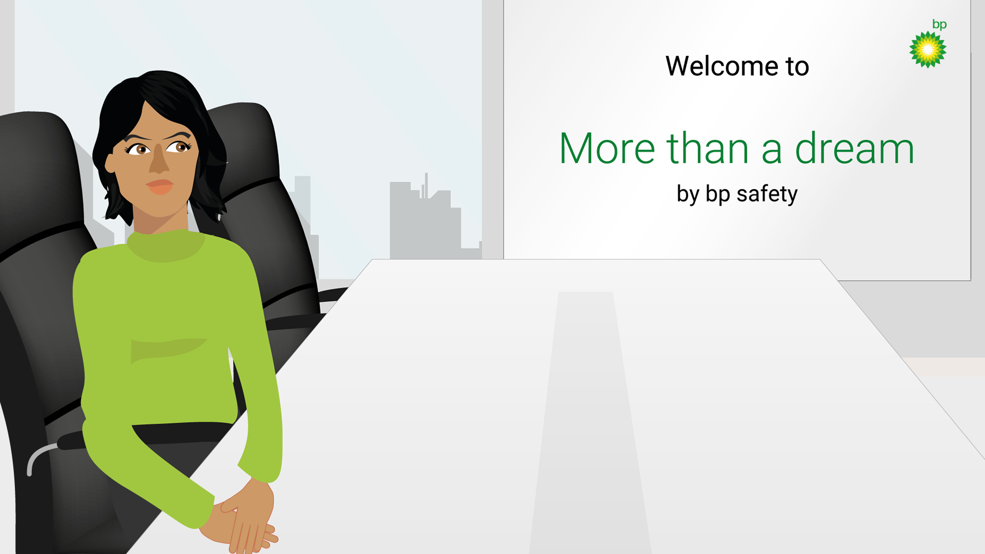
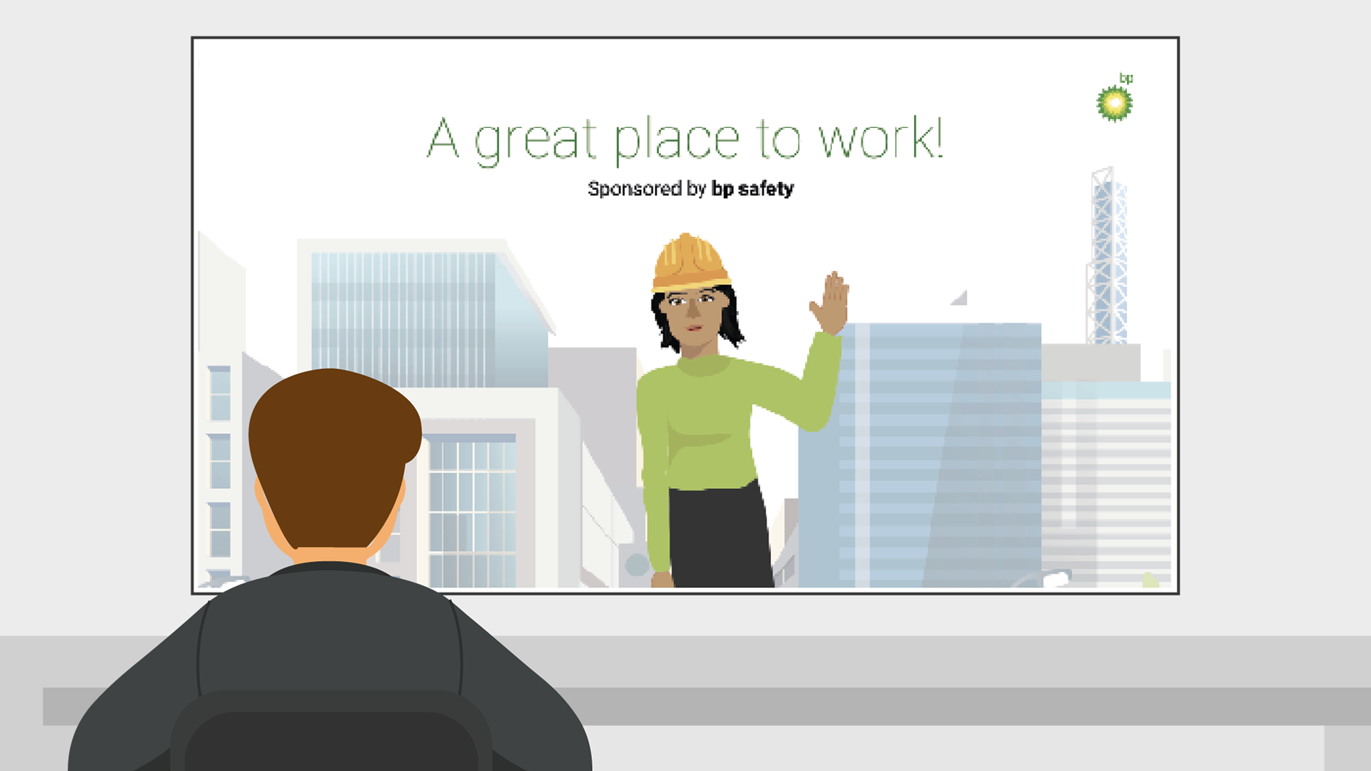
Concept 3
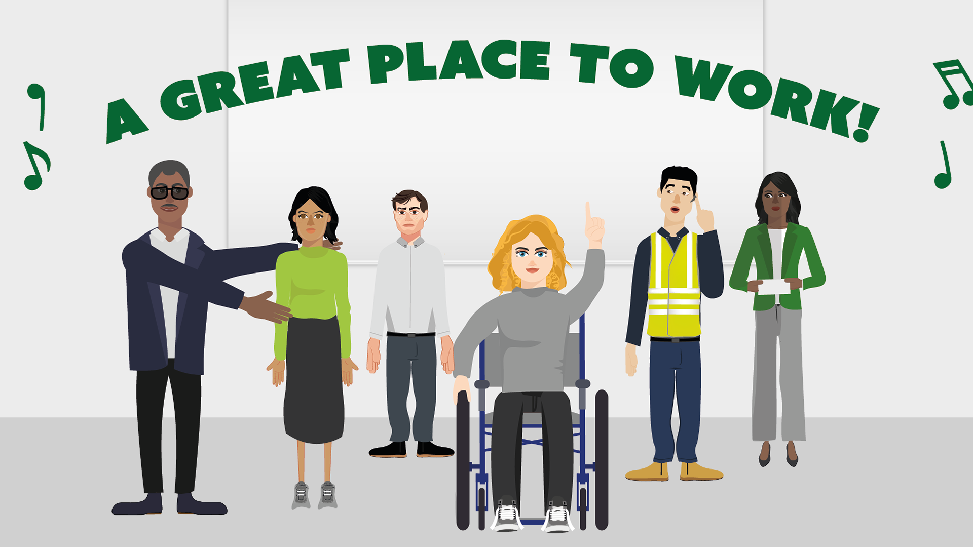

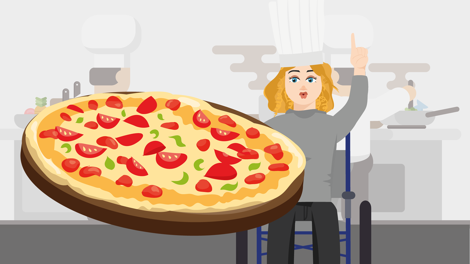
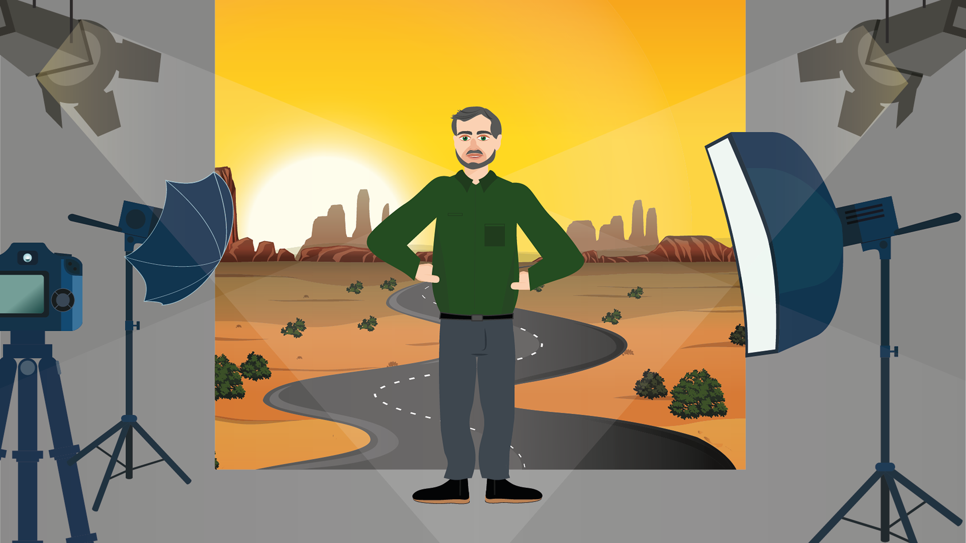
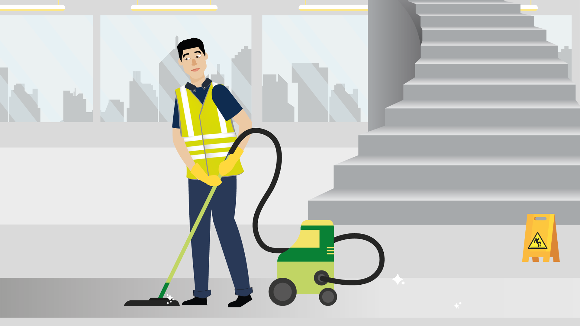
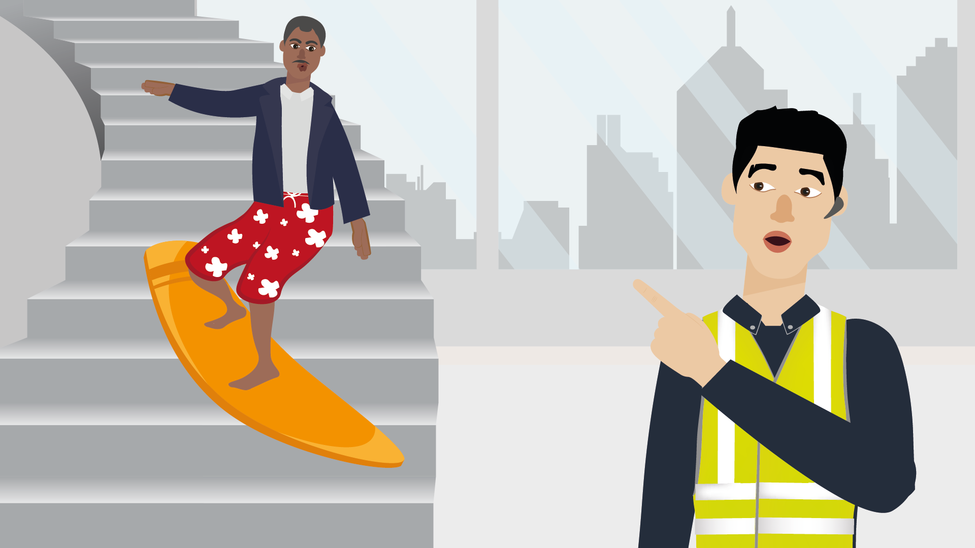
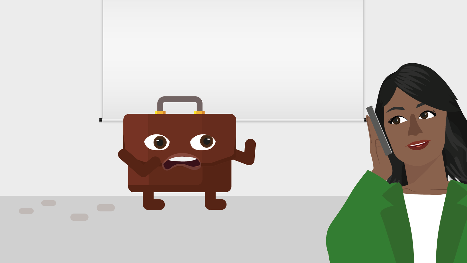
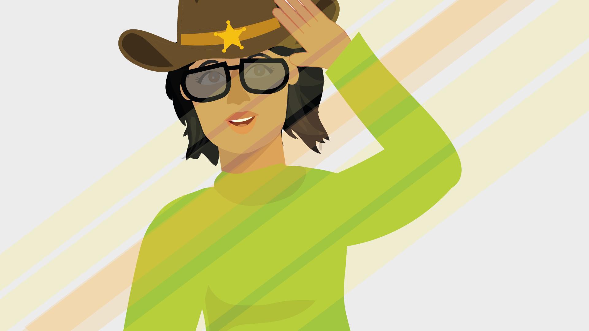
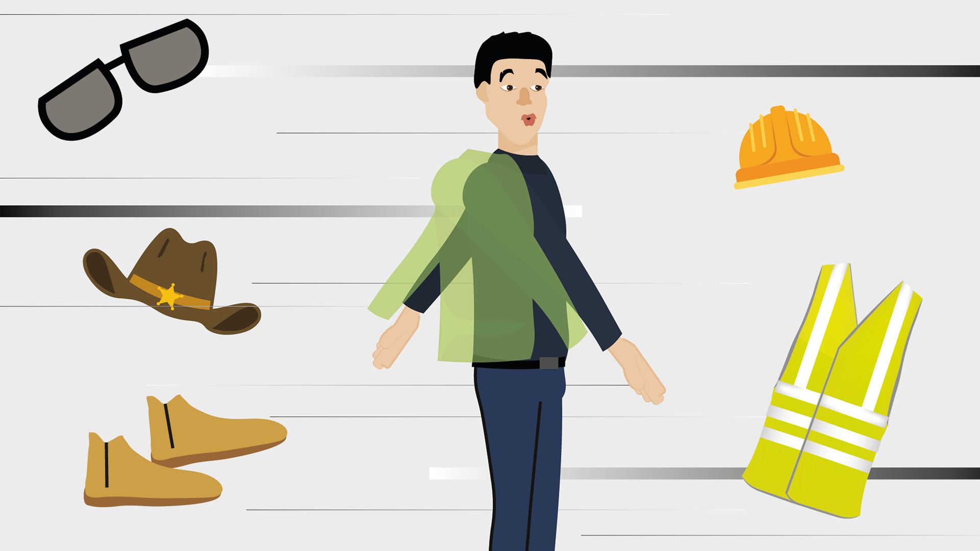
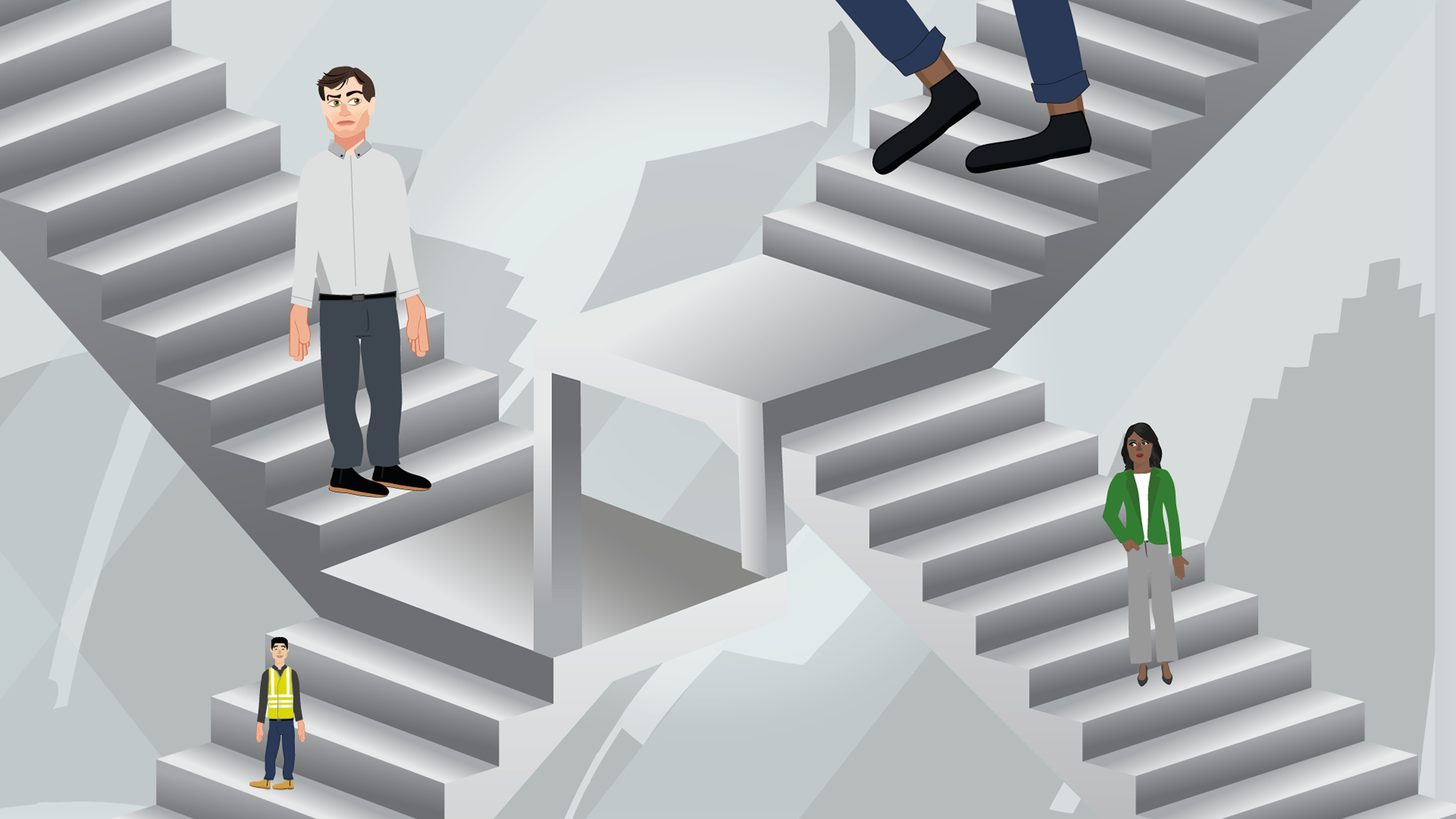
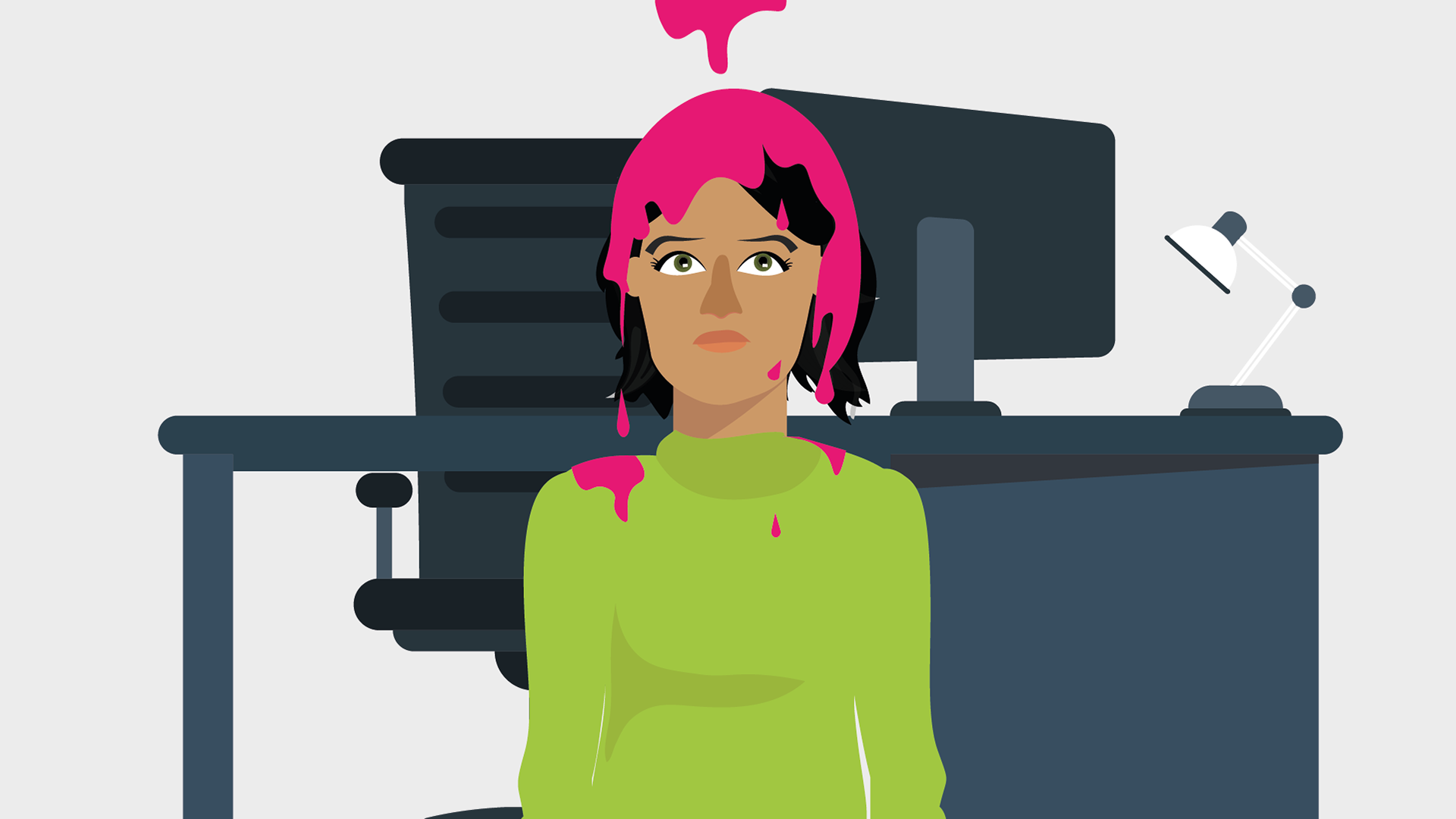
For the initial concepts, we wanted to really experiment and push the animation to be as playful as possible. One idea dabbles with optical illusions and perspective, while another sets the characters to be in extremely different contexts, all being whimsical and fun. All of these concepts received positive feedback, however we agreed to dial it back and have the characters in more of a relatable setting.
Final concept
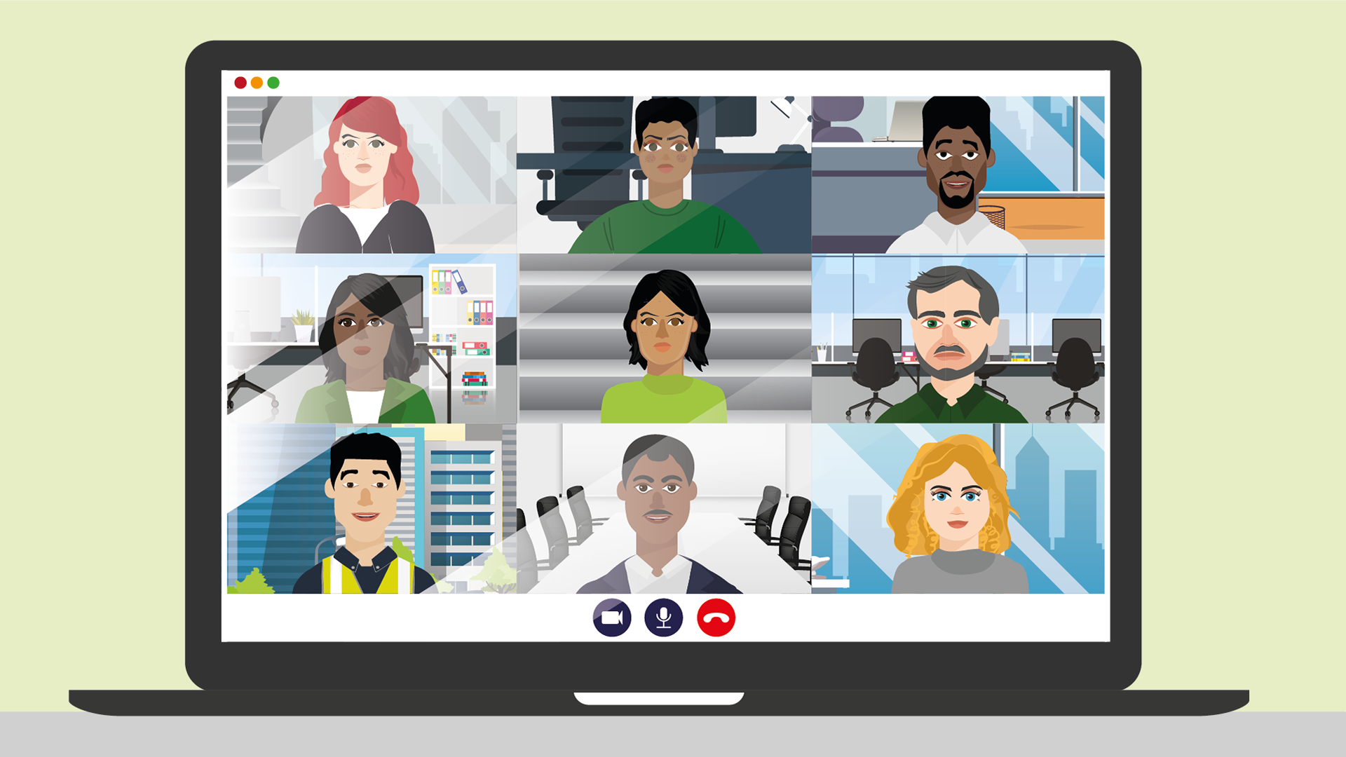
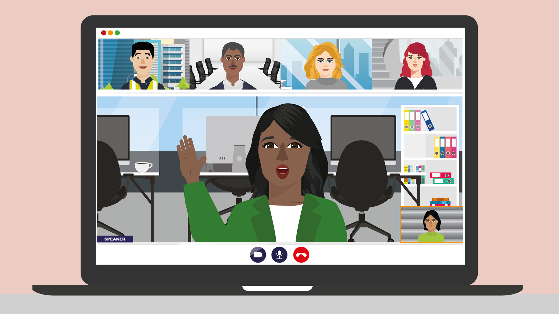
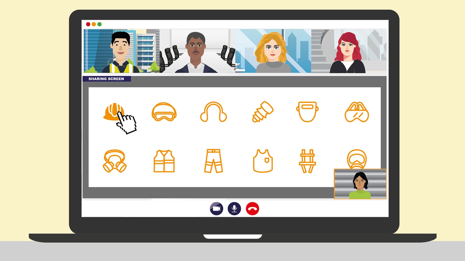
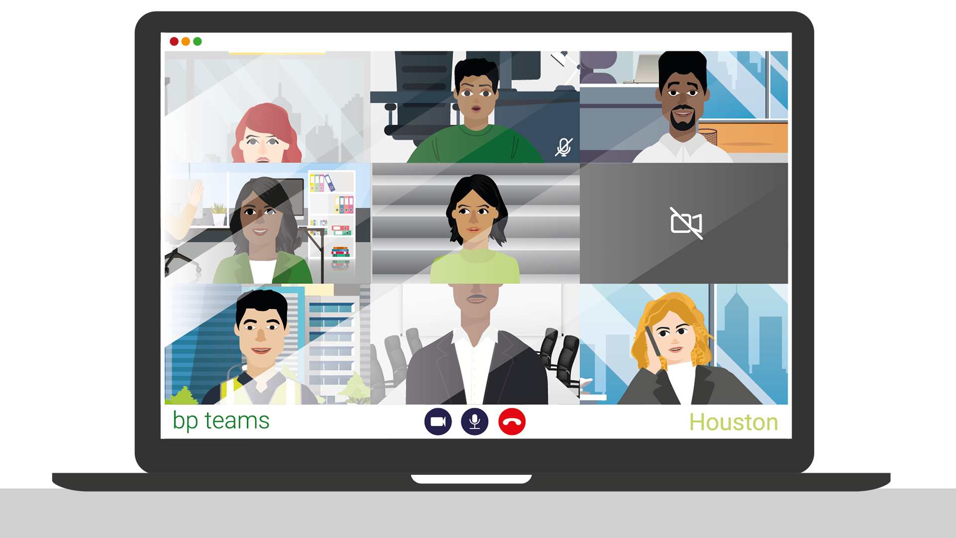
The concept we ended up choosing was a play on a team's call, however having it all animated. The challenge with this idea, apart from the character animation itself, was to make it visually engaging in a team’s call (usually a set aesthetic). So I created a framework inspired b the actual MicrosoftTeams layout, however, added some design elements to make the screen visually stimulating. With that, the next step was to develop the characters and their background to have them stand out on their own.
First draft
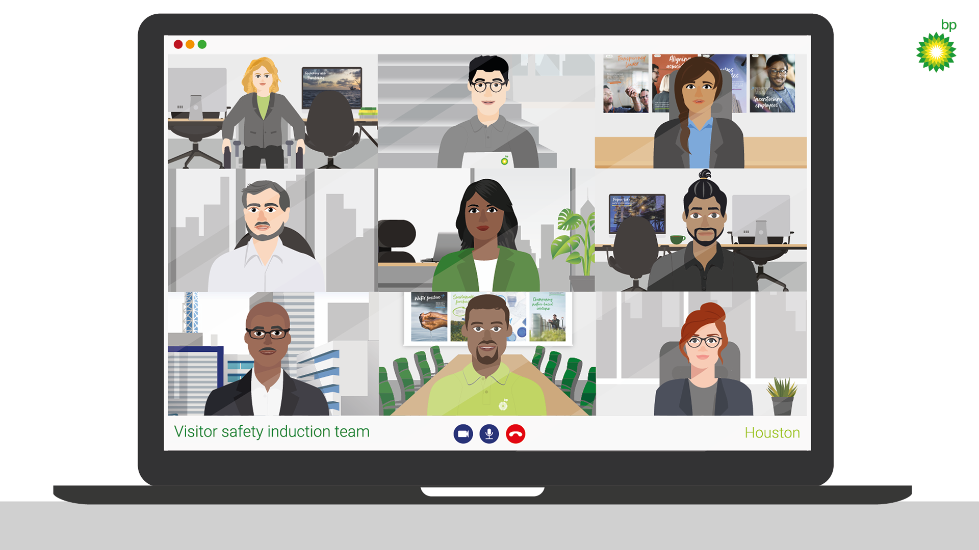
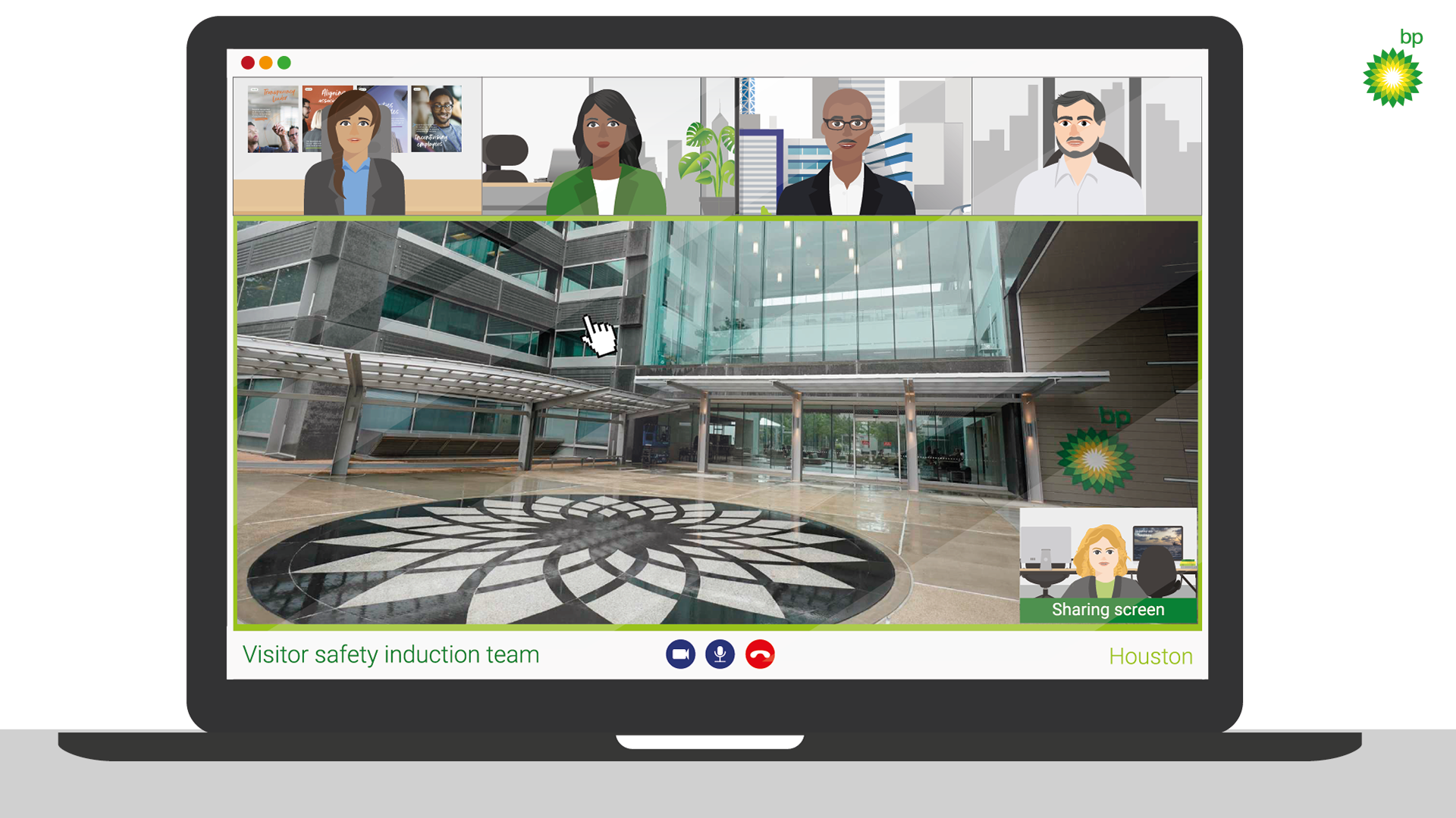
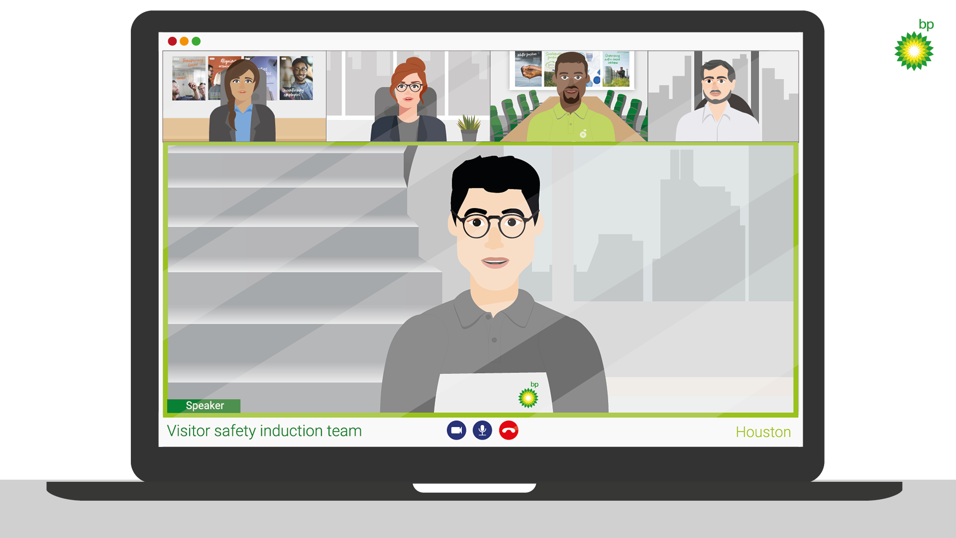
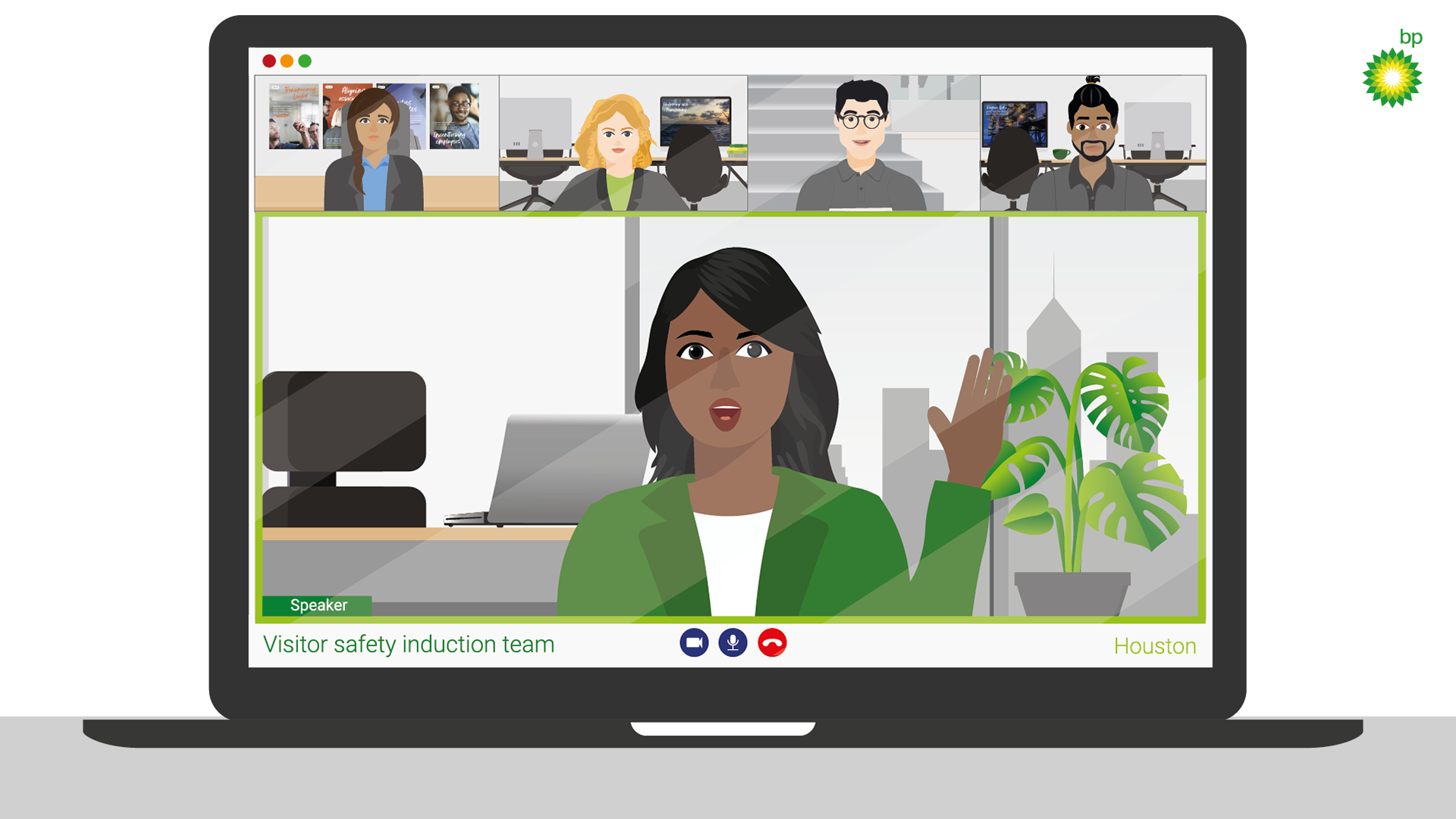
To develop the chosen concept, I had to develop the characters themselves and make them more "realistic" employees whilst standing out on their own. I created each background based on the information each character would share in the animation (for example; one of the characters is outdoors since he is speaking about outdoor safety). Creating different office backgrounds was challenging due to the lack of references and the basic aesthetic. My job was to liven up the visuals I create and make them complementary to the characters. Moving forward, we wanted to combine more images with illustrations to make the animation tailored to the company itself and add more dimension to all of the visuals.
Second draft
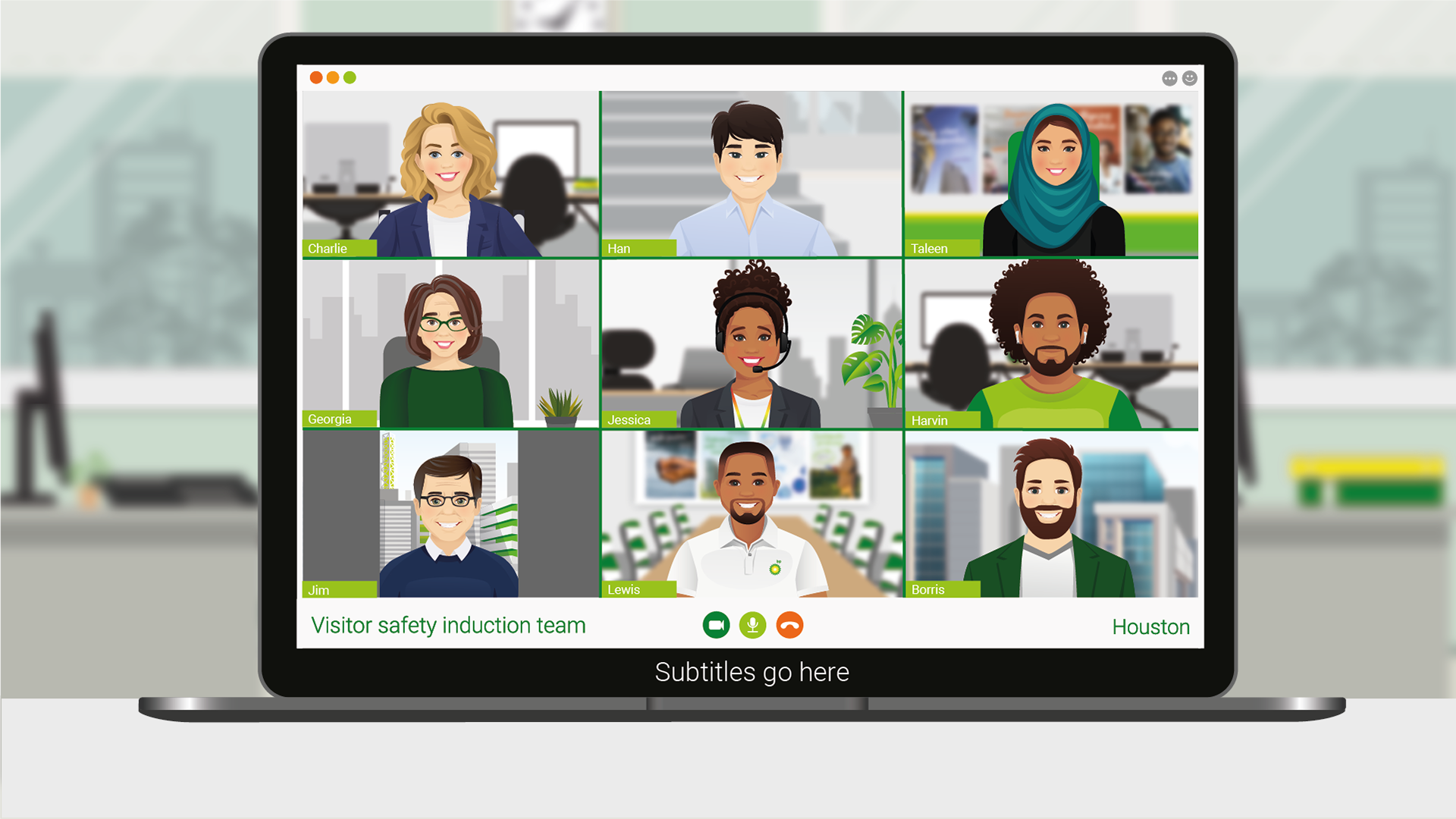
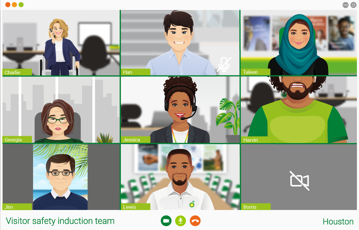
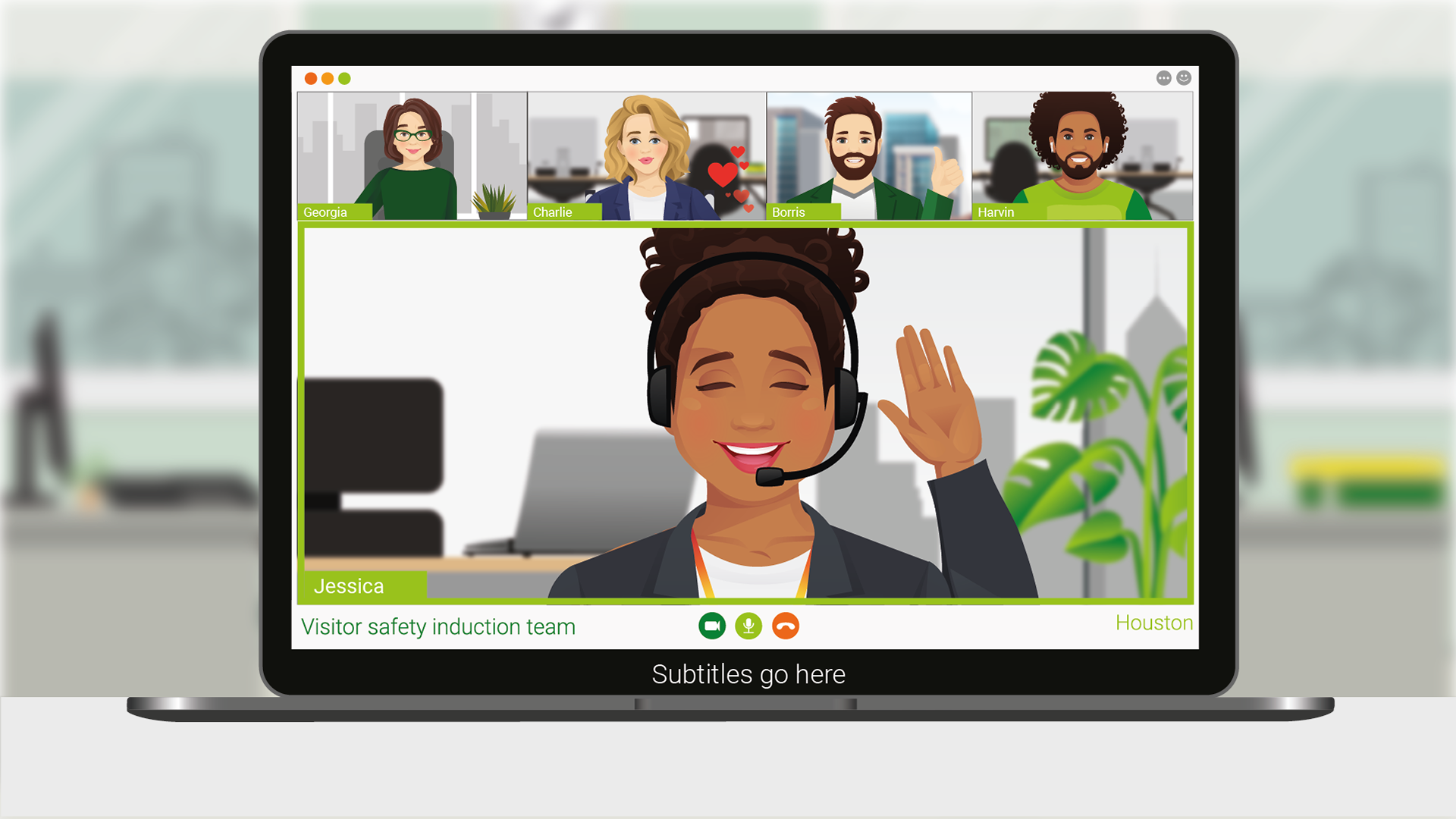
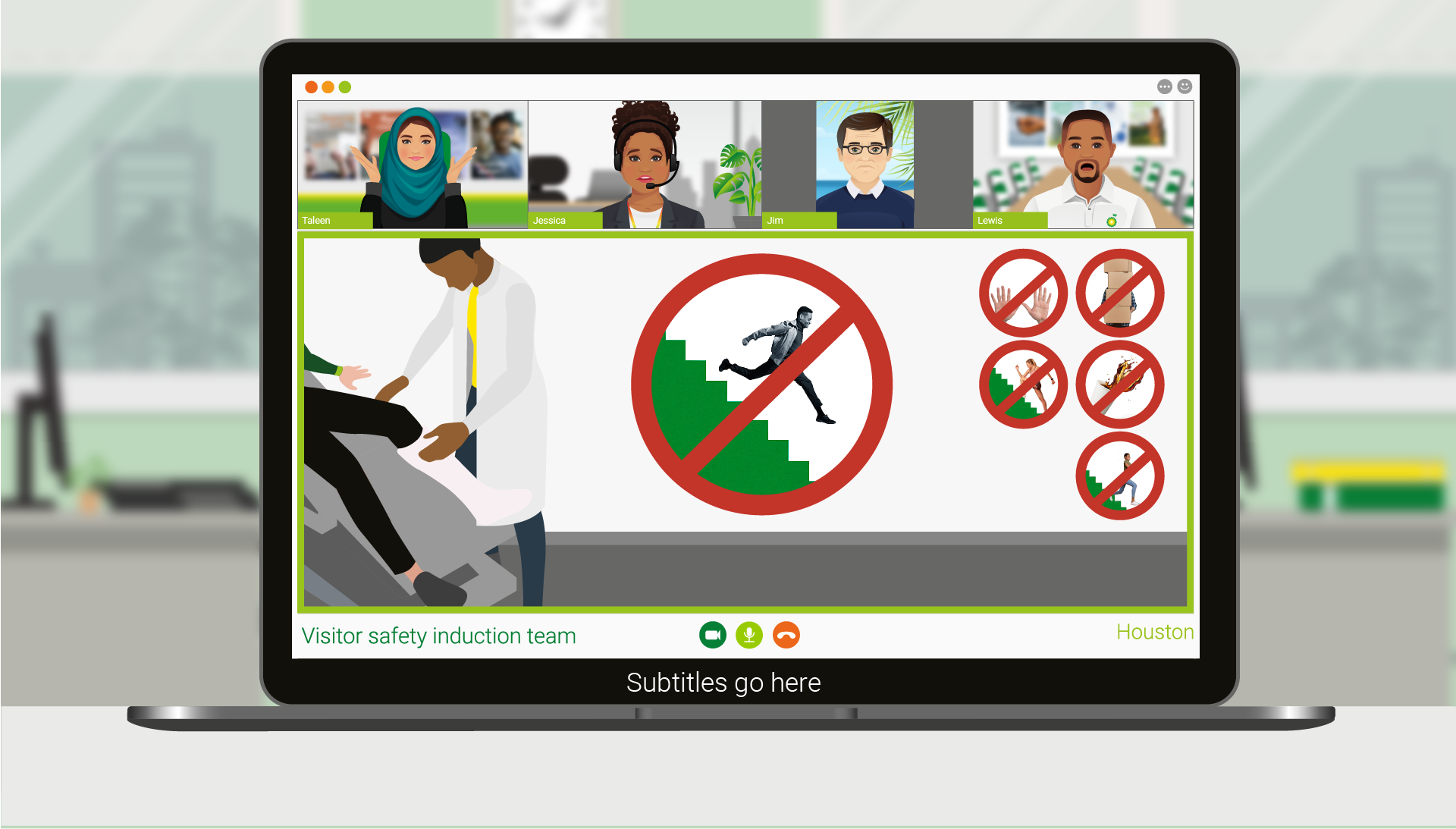
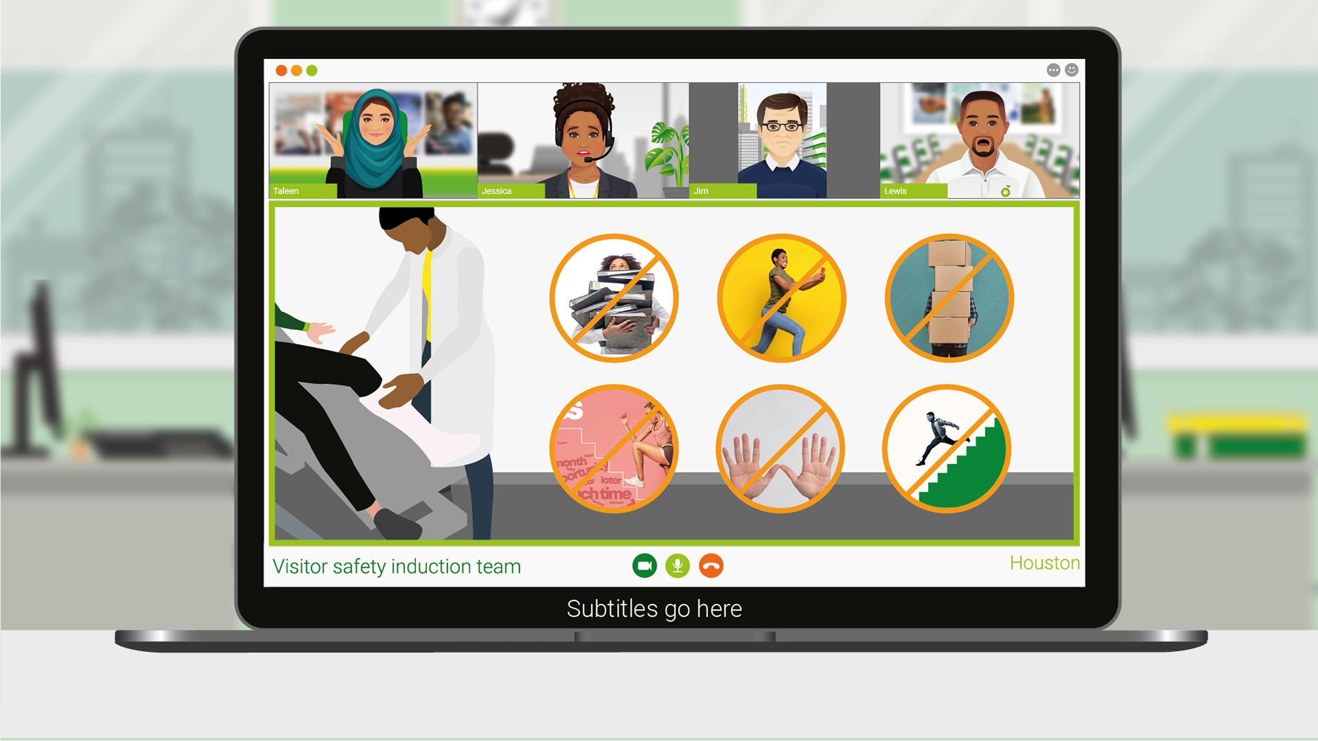
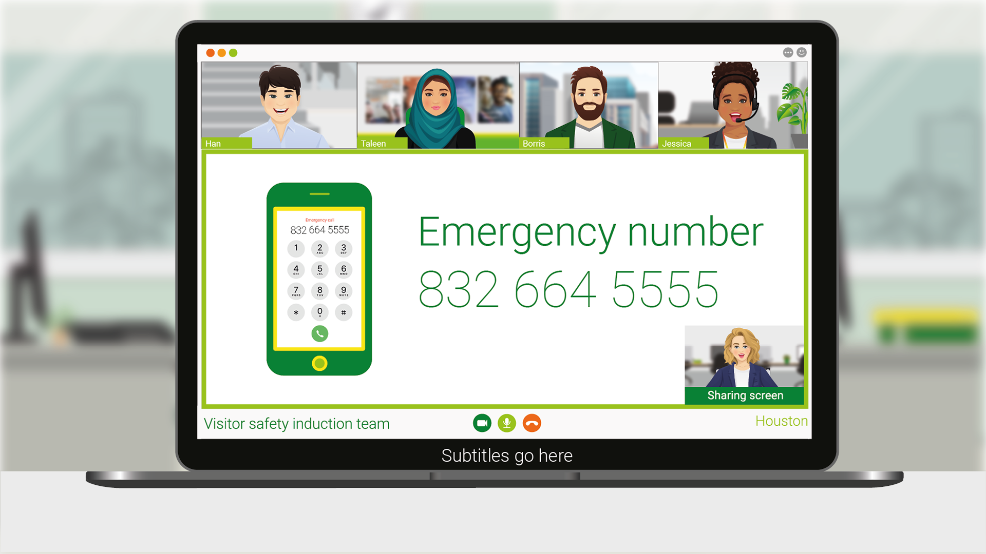
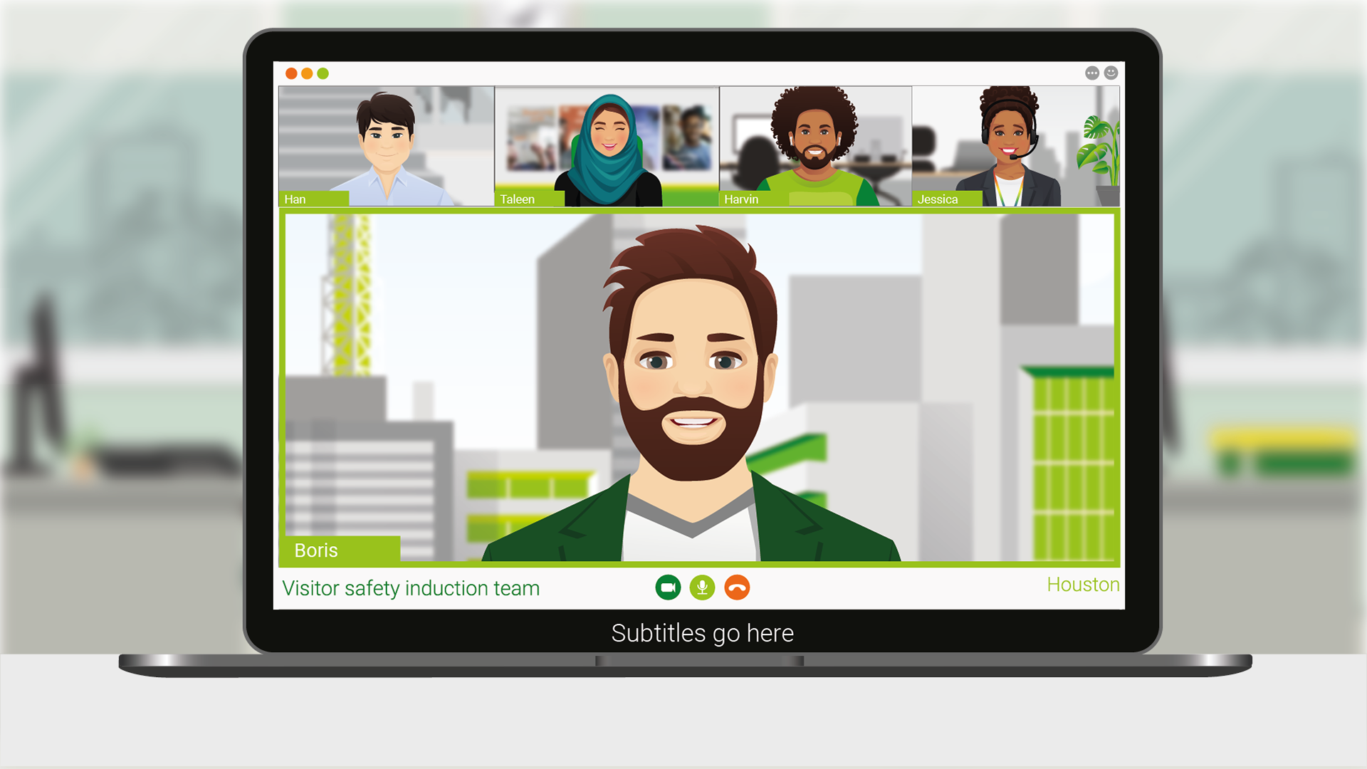
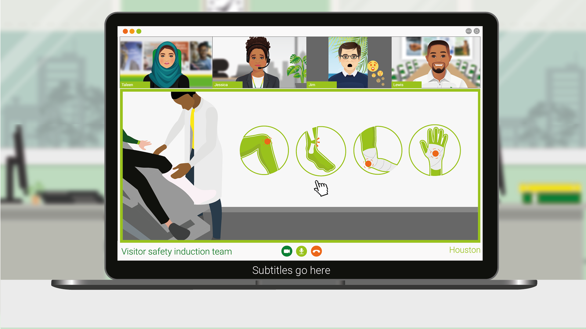
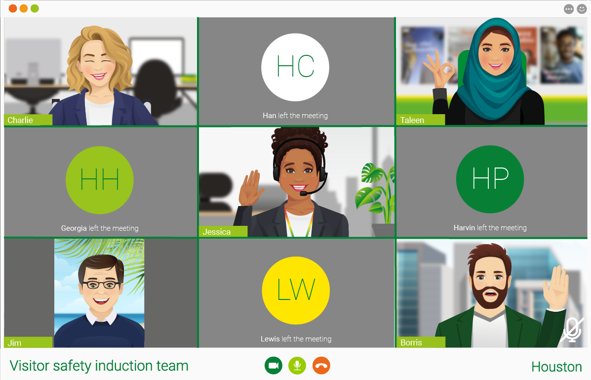
At this stage, we were torn about the characters, so I create a new set of ten characters that are all individual and representative of different individuals that can be found in the office. In addition to that, I predominate using the company colours for the key visuals to ensure cohesiveness. I started creating transitional scenes for each character that shows different expressions and chronological spread of information. I kept on going back and forth between illustrative and image backgrounds, as both worked however the images did break up the illustrative aspect and added a unique take on the visuals.
Final draft
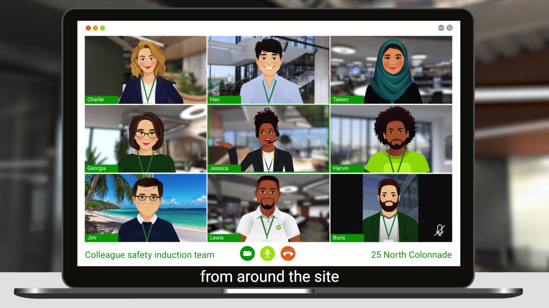
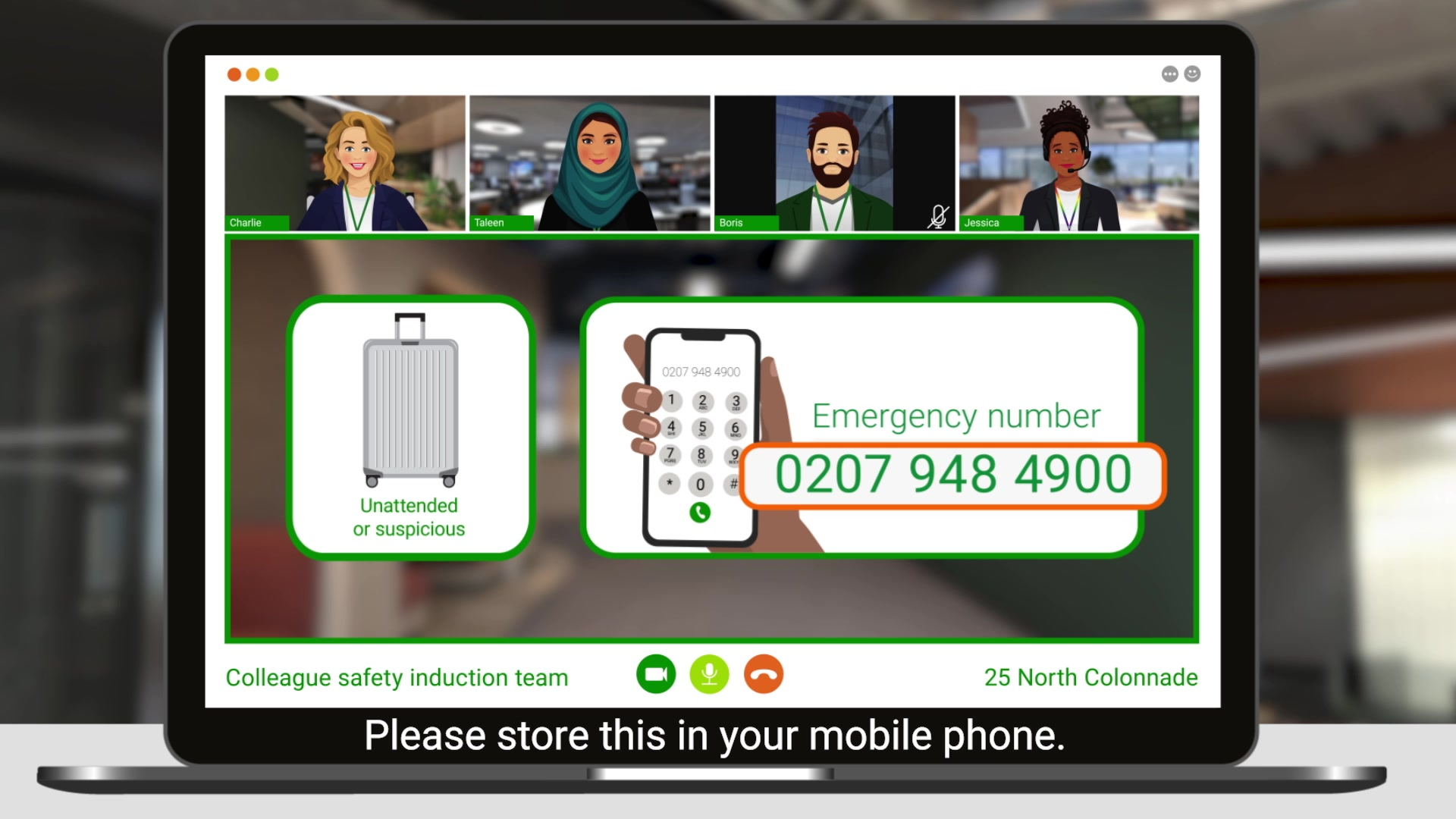
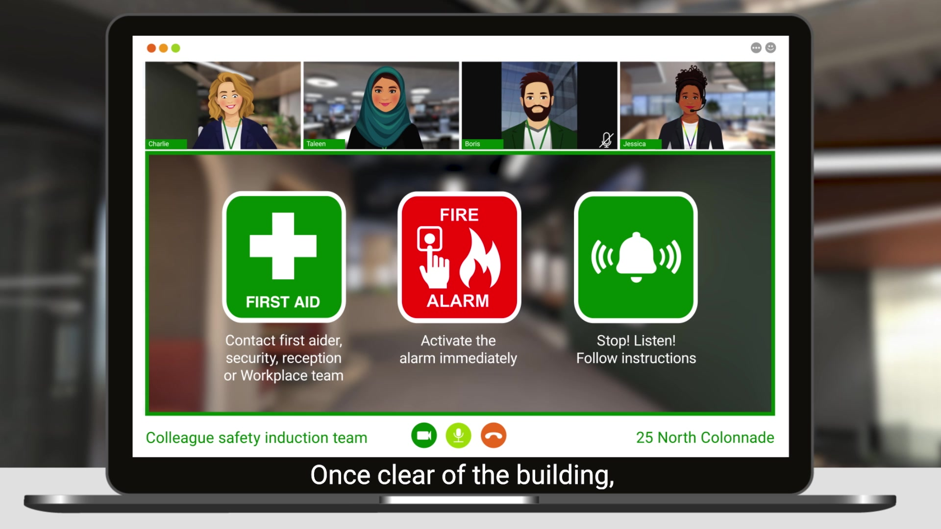
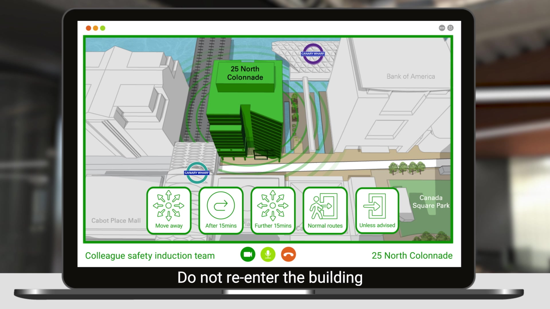
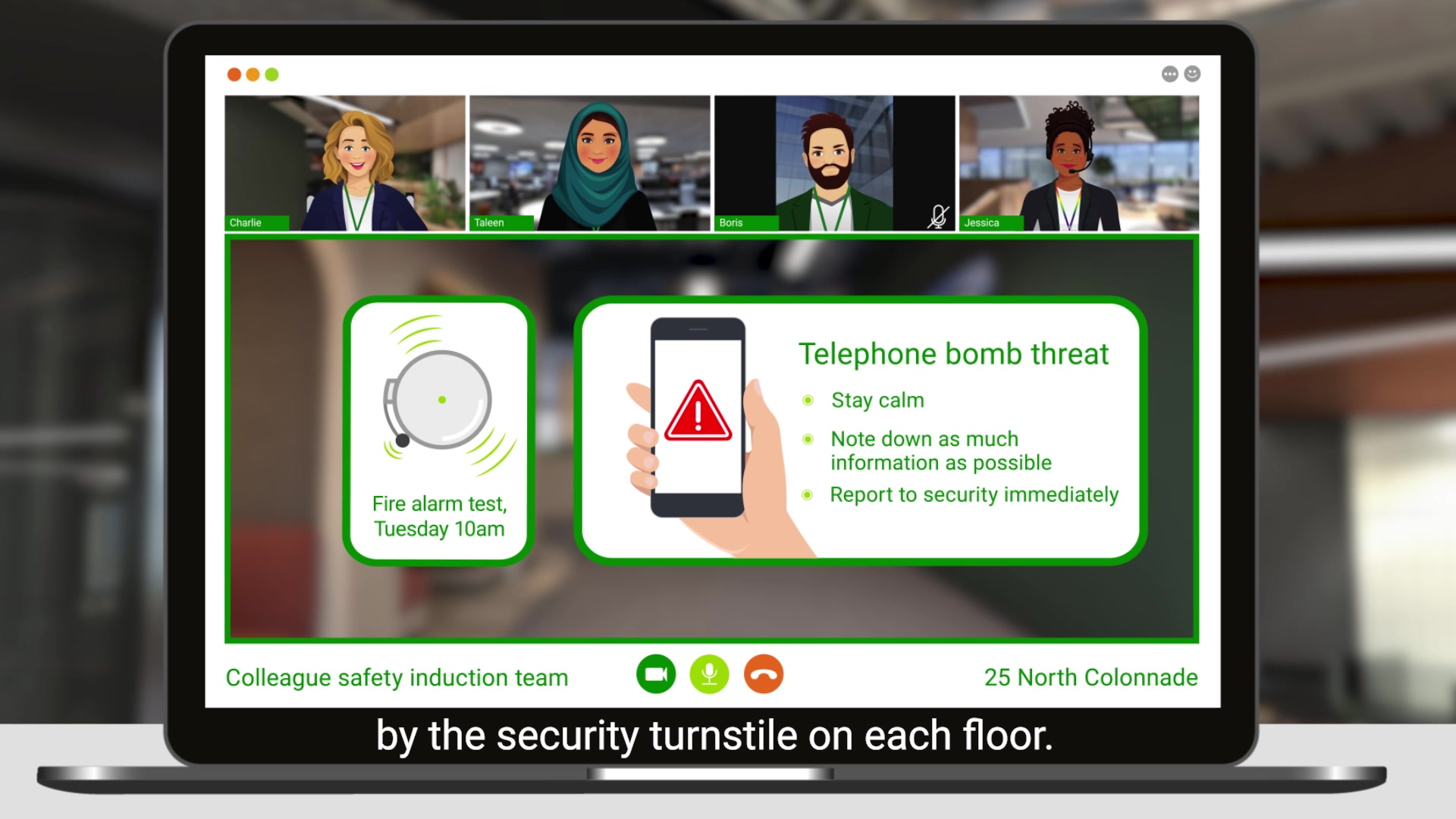
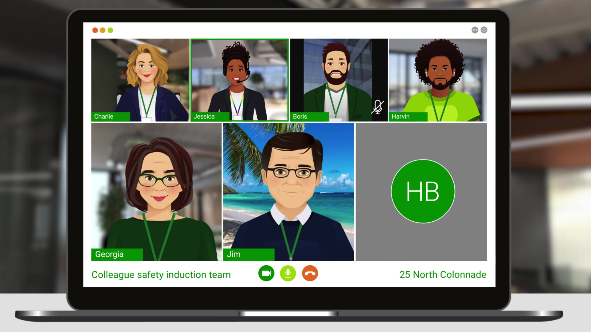
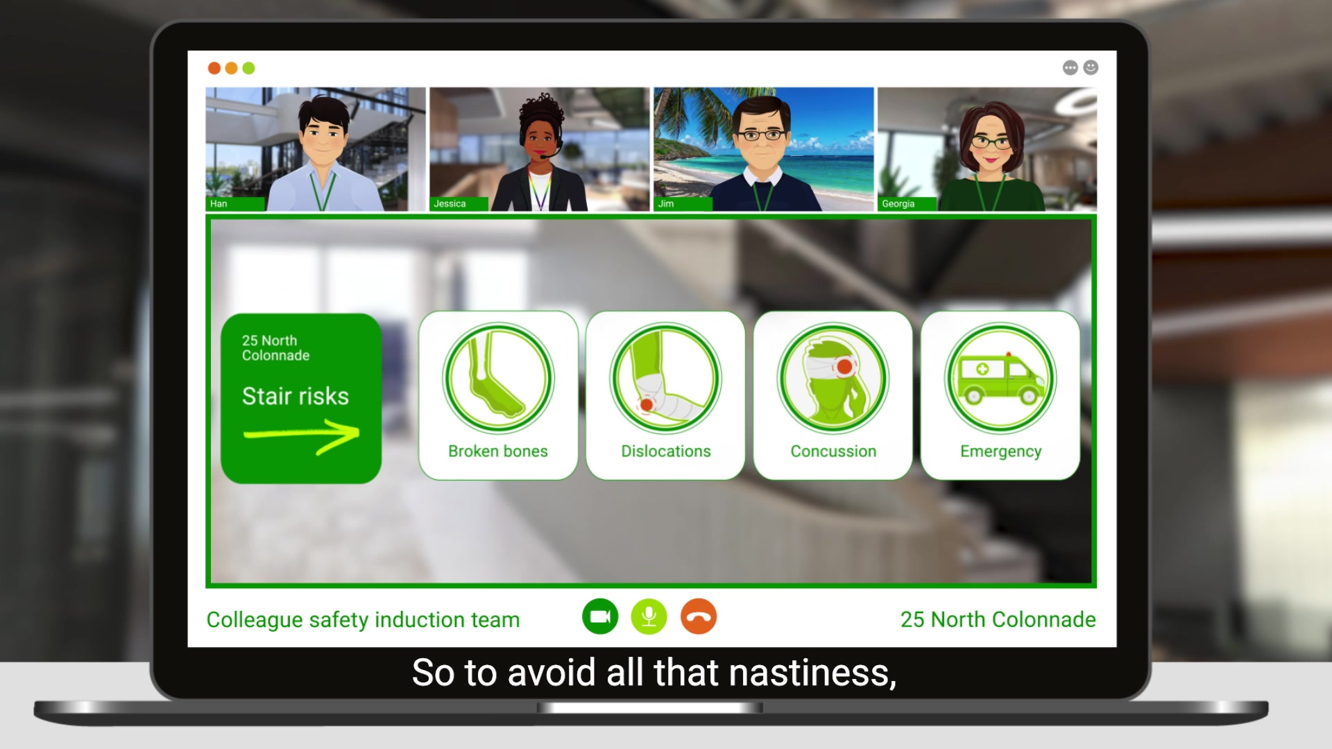
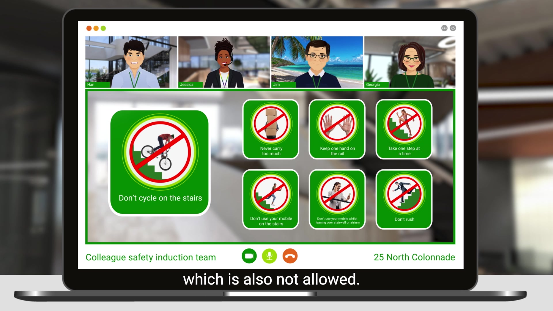
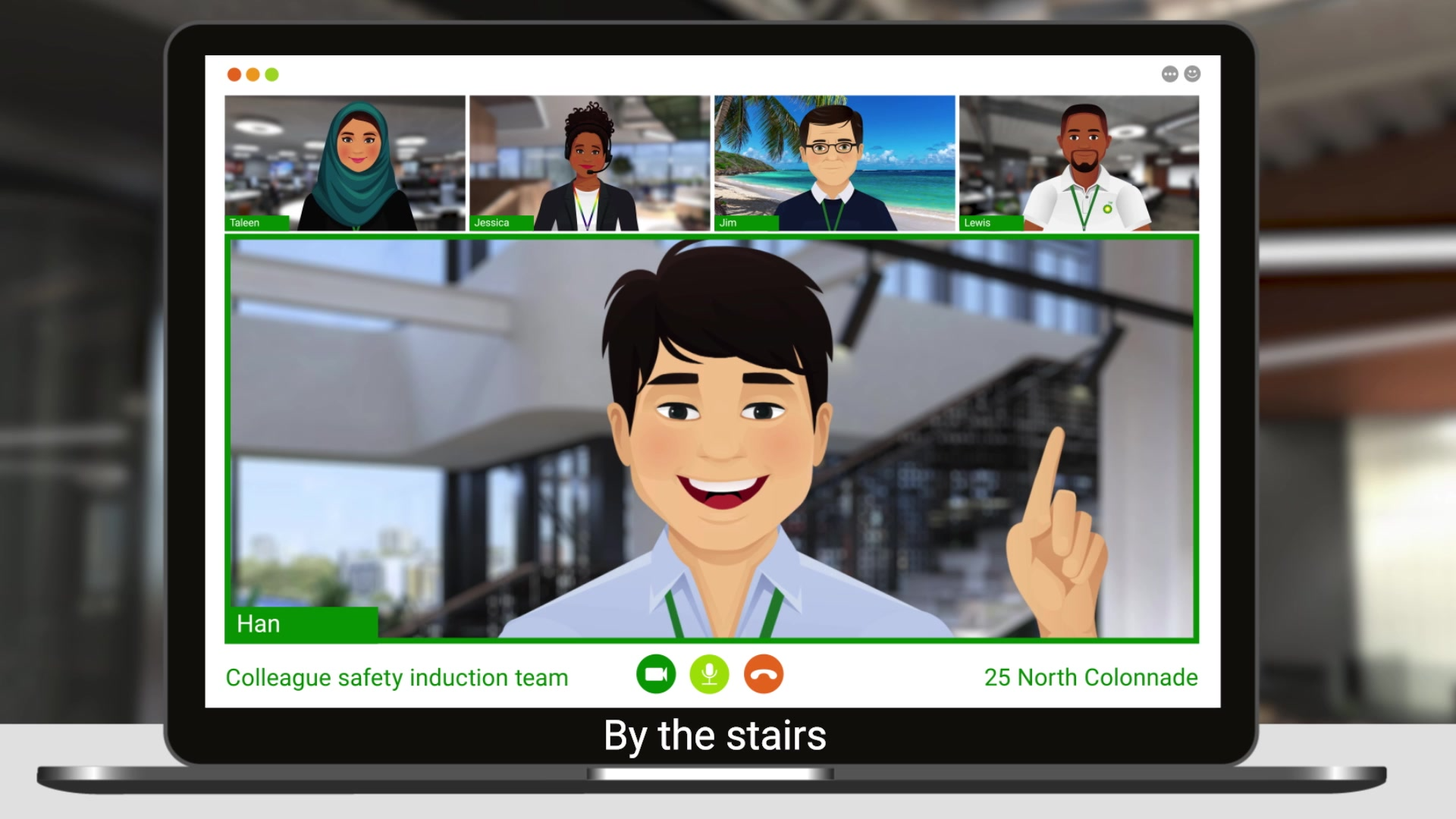
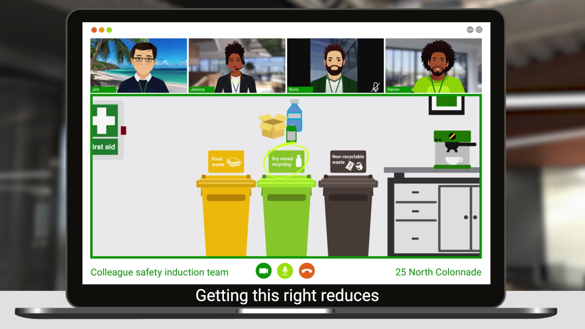
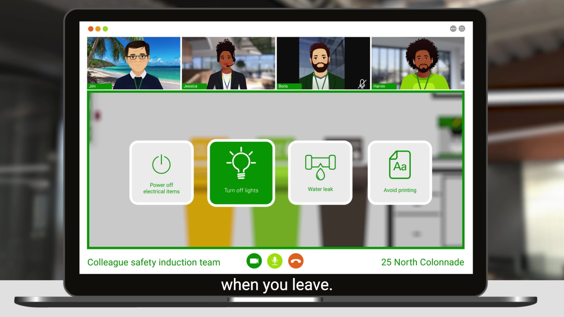
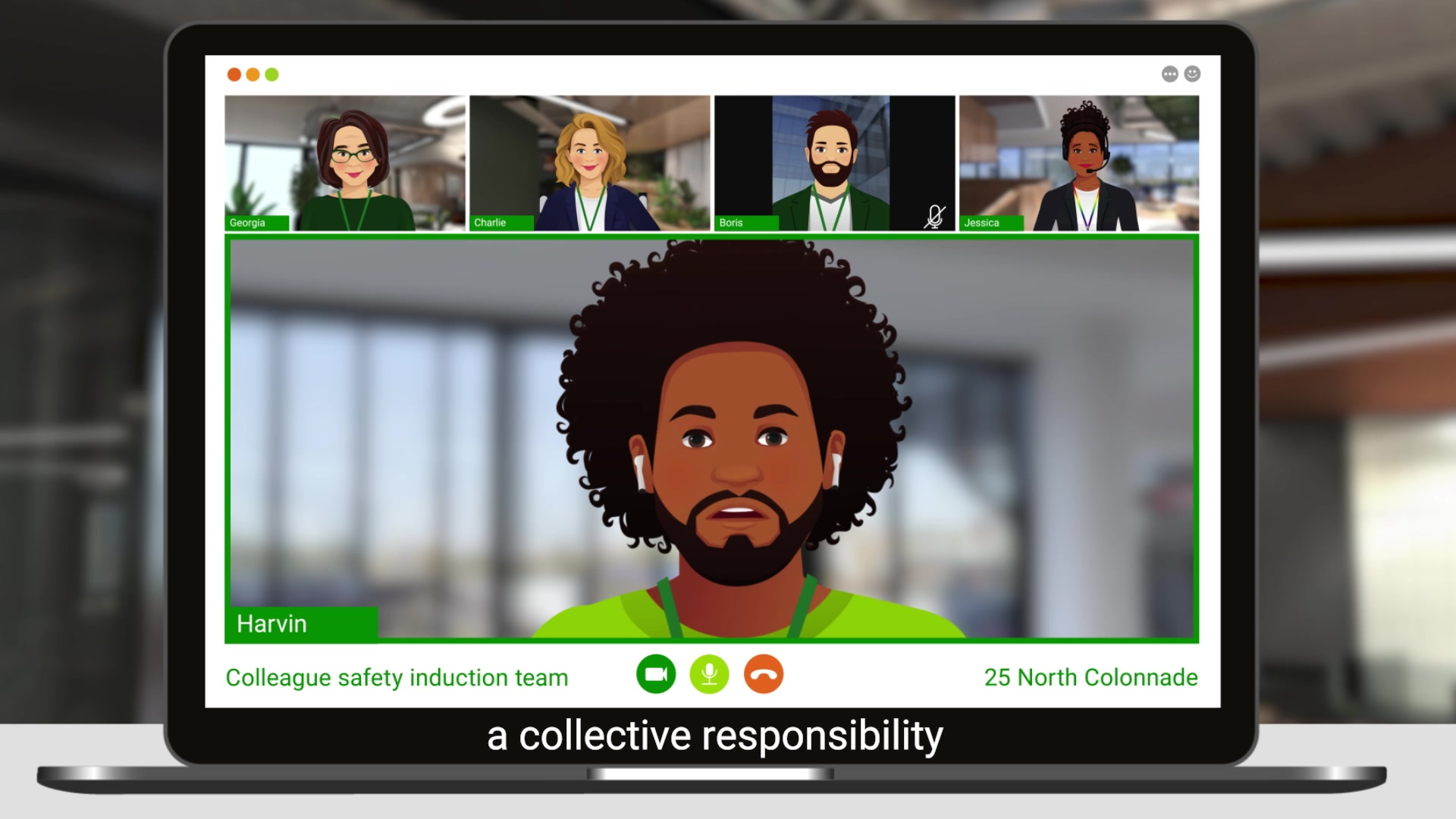
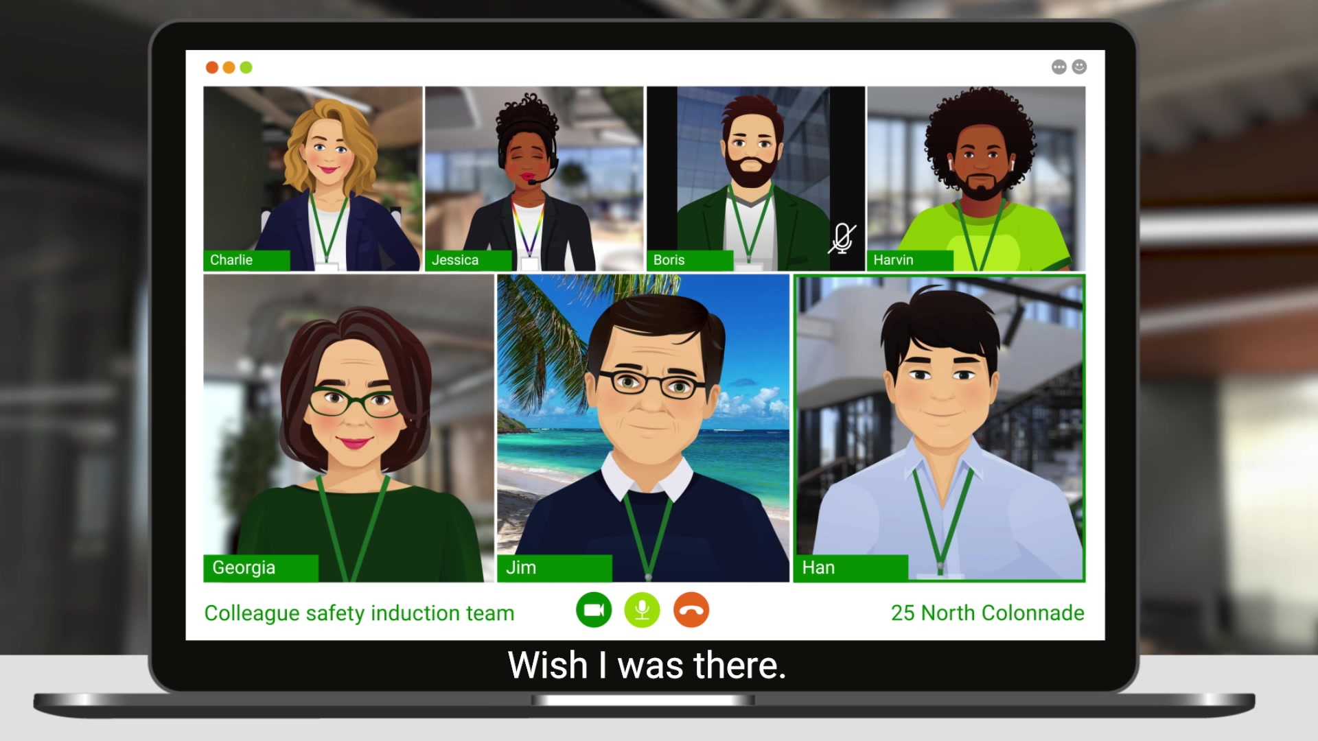
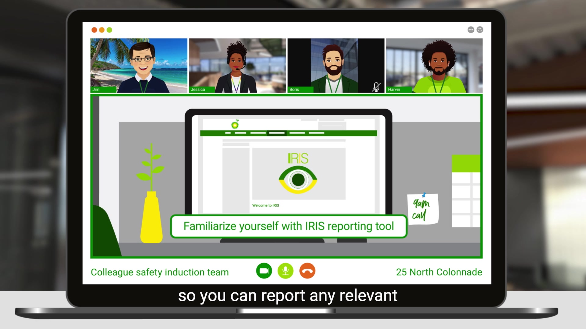
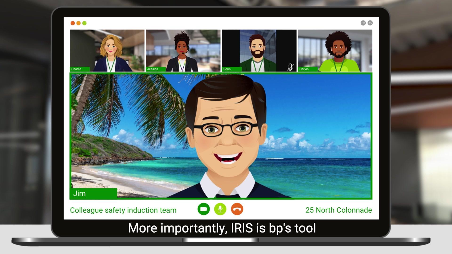
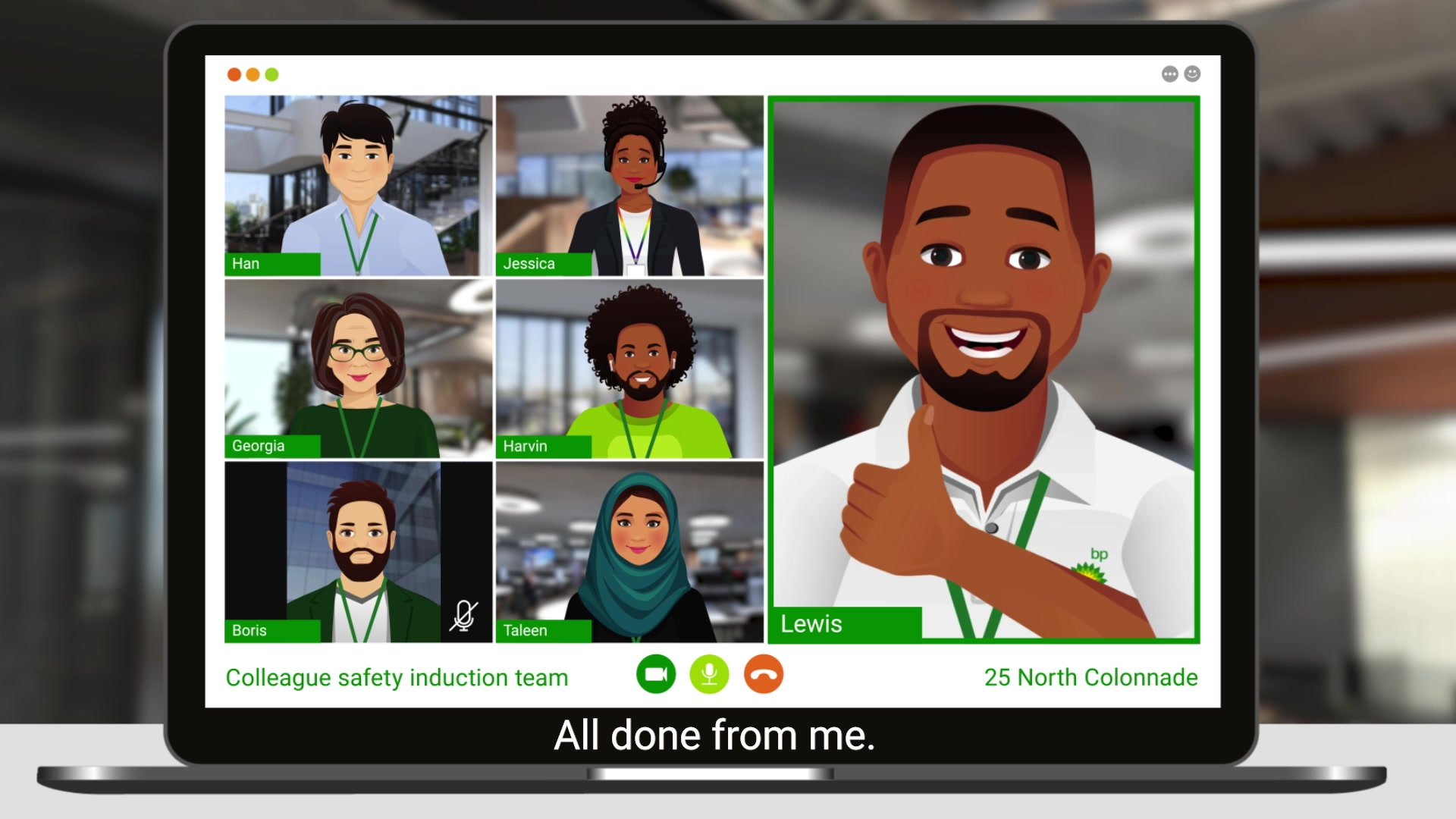
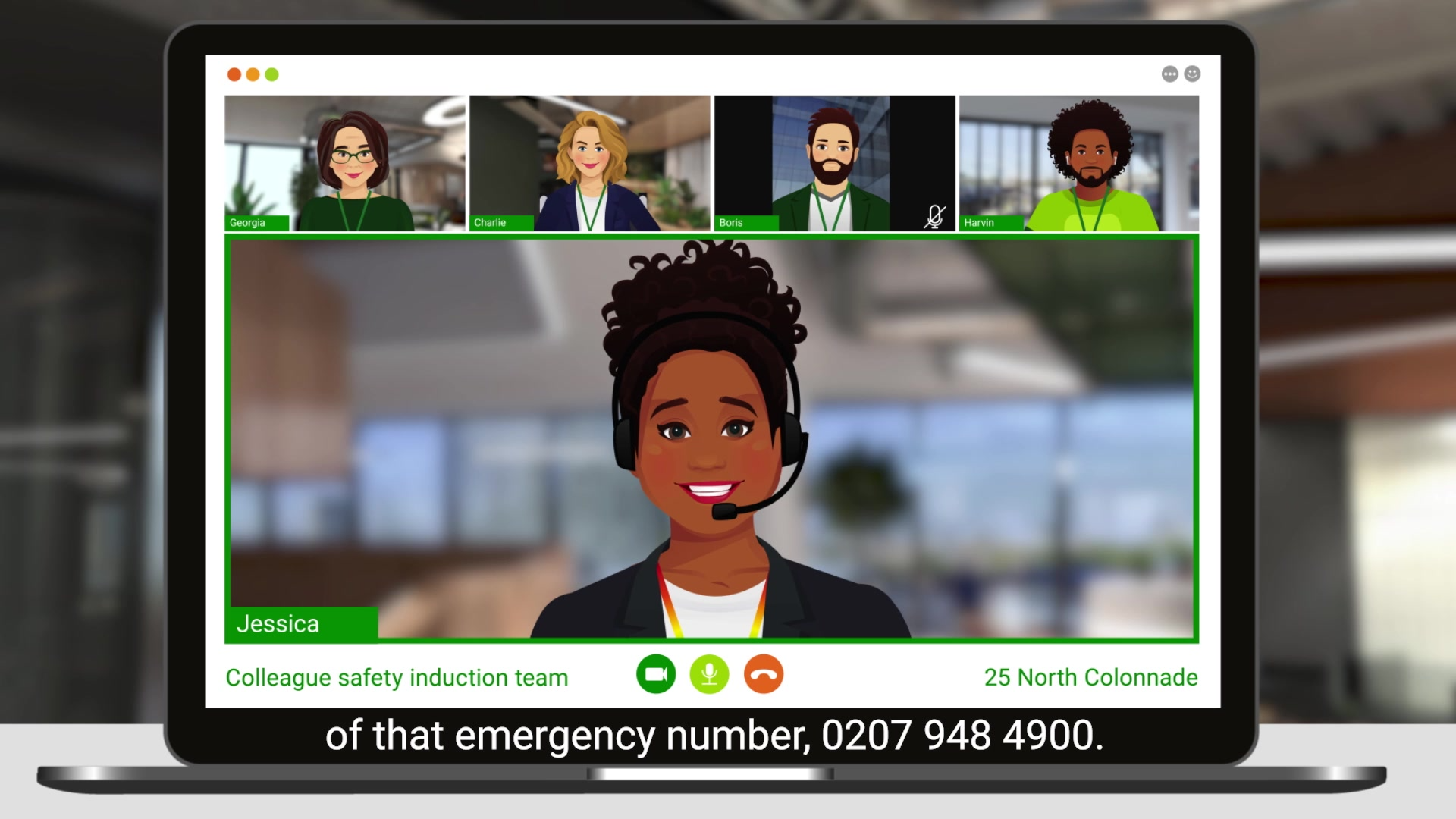
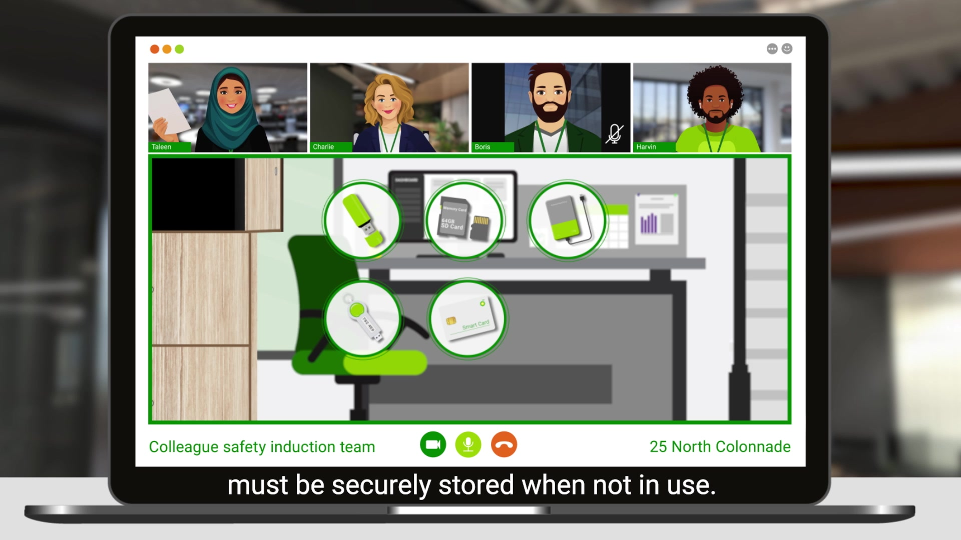
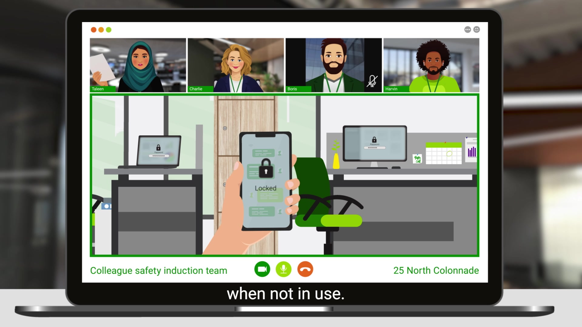
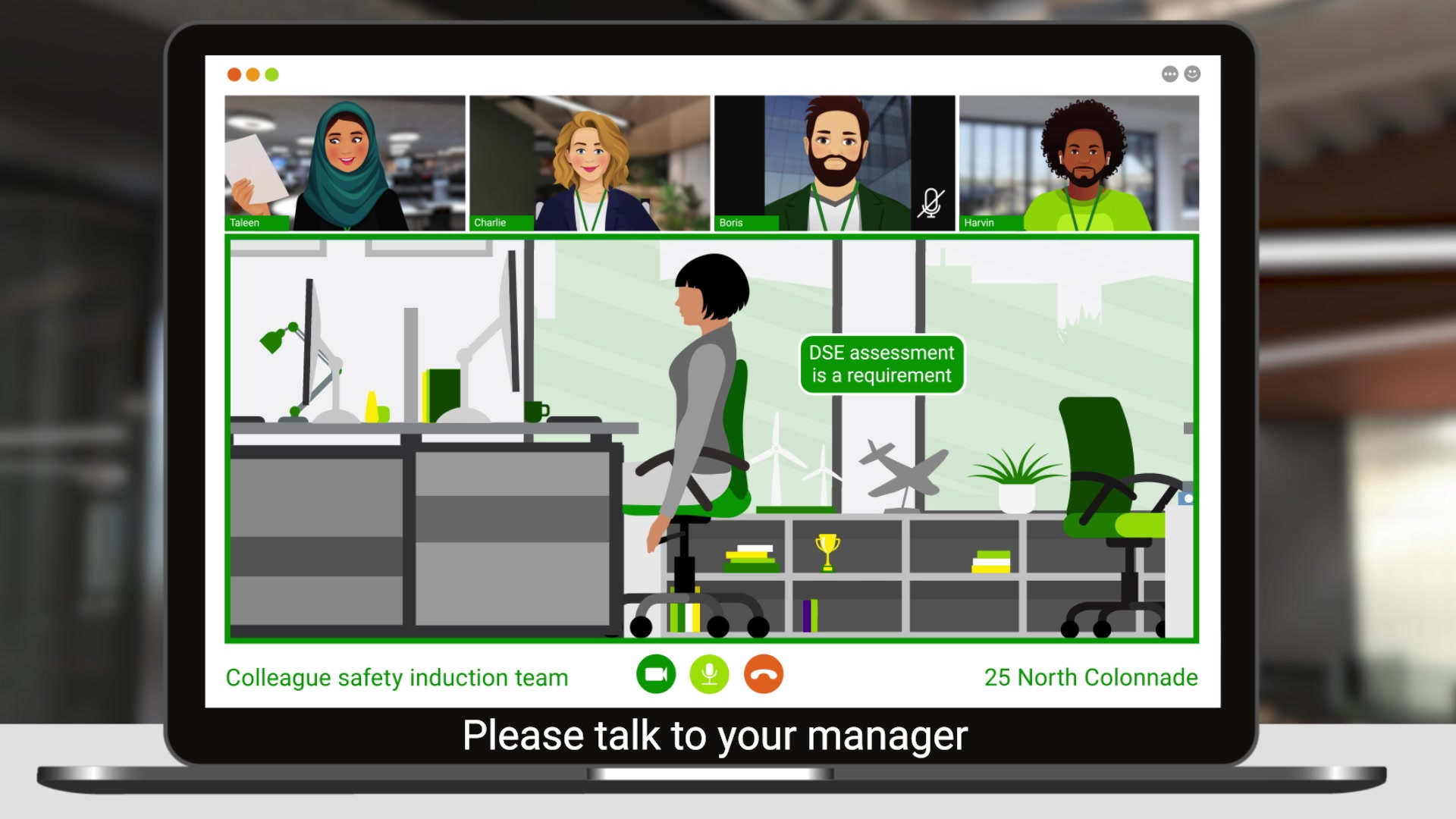
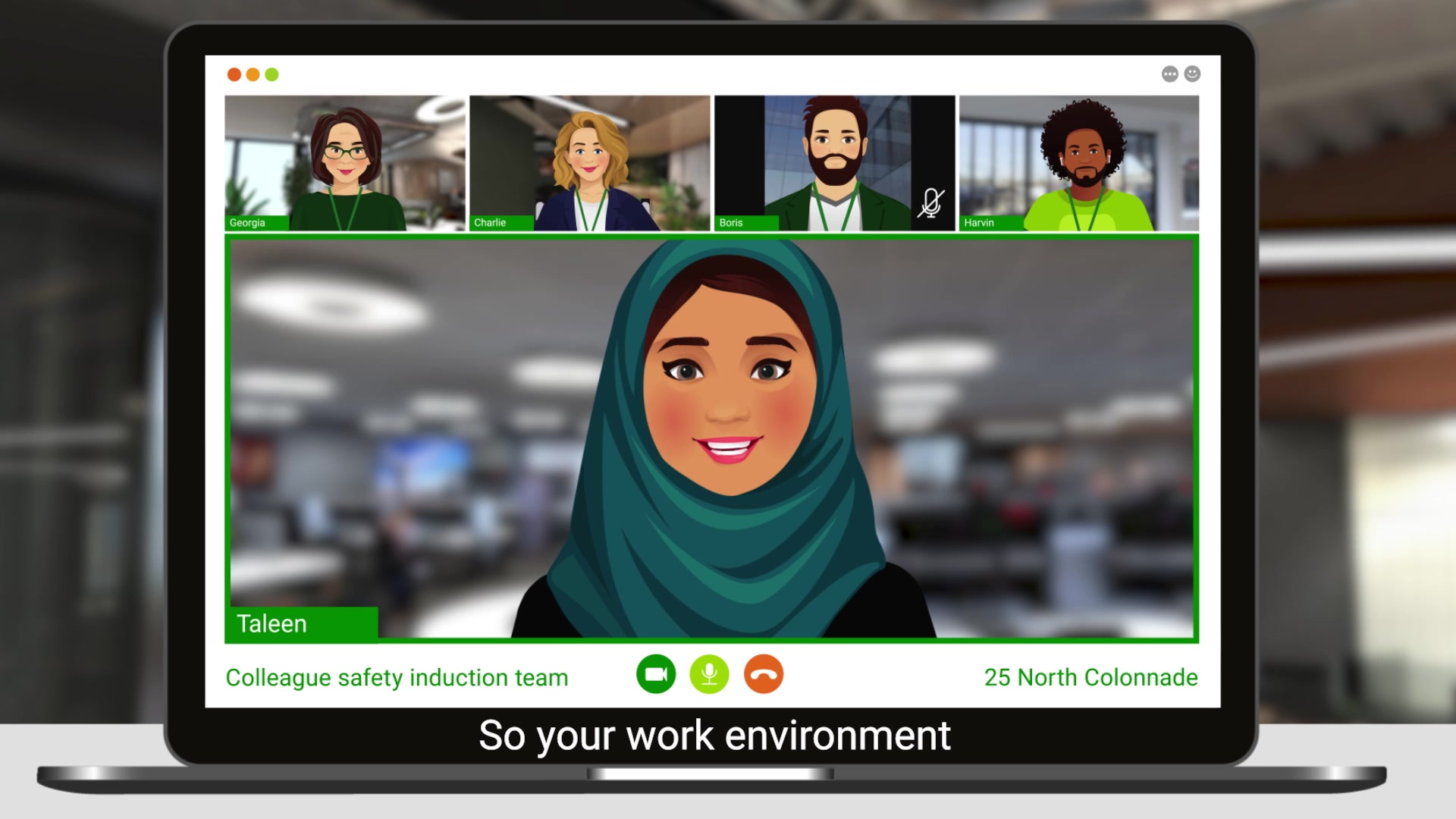
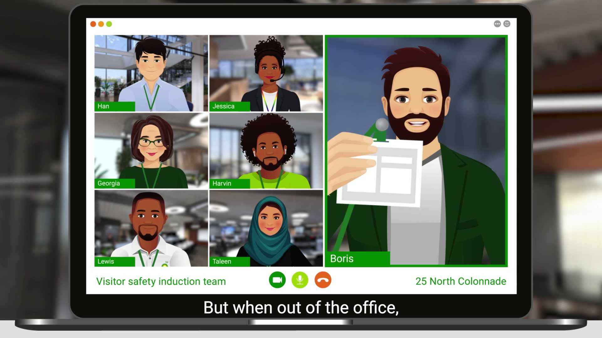
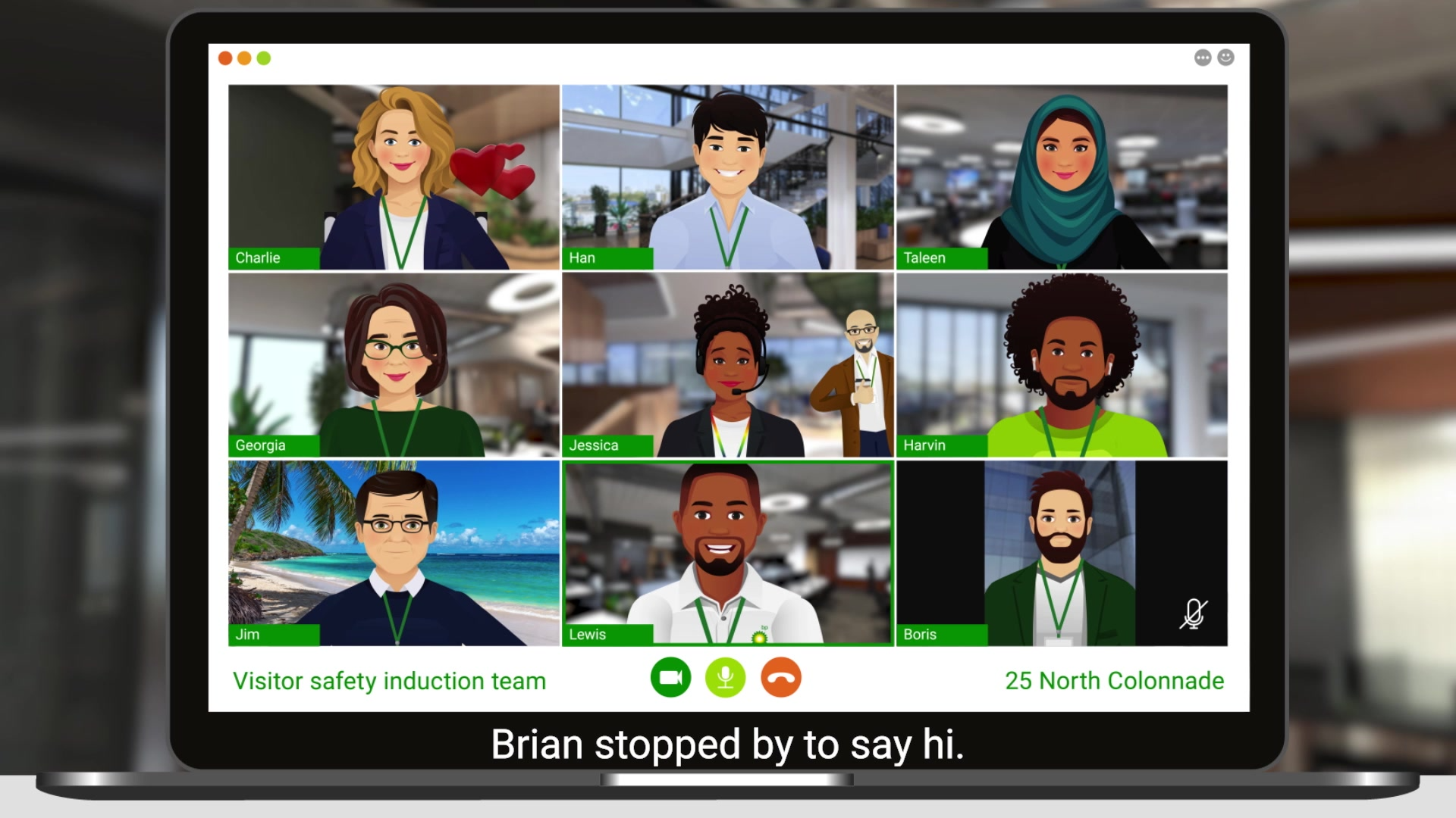
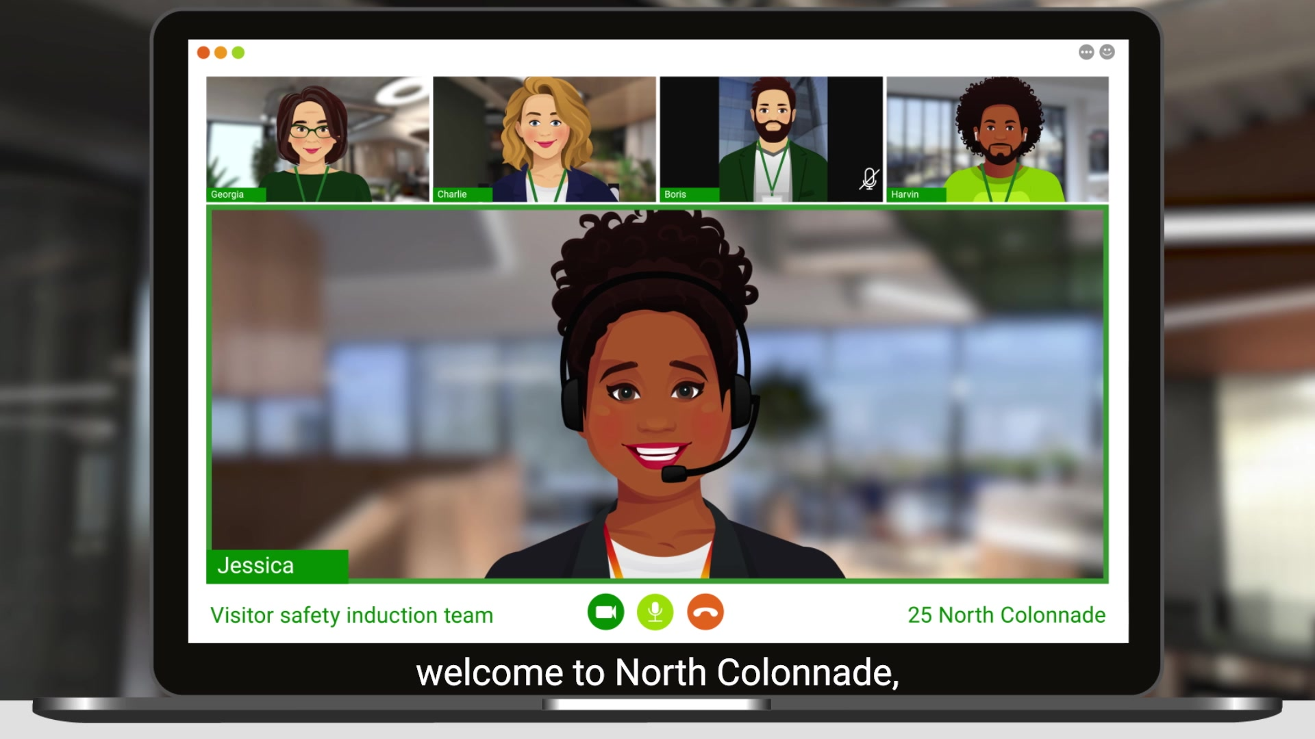
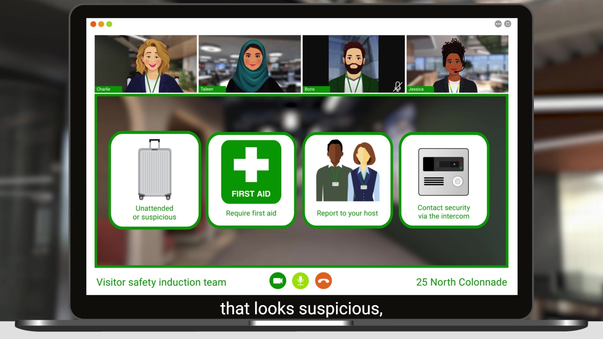
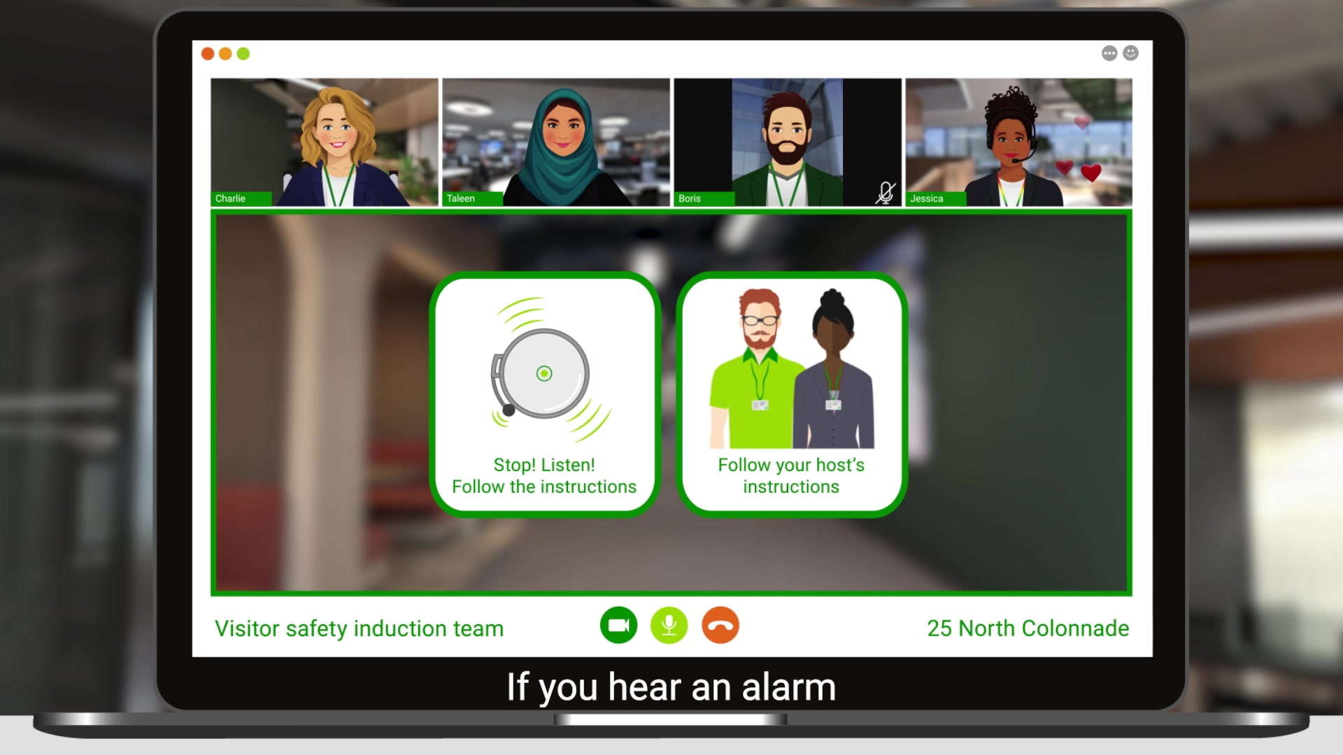
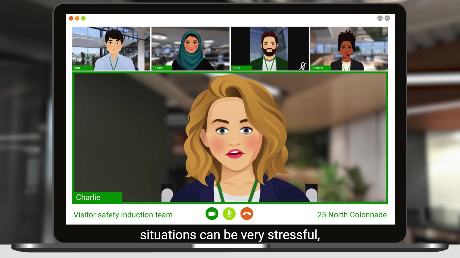
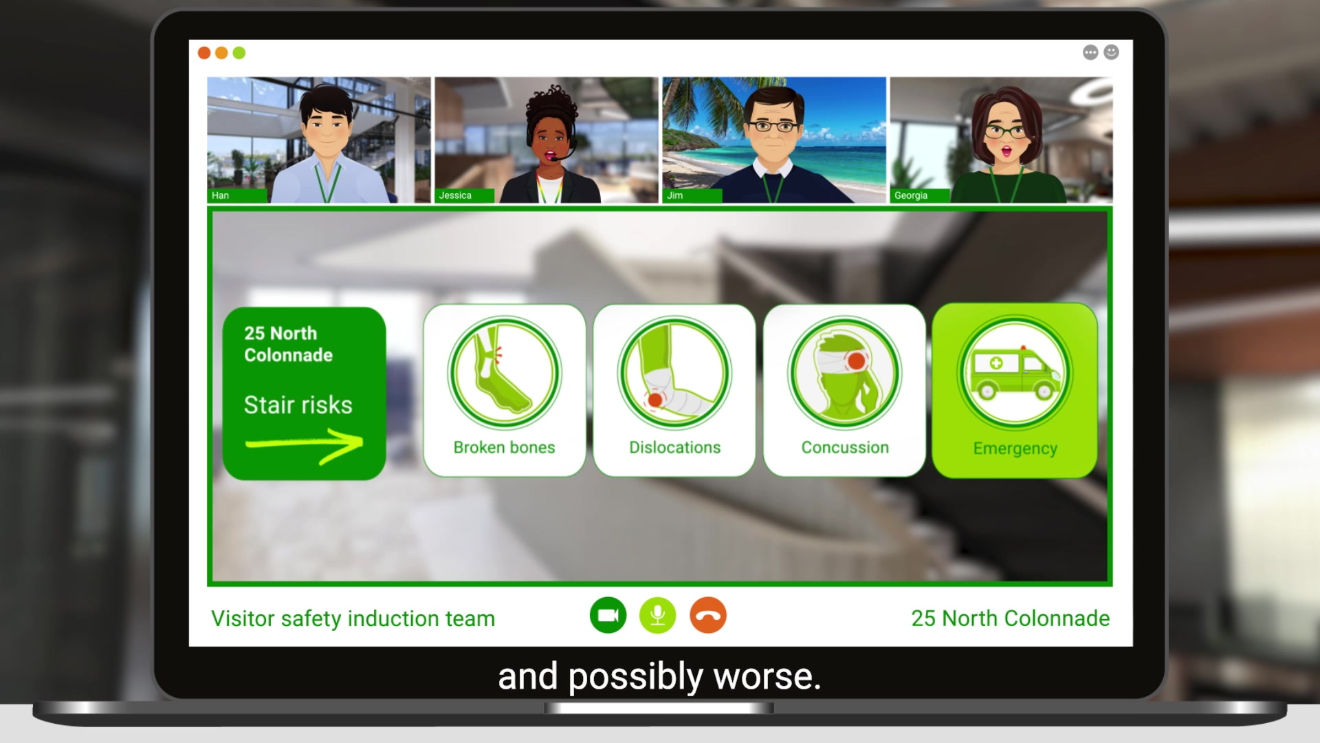
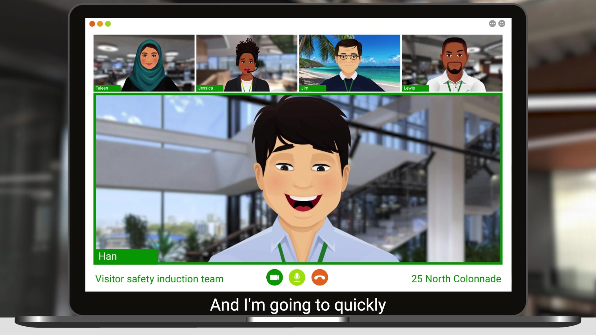
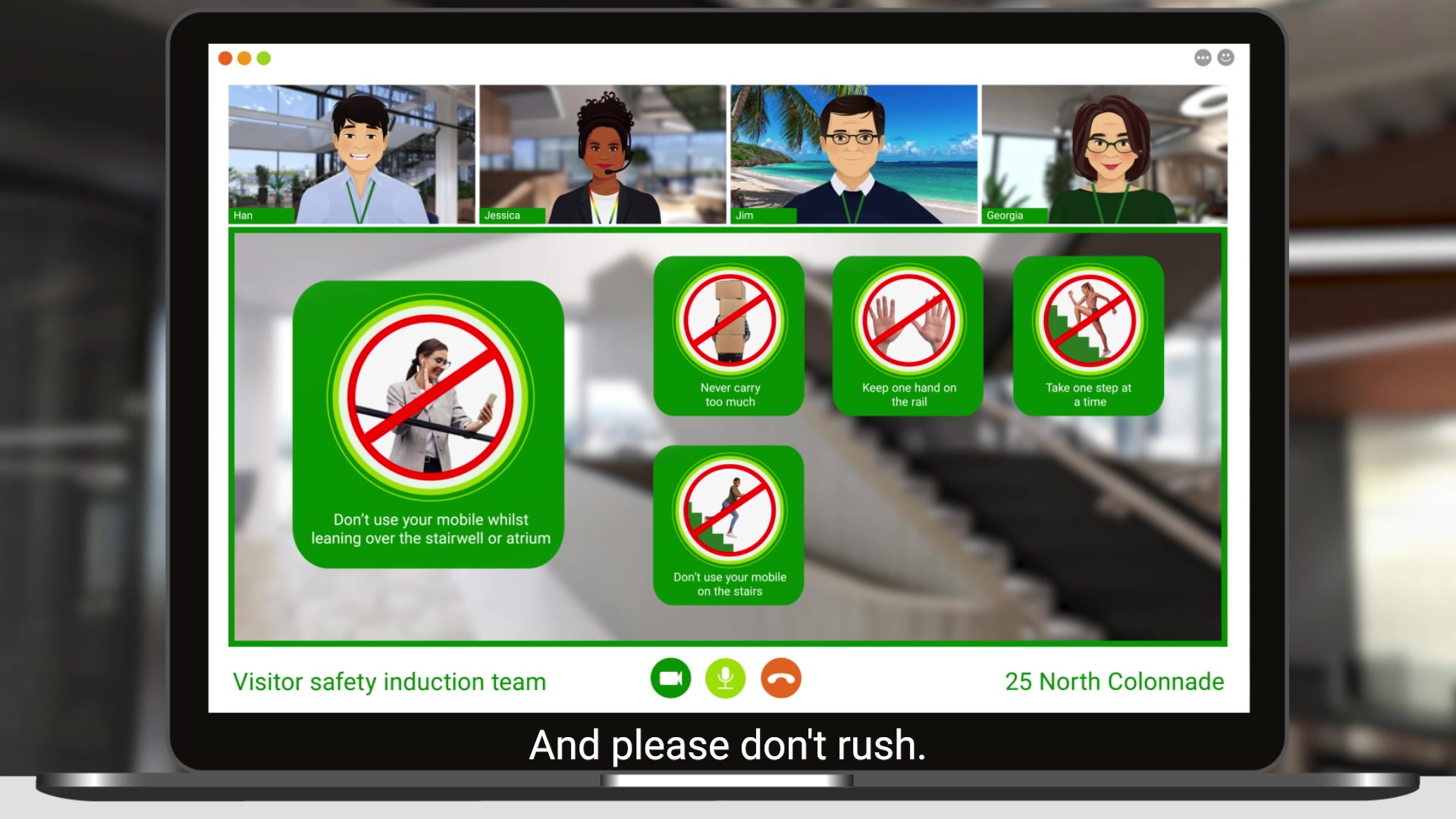
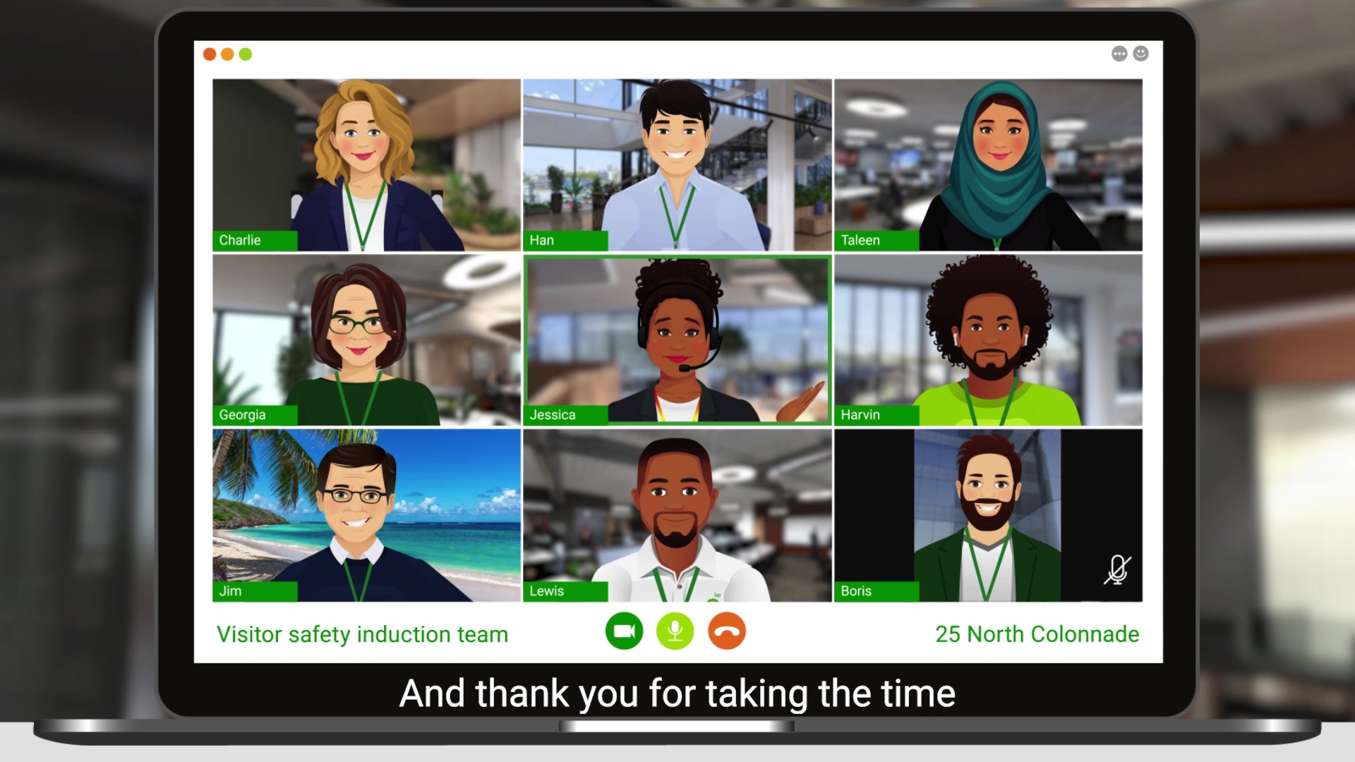
Developing the previous version, I finalised the characters and made them animation read with a variety of facial expressions that would be used to make the characters more humane. I also punched up the colours and added more details to the illustrations and screen layouts. I decided to have the majority of the background images that I have edited and blurred out to work with the rest of the visuals. This adds depth without distracting the audience. I also edited all the information-related images to work with the content and look cohesive. All in all, I was extremely proud of the end results since all of the hard work paid off and sent the company's message.
Ensuring longevity
After receiving great feedback on both animations, we wanted to make sure that the client would have all of the necessary files to recreate the animation for other projects. I packed all the files into subfolders and laid out each scene with the corresponding script and transitional effect for the client to have. It is important to create projects that last the test of time and that can be developed and updated b other peers.