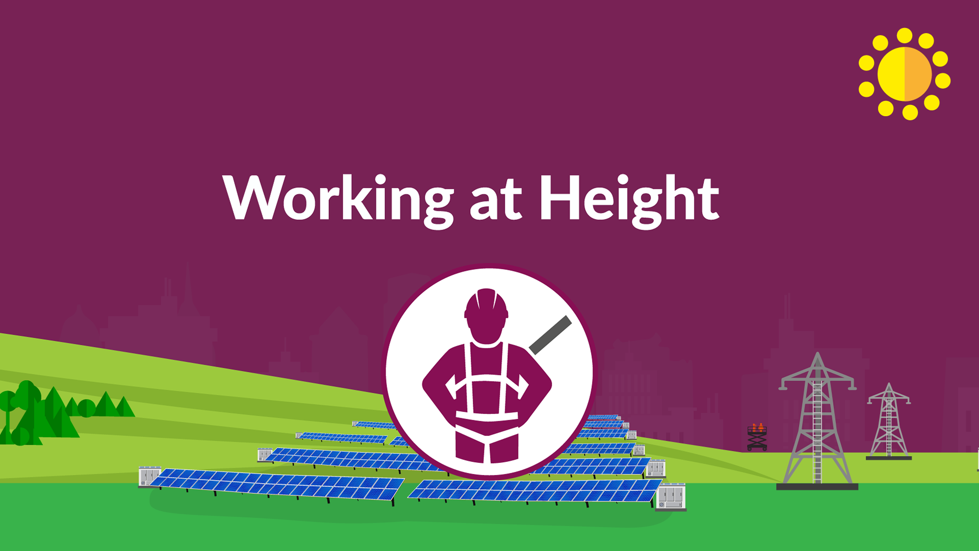
Safety is the number one priority across organisations. We were challenged to create a simple, authoritative but friendly animation that would engage with frontline operators and highlight their six “Golden Rules”. By following our six Golden Rules, employees avoid work-related accidents and create a culture of safety at Lightsource bp. The golden rules are Personal Safety, Vehicle Safety, Environmental Safety, Equipment Safety, Electrical Safety, and Working at height.
The creative was developed to reflect the existing company branding. I was in charge of handling the creative direction for this project from start to finish. By brainstorming ideas with the clients, providing initial ideas then creating the entire sequence of visuals, I got the chance to manage this entire project and collaborate with an animator.
We opted to create an animation to demonstrate these rules since animated explainer videos are perfect for showing dangerous scenarios, difficult locations, and any other setting we needed. Due to the lack of references and imagery, an amination would work better in portraying these environments cohesively. Using vibrant colours and memorable characters and still maintaining the branding, engagingly communicate health and safety messages, while also delivering a professional branded result.
Initial storyboard:
I started the project by analyzing the brand identity, this included the preferred colour scheme, typefaces and use of icons. I wanted to build a rule based on the logos the client provided, and use their corresponding colours to separate each section. In addition, I drew and developed the key mascot that will be demonstrating these rules, and drew it in different contexts alongside the other assets. While creating the individual scenes I suggested transitional effects that can help go through the scenes.
Key background Illustration
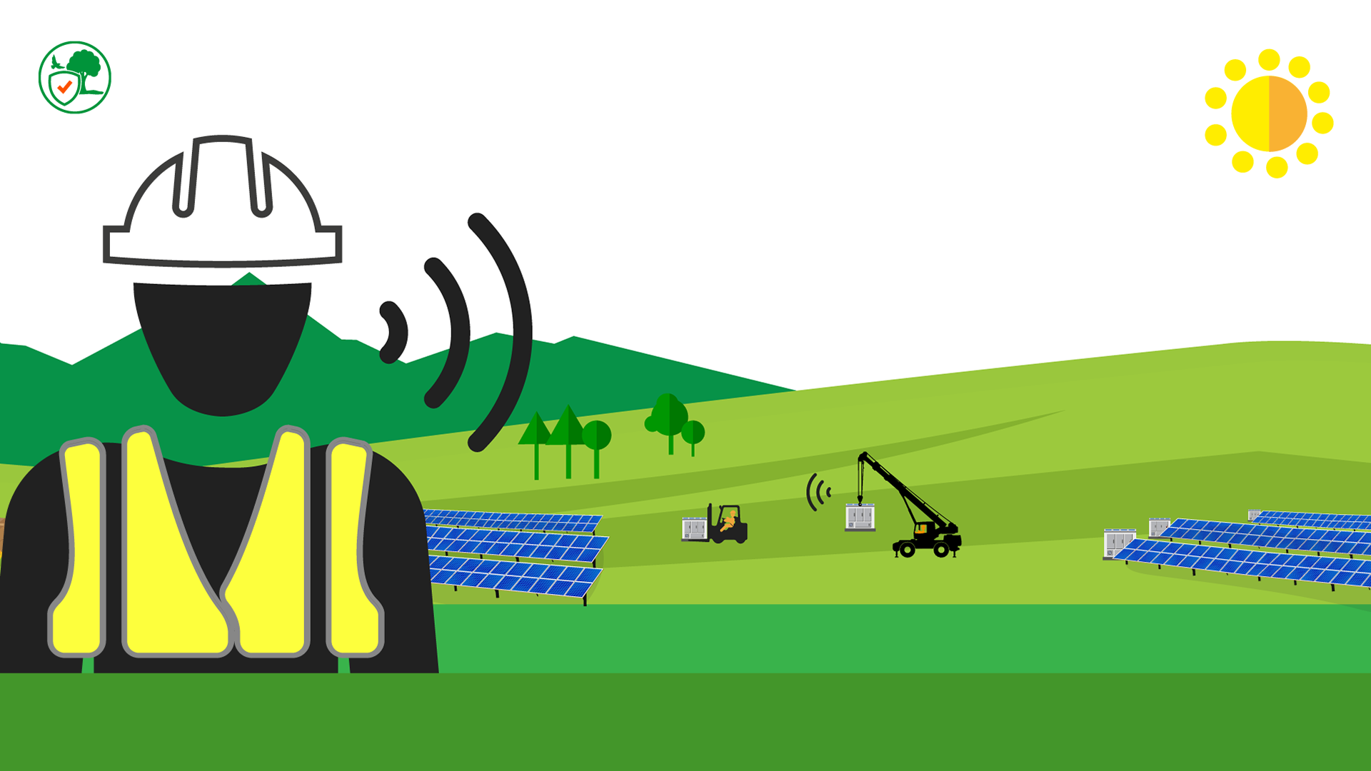
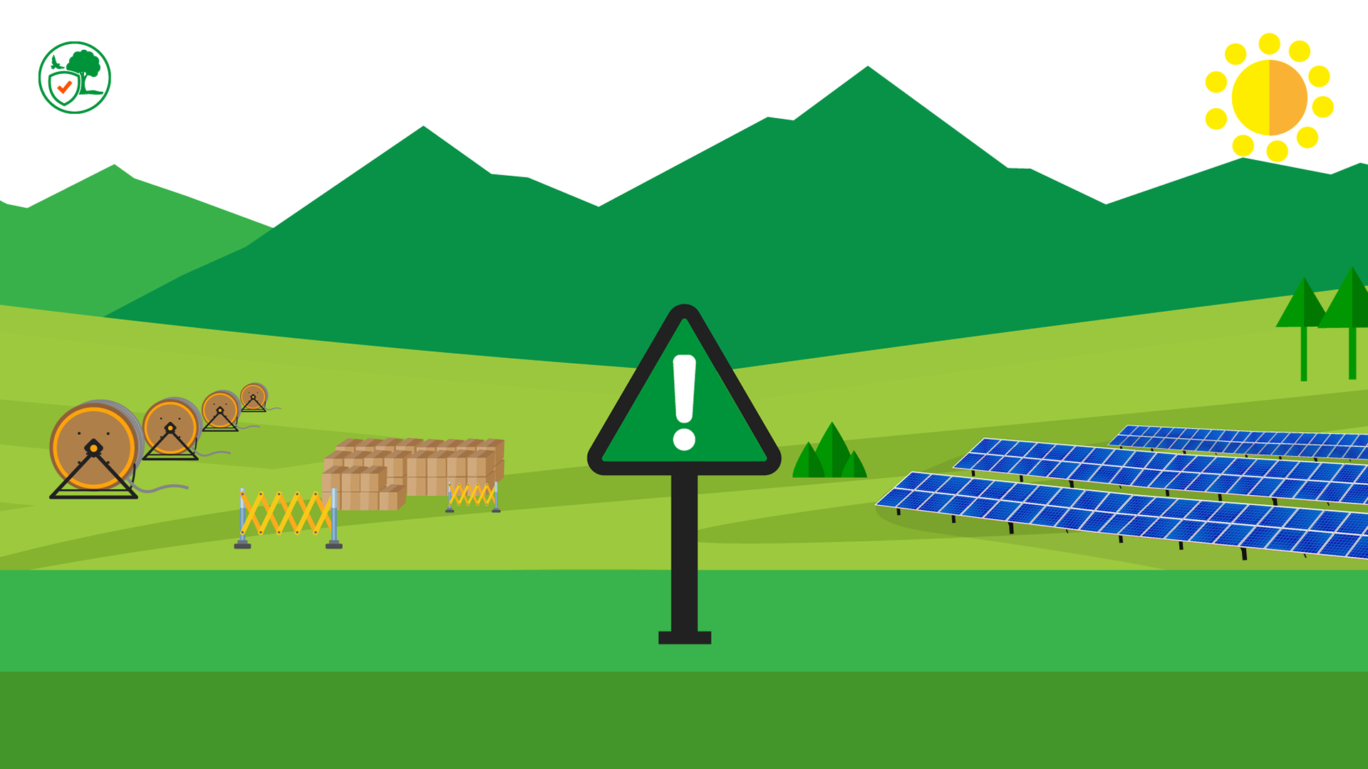
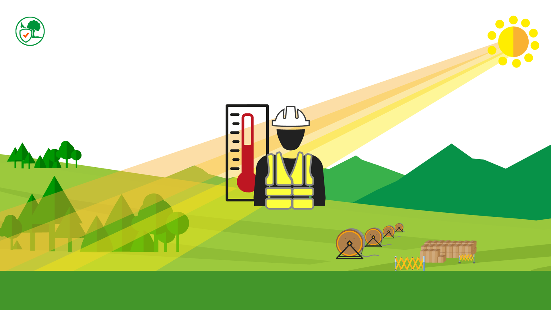
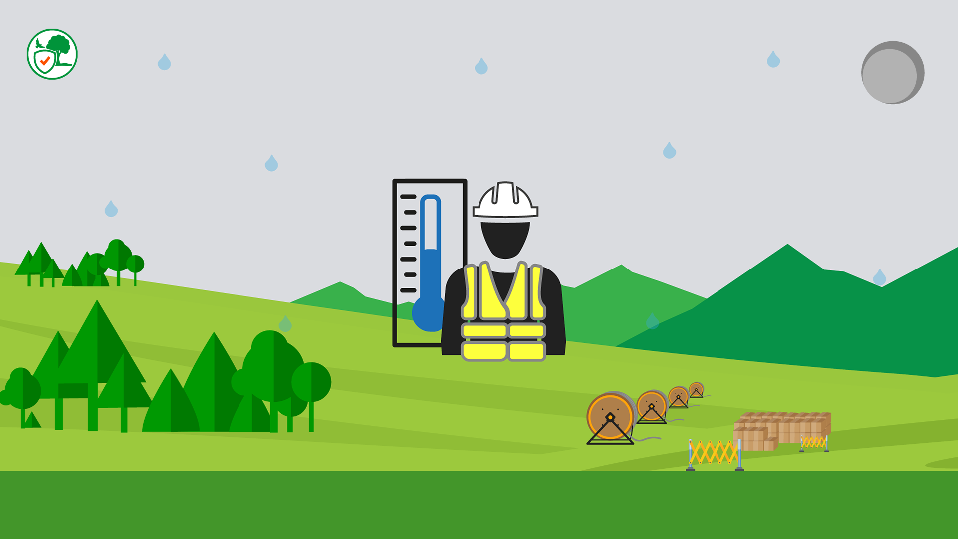
I challenged myself by creating one background that will be used for the entirety of the animation, to allow a seamless transition between scenes. I drew the background from scratch as there were minimal reference photos, the key was to get both a 2D and 3D effect, focusing on the solar panels. I layered the background in panels, to help the animator manipulate the assets and go through the background in a three-dimensional perspective. This provides more space to add scenes and assets for future projects.
Storyboard for each rule
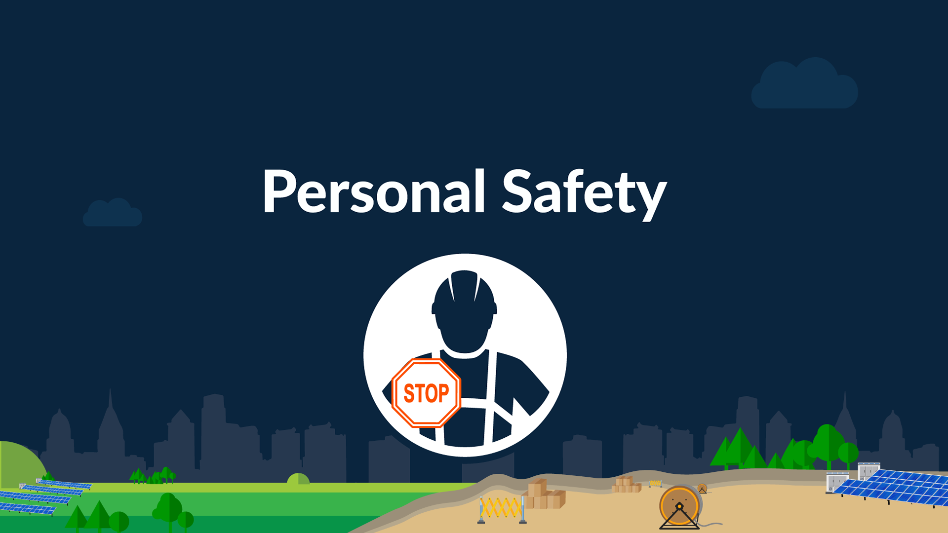
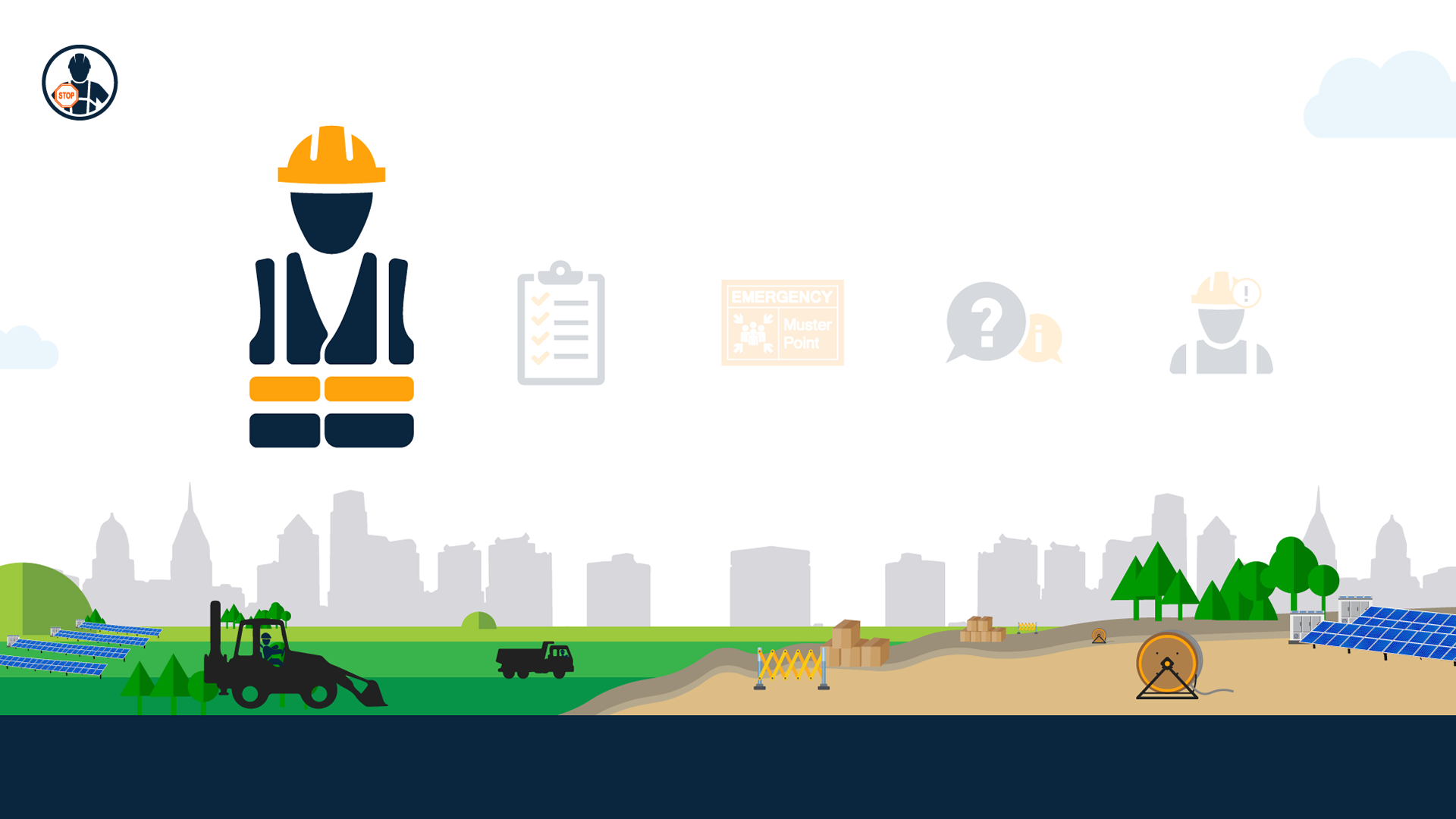
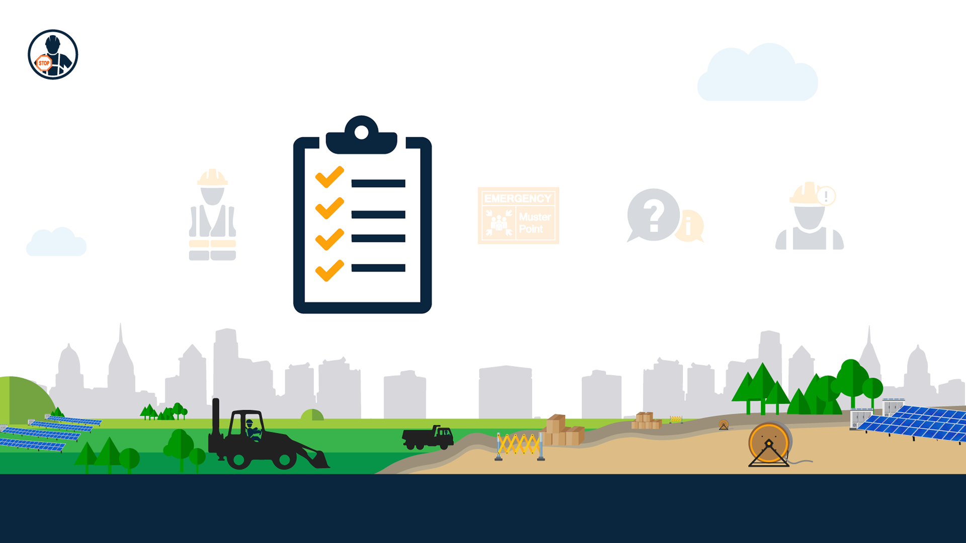
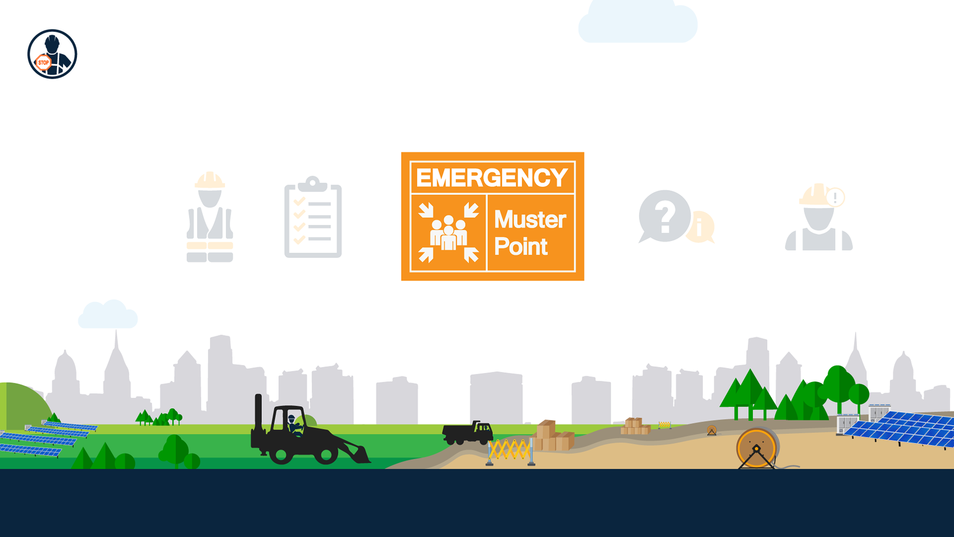

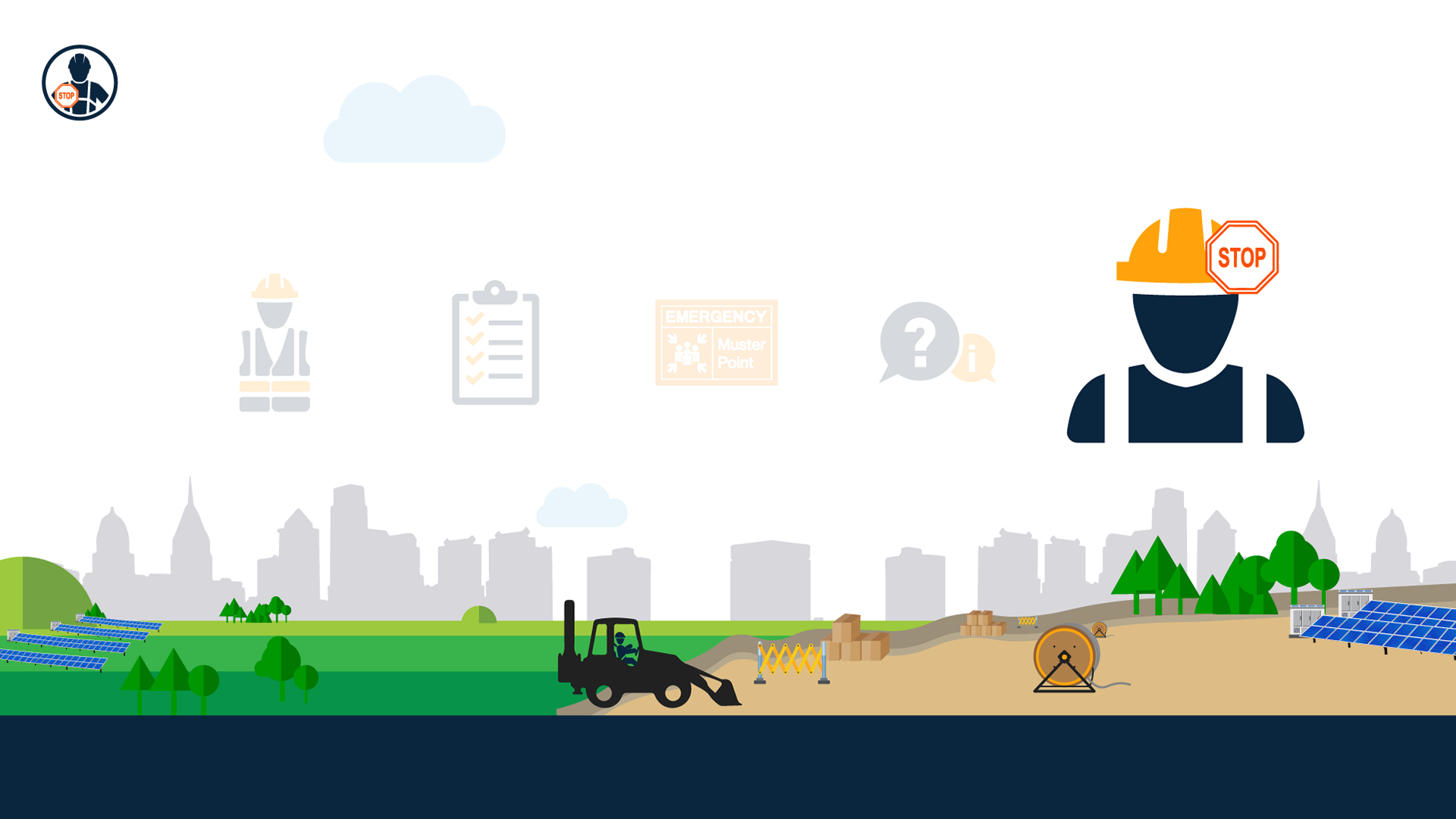
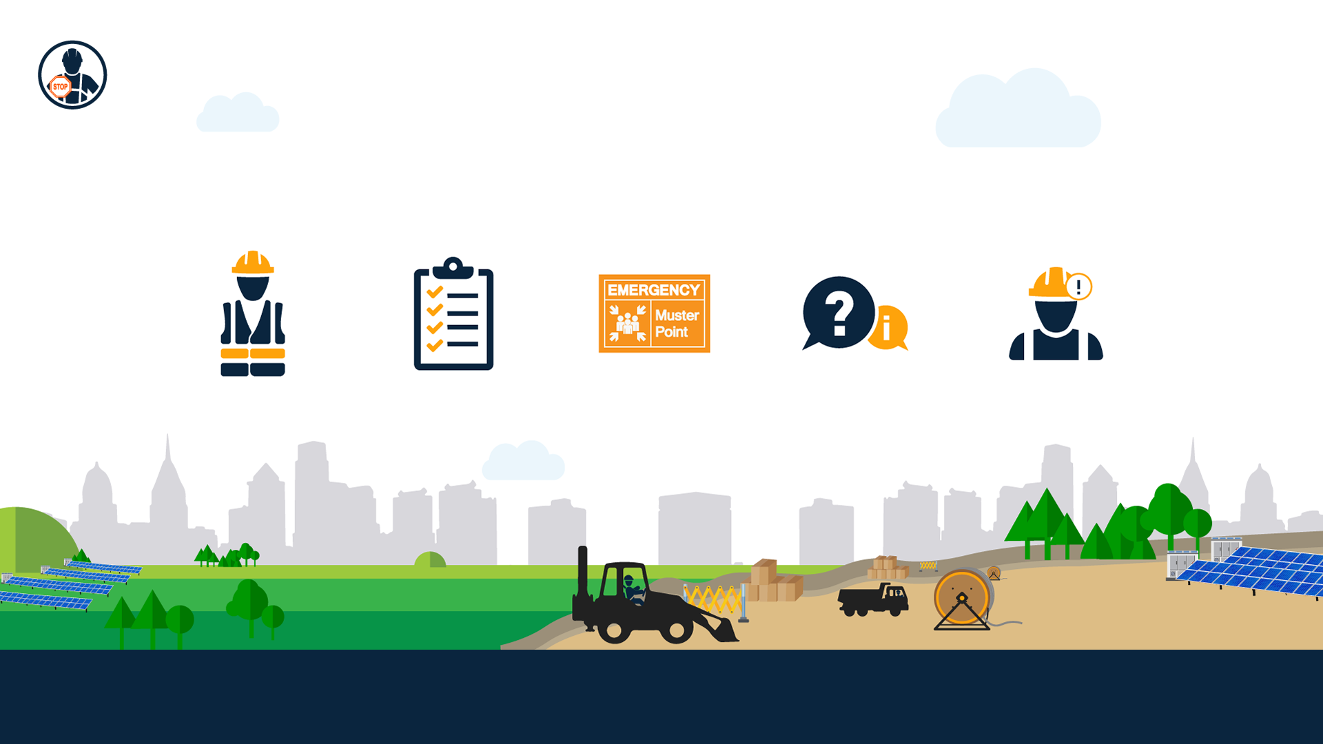
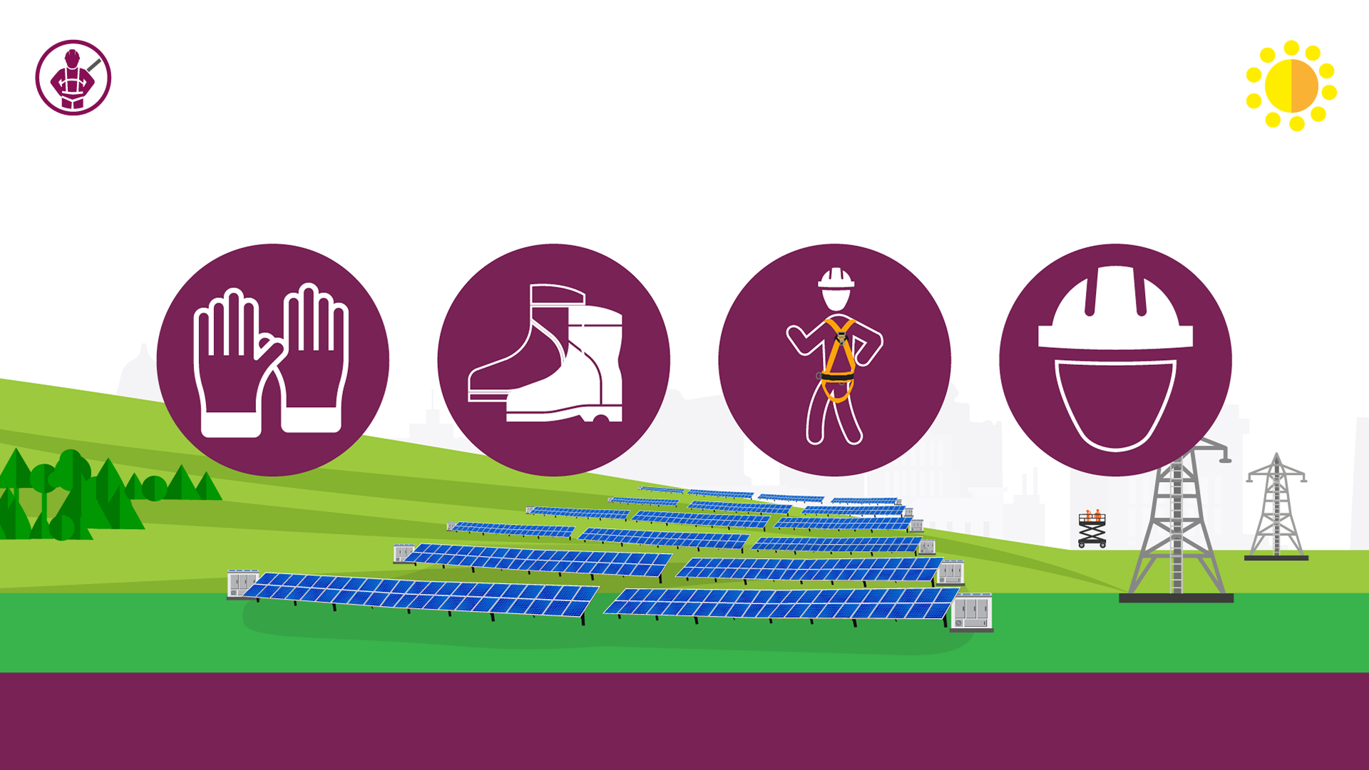
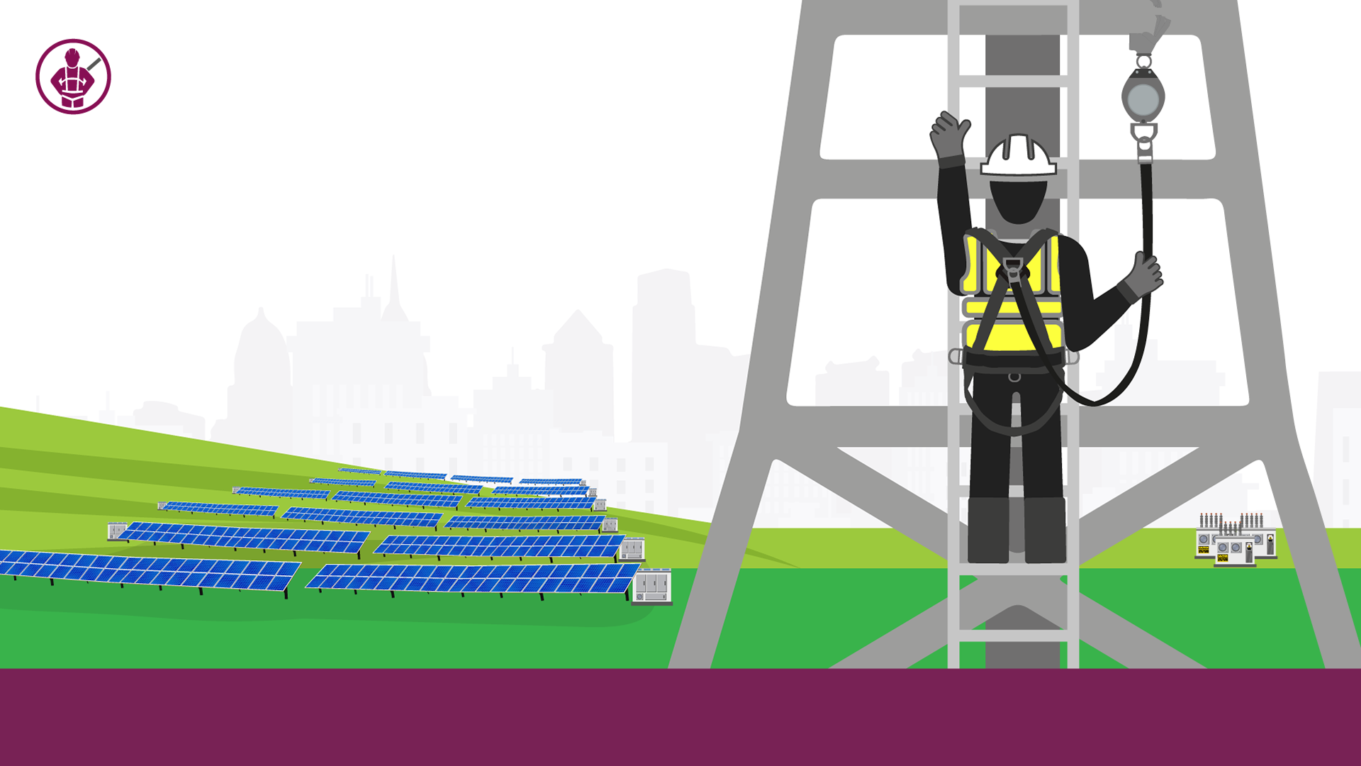
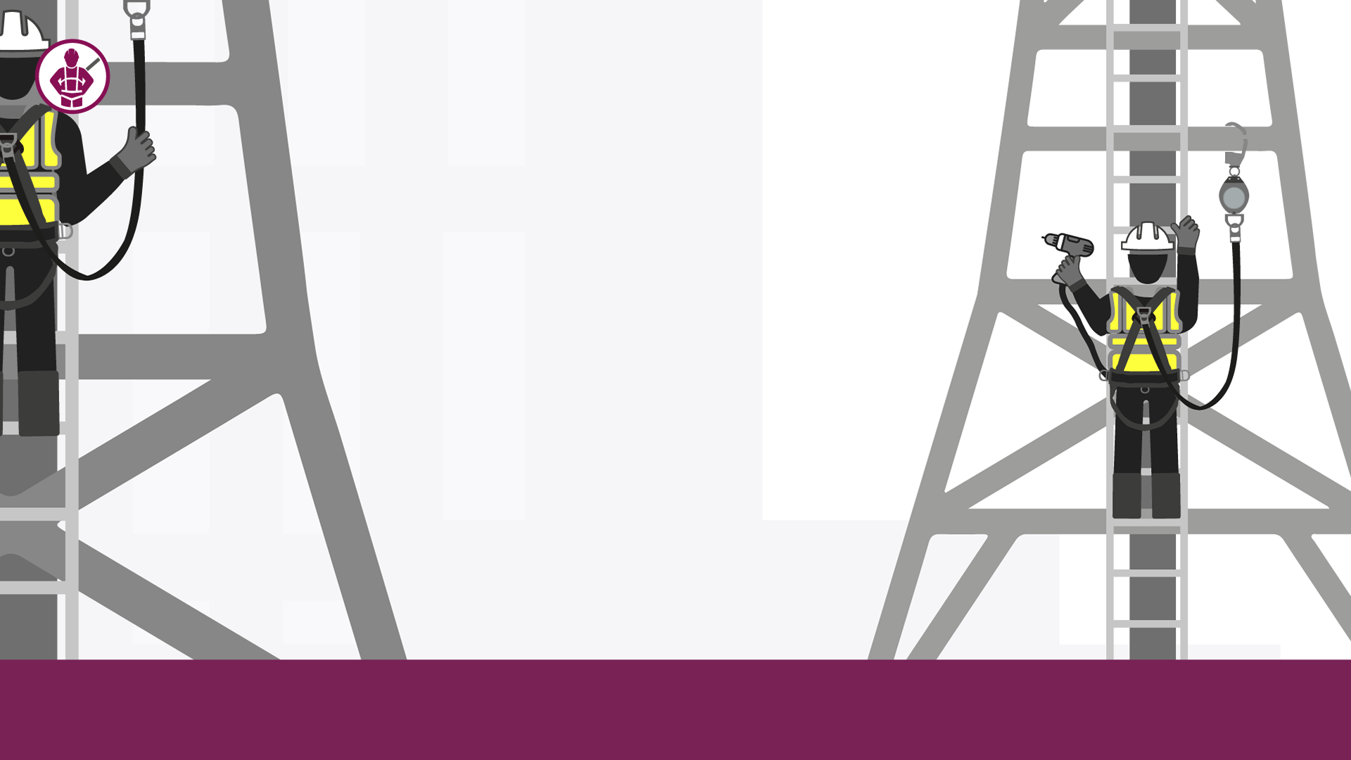
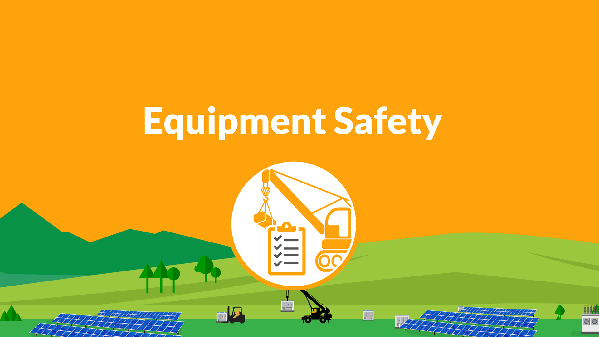
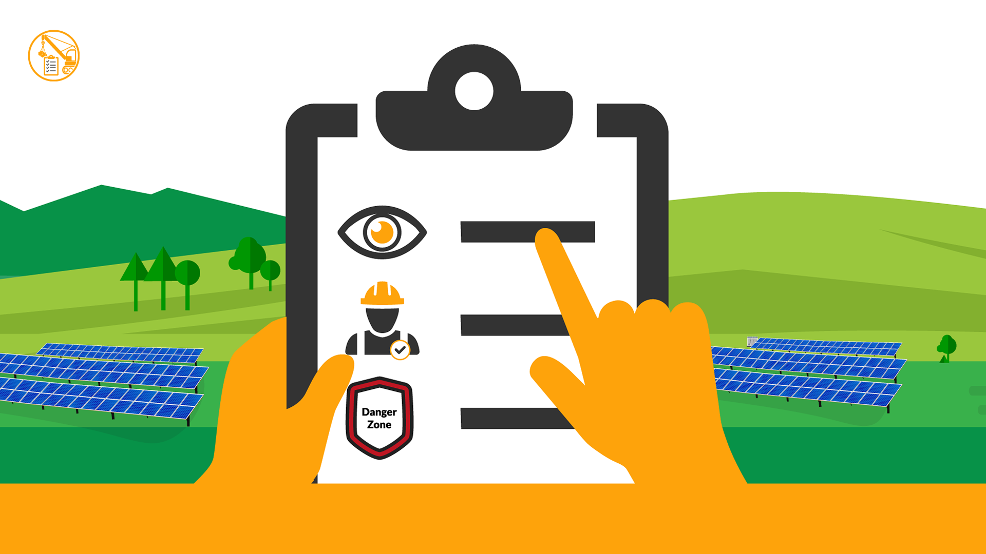
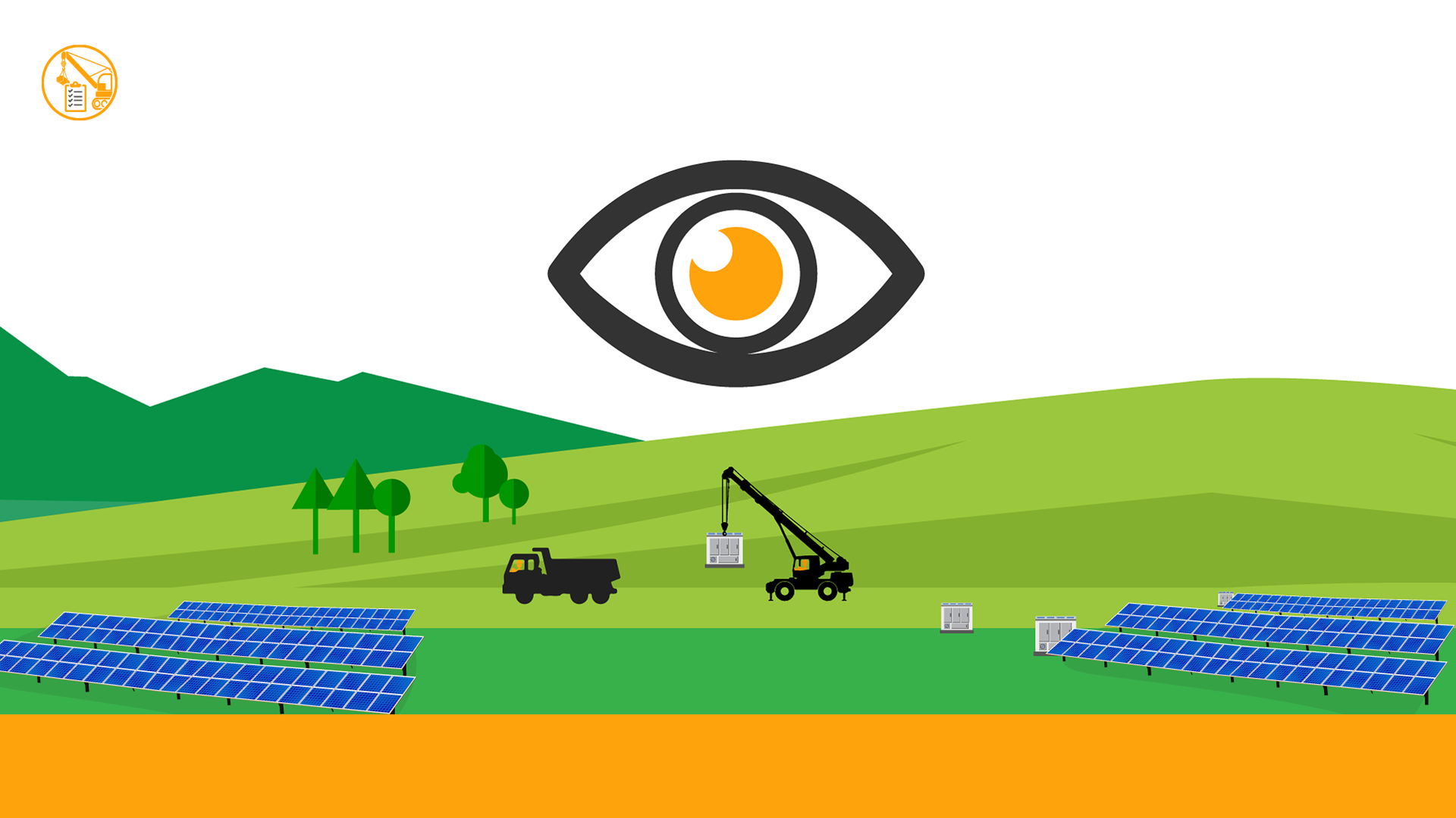
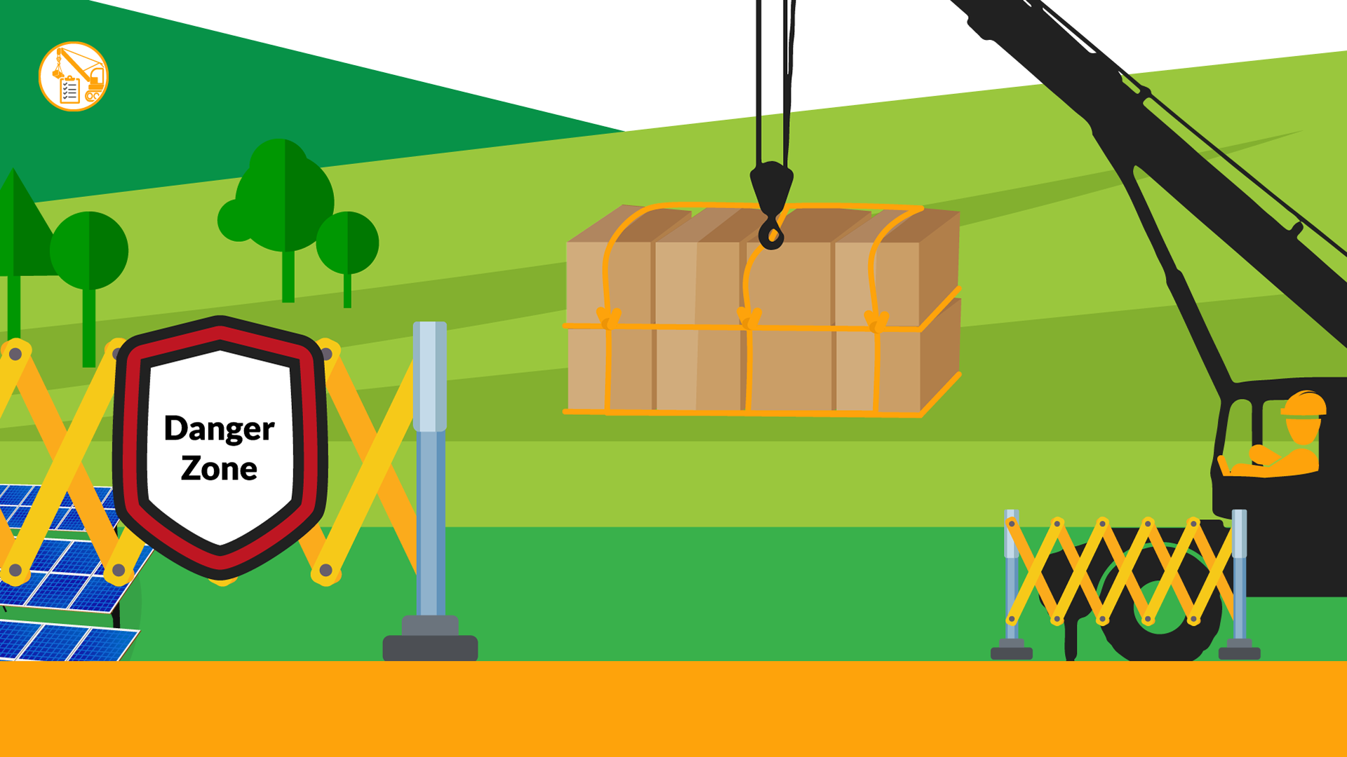
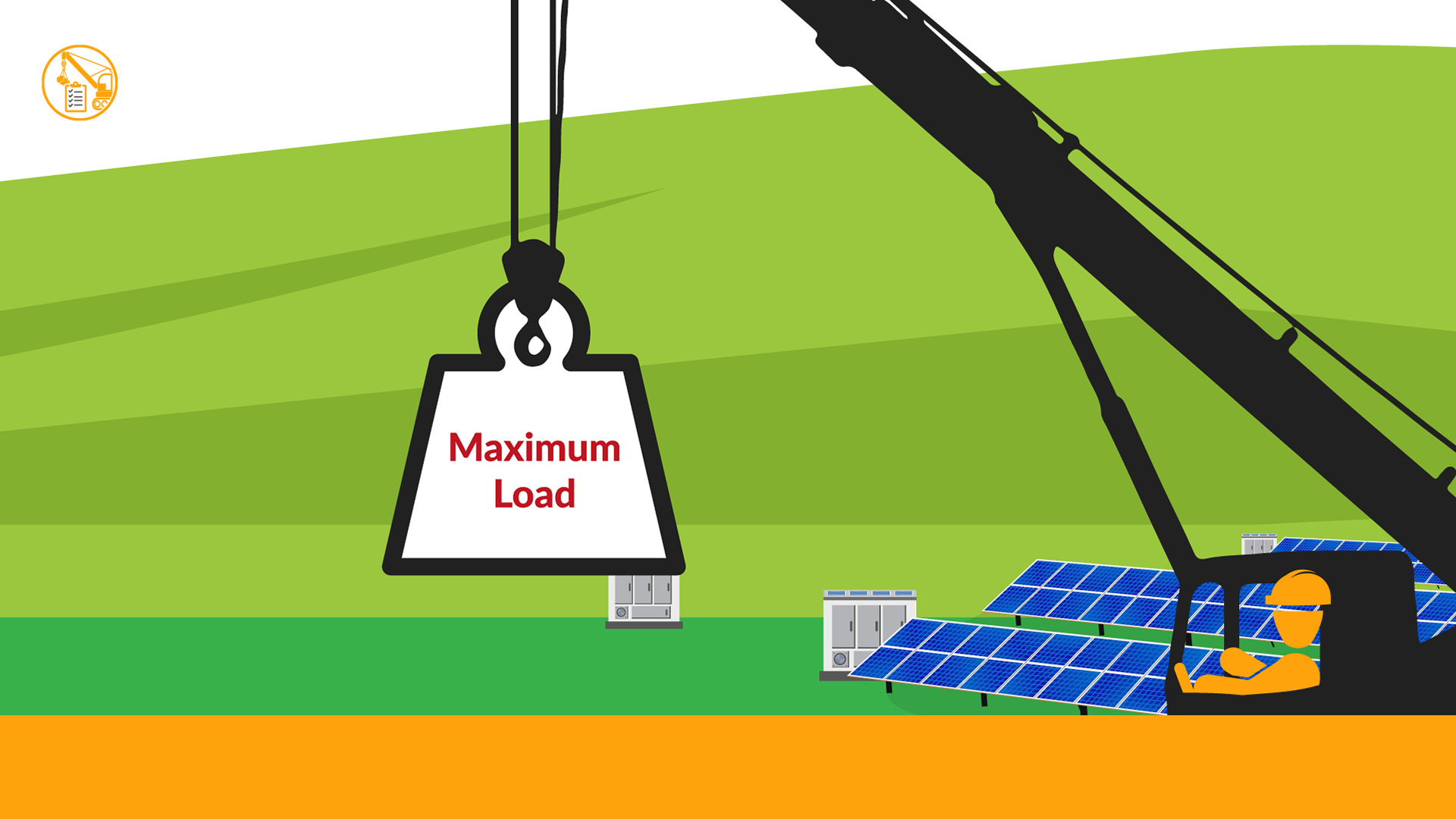
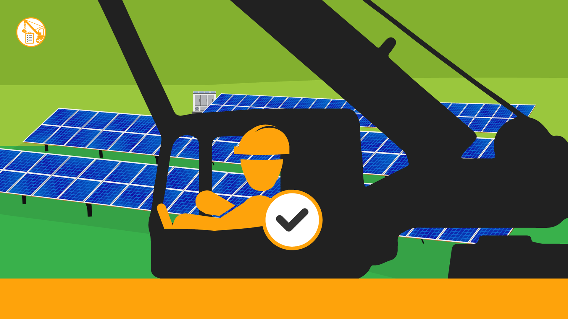
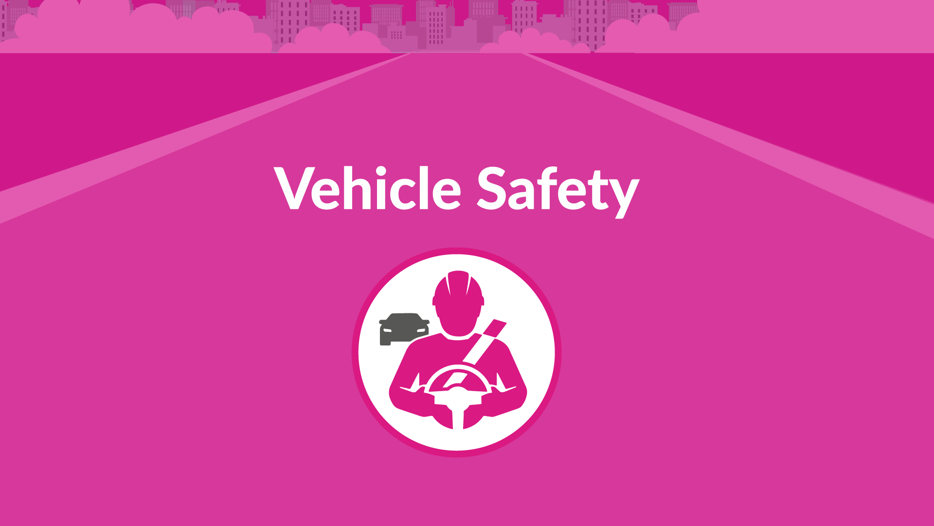
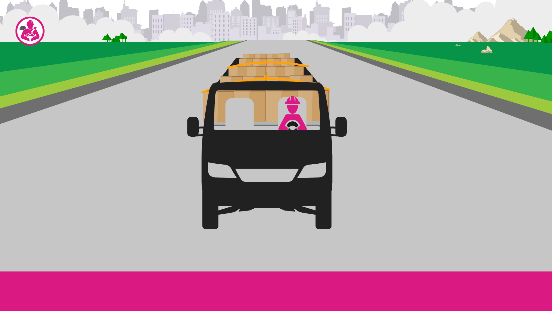
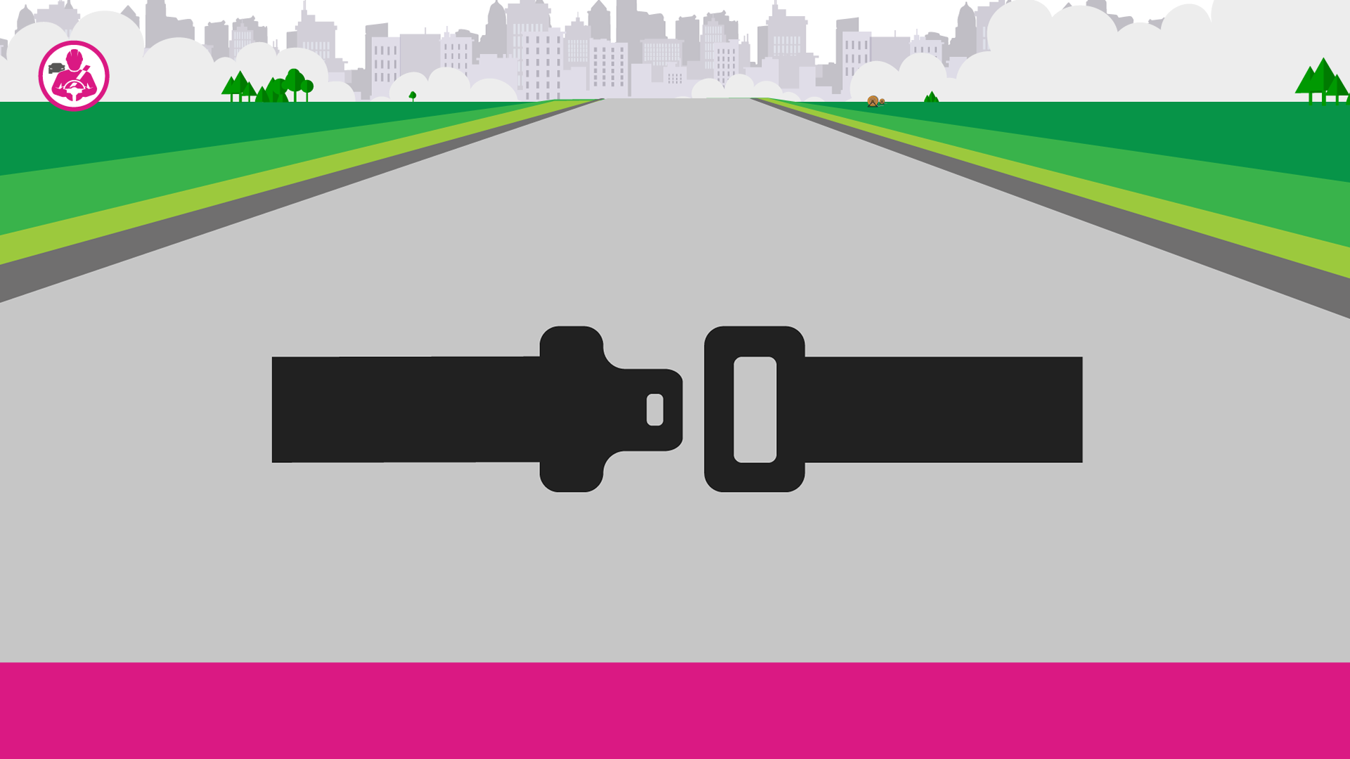
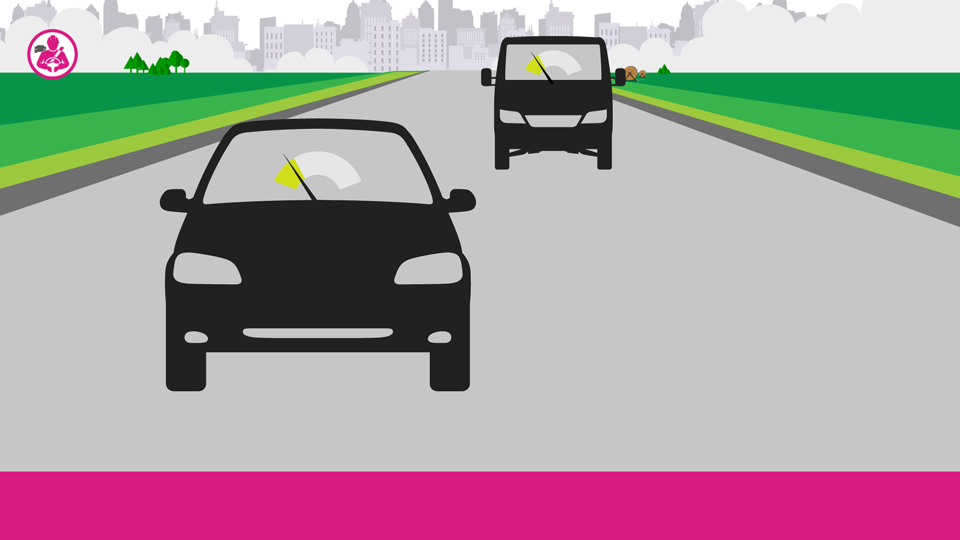
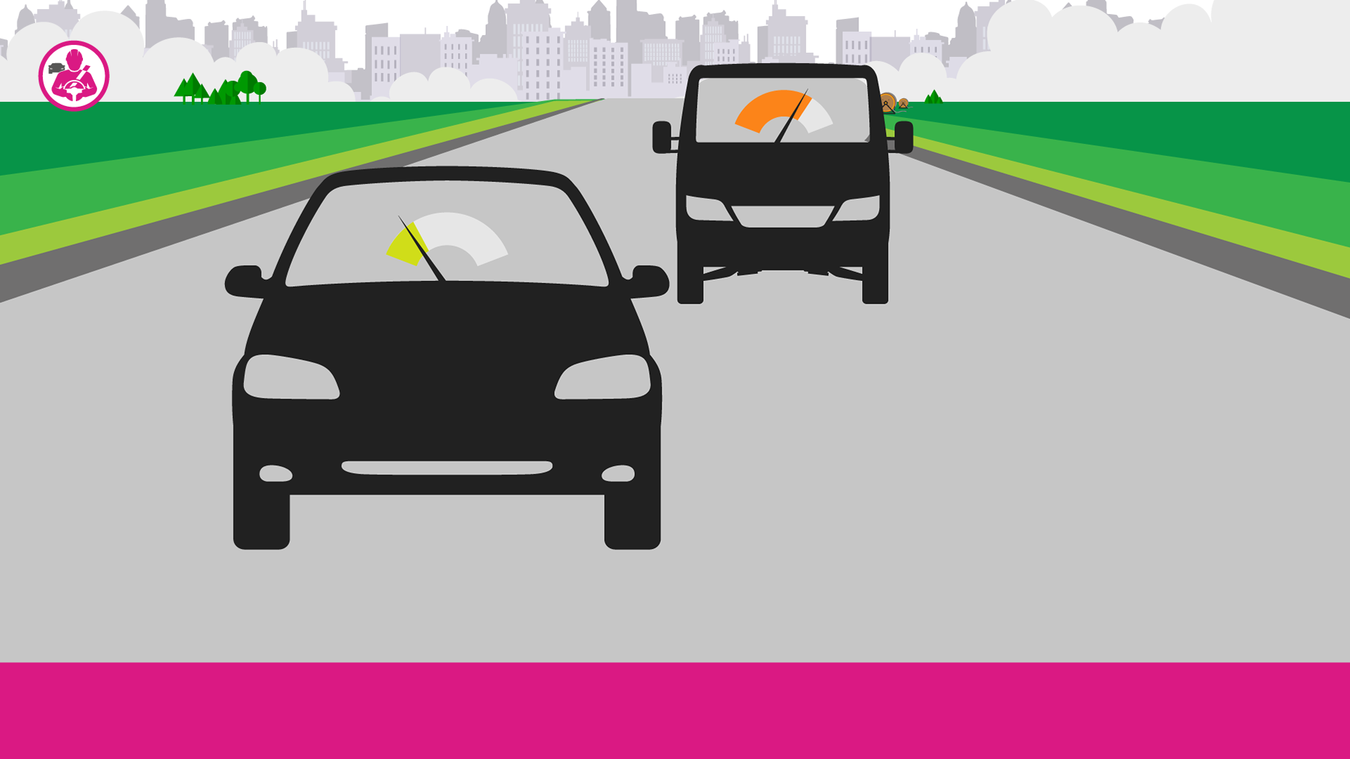
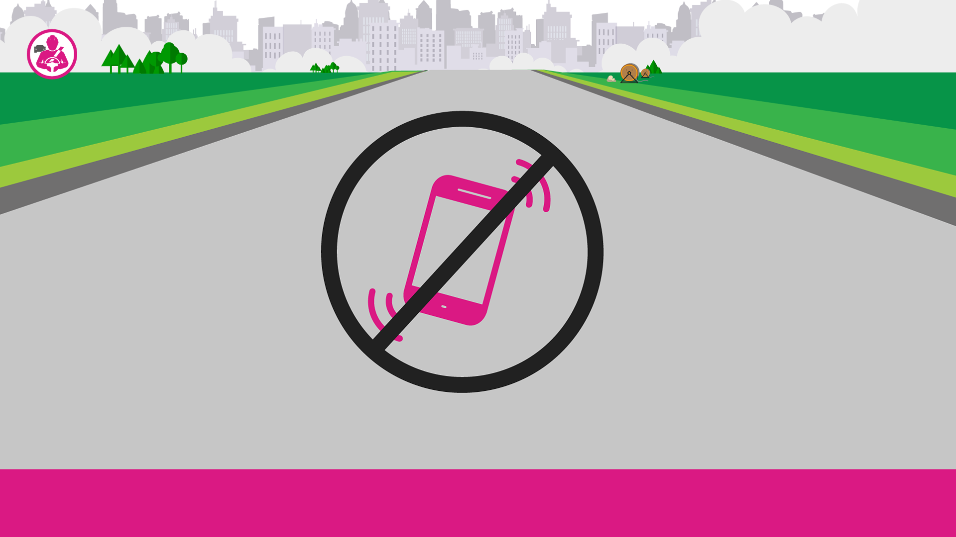
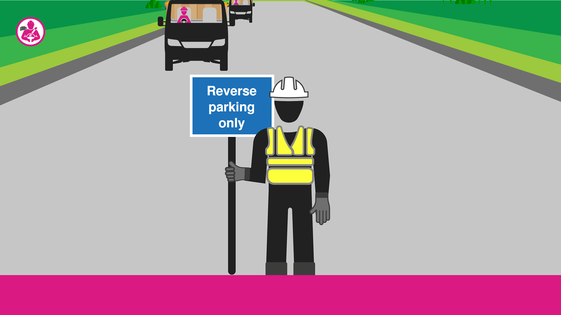
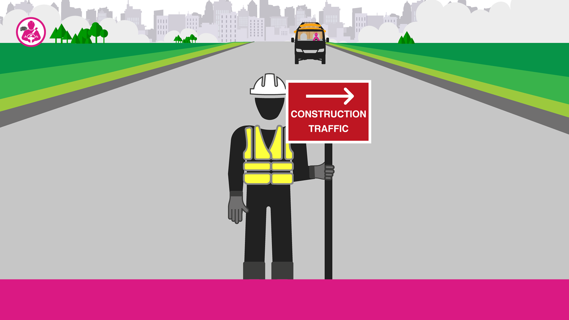
I designed each rule based on the logo colour, and predominantly iconography to help simplify the information. The colours were used as the key section breaker through the title cards, mascot and subtitle box. I customised and drew all of the icons to work with the provided script and given visual layout. To avoid repetitiveness, I switched between icons and detailed illustrations to maintain engagement and concisely demonstrate the rules.
Equipment Safety



Environmental Safety


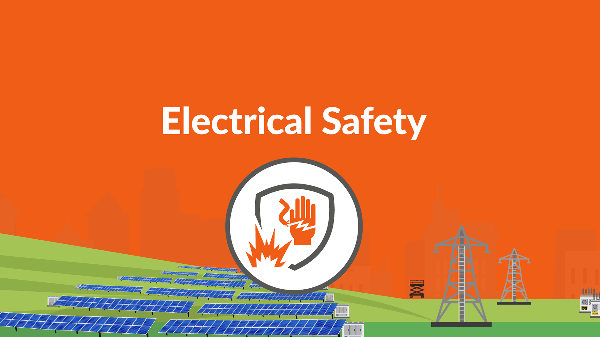
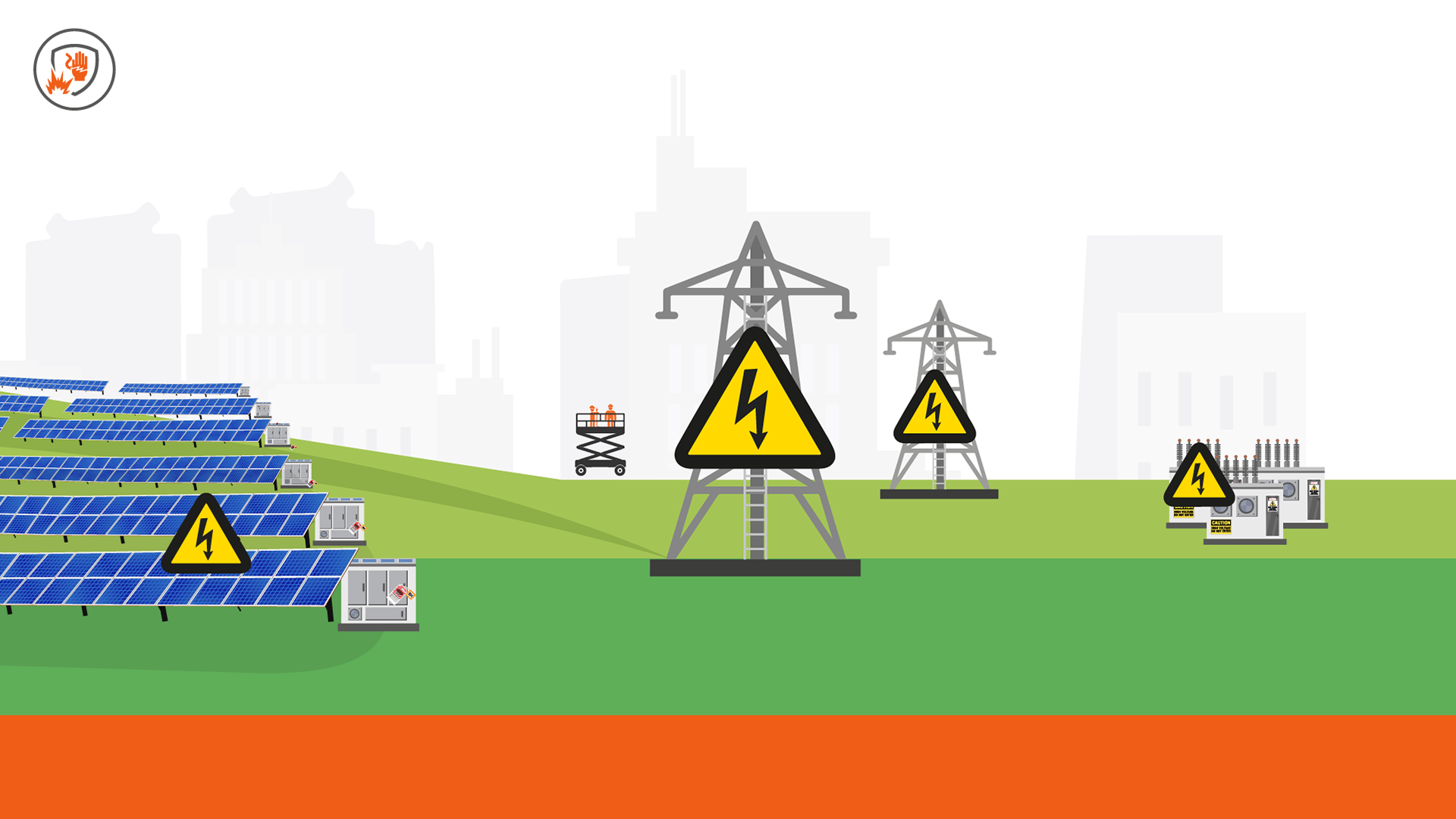
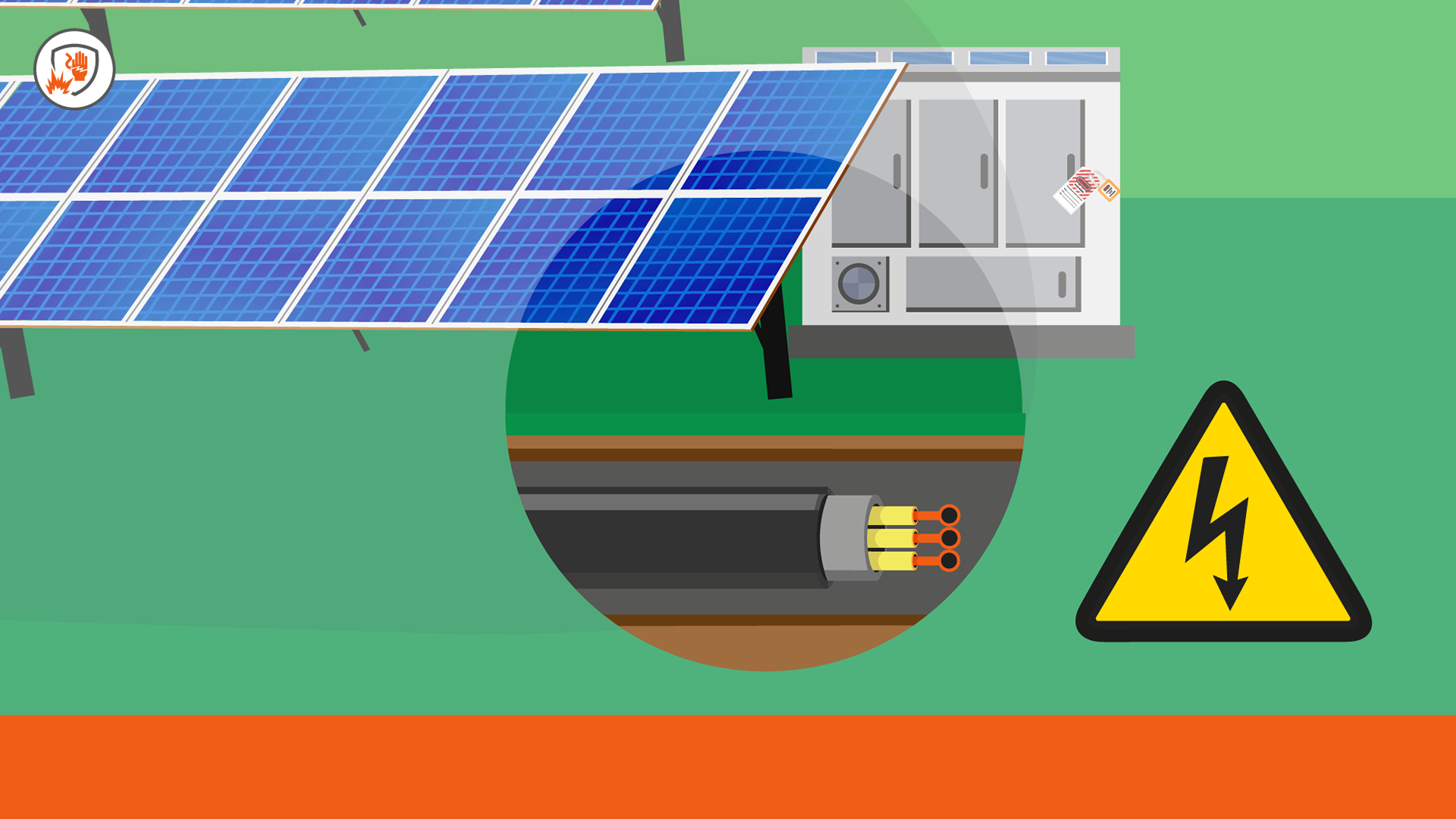
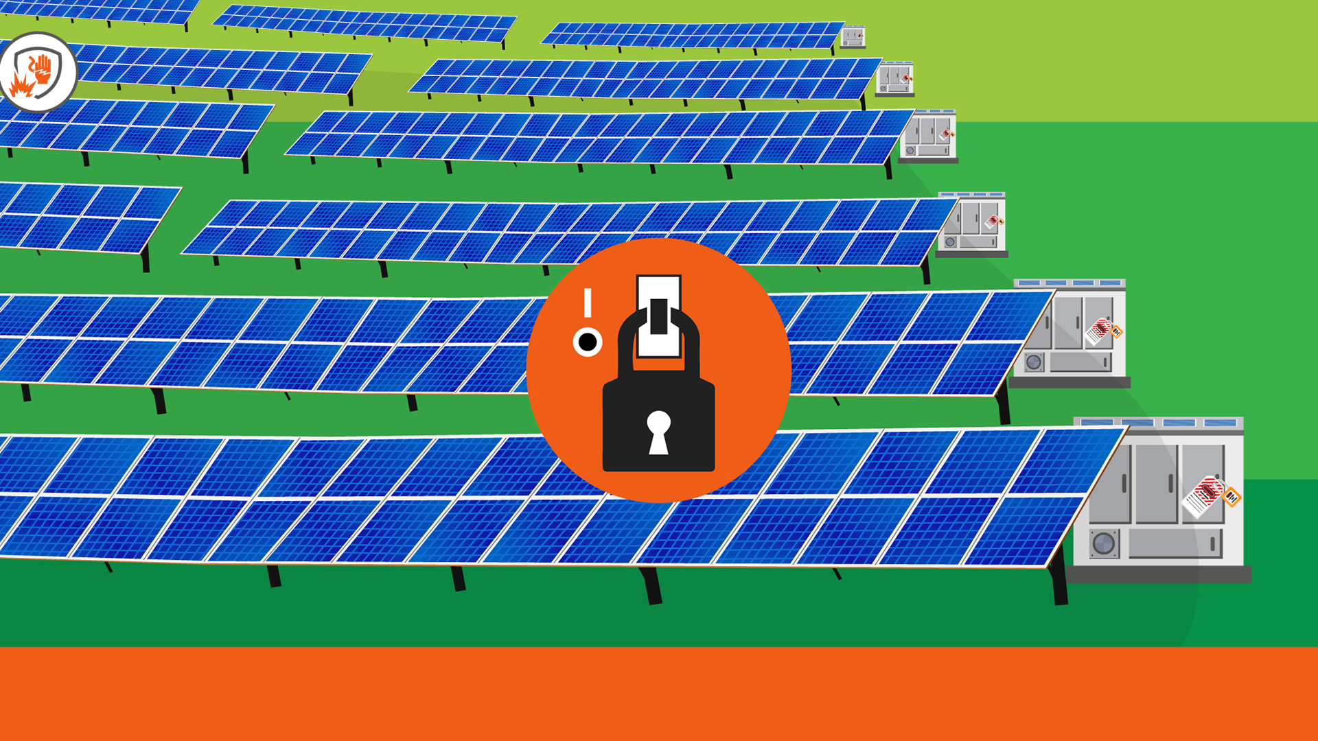
Electrical Safety


Vehicle Safety

Working at Height
